Copyright & Copyleft
Every Teachers Guide To Technology* was written on GNU/Linux (Gentoo Distribution) with Free / Open Source Software (mostly Emacs and LaTeX).
This book is copyright © 2021 Chris Spackman.
Original PDF and editable versions are available at: https://www.chrisspackman.com/technology/every-sentient-beings-guide/. 1
This work is licensed under the Creative Commons Attribution-ShareAlike 4.0 International License. You are free to copy, modify, and redistribute this work under the terms of that license.

Edition: 1.0.1 Last Updated: 08 December 2021
HTML version: 1.0.1 Last Updated: 31 December 2021
About The Author & Acknowledgments
My name is Chris Spackman. I am an ESOL teacher in Columbus, Ohio, U.S.A.2 I taught EFL (English as a Foreign Language) in Japan for many years. I have used personal computers since at least the days of the Commodore 64 and the Odyssey2.3 More recently, I have experience with MS Windows, Mac OSX, and Linux. I started using Linux in 1998 and have been a happy Gentoo Linux user for many, many years.

I have been working in education since 1995, when I went to Japan as an ALT on the JET Program(me).4 I came back to the U.S.A. in 2008, earned my MA TESOL from ODU, and a K-12 teaching license from the state of Ohio, and began working as an ESOL teacher.5
You can reach me at: chris@ChrisSpackman.com. I am @OsugiSakae on Twitter.6
Acknowledgments
Several friends have been kind enough to read through this book over the last few years as I put it together. Their feedback has been most helpful and is most appreciated. That said, all mistakes are my own.
Many thanks also to the wonderful people who created and maintain the Tufte LaTeX styles.7
Introduction
Let me begin by explaining the * in the title. Obviously, this book is not actually every teacher’s guide to technology. Many teachers already know more than me about technology, and they will likely get little out of this book. Teachers who cannot read English would also not get much from this book. You get the idea.
My intended meaning of “Every Teacher’s” is that this guide is accessible to anyone with an interest in using technology for education. You do not need any special training or experience to understand and use the information here. Also, I do not want to insult my readers by calling them “stupid”, “idiots”, or “dummies”. Uninformed on this topic they might (might!) be, but reading this book should help with that. “The Uninformed Teacher’s Guide to Technology” might have been acceptable, but it still focuses too much on the negative. “Every Teacher’s” is the best way, I think, to make it clear to everyone that this book will be accessible and useful.
Speaking of this book, thank you for reading it — if you find it useful, I hope you will share it with others. Every Teachers Guide to Technology* is published under a Creative Commons license, and you are free to copy, print, distribute, modify, etc. as you like — as long as you follow the license and “share alike” as they say. One thing I do, for example, is send out individual chapters8 to teachers in my schools at the beginning of the school year (and again as people have questions).
Who This Book Is For
This book is for any teacher who wants to use technology to improve student outcomes. This book is not about using technology in the classroom, or “edtech” in general. Technology is just one more tool in teachers’ toolboxes; technology by itself does not automatically improve teaching or learning. Check with all the districts that implemented 1-to-1 programs9 (pre-Covid) without proper training, or appropriate curriculum modifications, for a real-world example of how “more tech” does not automagically10 mean “better outcomes”.
Don’t get me wrong, I’m not against technology in the classroom. I am just saying we need to use it with clear educational goals and an understanding of how exactly the technology will improve student outcomes. Also, of course, we need to know that the time, money, and effort that went into using a technology would not have been better spent on something else.
Similarly, there is research showing that students and teachers are not all that tech savvy, despite the students supposedly being “digital natives”. This EdWeek article goes into that a bit.11
The truth is, there is huge waste and under-usage of “EdTech” websites, apps, and software. This is probably true, though perhaps less so, after 18+ months of pandemic-induced remote education. My hope is that maybe teachers can get more “bang for their buck” by learning to better use the tech that they already use daily, as well as maybe learn a bit about a few other programs that can help them do more, faster, better.
Thus, this book is about is how to use technology to more efficiently and effectively do the many daily tasks that teachers do to support their teaching — tasks such as making worksheets, readings, other handouts, tests, quizzes, posters, and the such.
How is that going to improve student outcomes? Well, my hope is that if teachers have a better understanding of technology and idea of how to use that technology, they will create (or find and modify) better materials, more quickly, with less stress.12 If better materials and less-stressed teachers can’t increase student outcomes, I’m honestly not sure what could.13 Also, when teachers know more about technology, they can make better decisions about when and how to use technology with their students. That, too, should improve outcomes.
Global Pandemic Update
So, an interesting thing happened while I was working on this book. And, by “interesting”, I mean “horrible”. Obviously, Covid-19 changed education in 2020 in ways that no one really imagined possible in 2019. For many teachers in the USA, covid meant a sudden switch to “online learning” 14. For many schools, it meant a sudden switch to (somehow, someway) going 1-to-1 as quickly as possible.
Many teachers spent the summer of 2020 becoming experts, or at least well-intentioned beginners, at using several edtech websites. Google Classroom, Nearpod, Quizzezz, Actively Learn, CommonLit, NewsELA, and IXL are just a few of the ones that teachers at my schools started using (or expanded their use of) in the spring and then studied how to use well during summer 2020.
The day-to-day methods of online teaching are different from in-person teaching and learning. Obviously the pedagogical basics don’t change, but how the teacher approaches them does. We aren’t printing papers anymore. Group work looks a bit different. Testing is somewhere between “a thing we don’t do anymore” and “something out of the novel 1984”.
And yet, some teachers are sharing portrait-oriented, letter-paper-sized15 worksheets with online-only students. These teachers maybe haven’t totally figured this new world out yet. Totally understandable, but perhaps something that has some room for improvement.
For example, if students are only accessing documents on a landscape-oriented laptop or chromebook, 16 then why give a portrait-oriented worksheet or reading?[portrait-vs-landscape] Some teachers are still making everything 12-point font with 1-inch margins. Why? If students aren’t going to print the document, it makes more sense to increase the font size to be easier to read on the screen, and it makes sense to use landscape-oriented “paper” with smaller margins.17 These are small things, true, but they can be the difference between “okay” materials and “great” materials. It is the difference between students finishing the school day with energy left and finishing with a headache and low-level frustration.18
Although this book does not intend to teach you how to use (most) EdTech web sites, it can help you think about tech a bit more deeply, so that you realize things like the examples above, more quickly and more easily, and you will know how to make those changes.
Plus, if you read the entire book, you will probably also learn a whole lot more. Like possibly too much. I admit, there is a lot in this book. The chapter Advanced Topics,19 for example, includes content that I’m guessing 95% of teachers won’t care about. But, for that remaining 5%, it could be really helpful.20
What’s in This Book
Every Teacher’s Guide to Technology* has four parts. The first three are content and the fourth in currently a list of links, the glossary (laughably incomplete), and the index (equally laughably incomplete).
- Part 1
is “The Best Tool for the Job” and gives advice for choosing and using software to do specific tasks educators need to do. Start here if you just need to find out how to more effectively and more quickly make a poster or improve a worksheet. We look at types of software and what you can do with them. It is important to understand the ideas, the “why”, as well as the “how”. We look at both.
- Part 2
gets into more detail and the “why” behind various tech and education topics. If you want a better understanding of topics such as copyright, Open Educational Resources, or computer security, read Part 2.
- Part 3
contains links to (currently) worthwhile resources, divided into sections such as “Word Processors”, “Password Managers”, “Graphics and Images”, “Open Content”, and so on.21 If you need to find software or websites to use with students, or if you want to find some to help you prepare for classes more effectively, check the resources in Part 3.
- Part 4
contains three things: 1) a list of all the links in this book; 2) an incomplete Glossary, and 3) the beginnings of an Index. The list of links is complete and accurate, but the glossary and index are very incomplete.22 I do have big dreams and high expectations for them, though.
What’s in Part 1
- Metaphors
introduces a few useful computing concepts and explains how to use them to choose programs. Then, it gets into details of the most common categories of software (word processors, graphics programs, etc.), and how teachers can better use them to more efficiently and effectively do what they need to do. The rest of part one looks at each category in much, much more detail. Warning: the chapters are not imaginitively named.
- Word Processors
digs deeply into the features that make word processors, word processors and not just easier-to-use typewriters. You will (hopefully) learn how to more efficiently and effectively use word processors to make tests, readings, worksheets, and other mostly text documents.
- Presentation Software
is short, because I do not have much advice about using slides. We look at a few ways to use slides in education, mostly in “not lecturing” ways. The best content of this chapter is probably the links to web sites of people who know more than I do about using slides with their students.
- Graphics Software,
looks at some things teachers can do with graphics software. Really, we want to use the software to improve our pictures, charts, graphs, maps, and maybe make some graphic organizers. That’s what we delve into in “Graphics Software”.
- Desktop Publishing
is a deep dive into the how and why of using desktop publishing software (DTP). Many teachers probably don’t need DTP for big jobs that often, but for some types of smaller jobs, DTP can sometimes be the best tool for the job.
What’s in Part 2
Part 2 looks at some technology topics that many teachers know less about, but that can have a huge effect on productivity, especially when it comes to differentiating for students.25 As an ESOL teacher, that last is very important to me and for my students.
- Typography, Design, & Accessibility
help us create materials that look good, are pedagogically sound, and take into account the needs of all students and stakeholders. Understanding a little of the basics of these complex topics is part of making better documents faster.
- Scanning and OCR
helps teachers convert PDF and image files into text documents that they can actually do something with. OCR stands for “optical character recognition”. Sounds bad, maybe, but it is actually a lot easier than it sounds. Usually. Hopefully. If all goes well. Even if all doesn’t go well, OCR is still almost always much faster than redoing an entire document from scratch.
- Translating Documents
discusses ways to automagically translate documents from one language into another. Machine translation is still not as good as actual human professionals, but it is much cheaper. After reading this chapter, educators should have a clear idea how to use Google Translate as well as some idea of ways to get the best translation possible.
- Copyright and Fair Use
discusses copyright, fair use, and how they apply in the classroom. After this chapter, teachers should have a much better idea of how they can use materials in their classrooms without worrying about infringing copyright.
- Copyleft and Open Educational Resources
discusses,26 you will be surprised to hear, Copyleft (the “reverse” of copyright) and something called “Open Educational Resources”, or “OERs”. OERS are wonderful resources that teachers can use, modify, and share, usually for little or no cost. OERs usually depend on copyleft to protect themselves from others infringing their copyright.
- File Formats
discusses, well, um, file formats. Surprisingly, knowing a bit about file formats can actually, occasionally, save teachers some time and frustration. Learn all about the most common types of computer files in this chapter.27
- Portability
asks one question — “can you take your data with you?” Maybe you are okay with a “no” answer, but you should at least be aware when you start working with new software or a new website if you will be locked in or not. Given that this book includes a chapter on Copyleft and Open Educational Resources, you can probably guess my feelings on the topic.28
- Security Basics
gets into detail about how you can protect yourself and why you want to. In a nutshell, it comes down to strong passwords and keeping your software updated. The “why” is pretty straight forward; you have student data on your computer, or access to it through your browser.
- Advanced Topics
looks at some other ways that more tech-adventurous teachers can improve their productivity. We talk about things like shortcuts, snippets, content vs formatting, WYSIWYG, and WYSIWYM. If you want to supercharge your productivity, this is the chapter for you.
What’s in Part 3
Part 3 includes sites and software tools I use a lot. It is not intended as a comprehensive list of worthwhile resources. Such a thing is probably impossible to create, and I have no interest in maintaining such a list even if it could be created. Instead, Part 3 is intended to give you a place to start, if you don’t already have one, or if you want to learn more about a topic.
- Productivity Sites
gives links to some sites that I’ve used for years and find valuable.
- EdTech Books
looks at some great books about “Tech In Ed” and “Ed In Tech”.
- News Sites
links to web sites with news about education and technology. Many teachers will probably already be aware of most of the education sites, but may not be familiar with the tech sites.
- General Web Sites
introduces a few sites that don’t fit into other categories.
- Open Content
includes a wealth of sources for Open Educational Resources. I don’t consider “open” and “available” synonyms when we are talking about educational resources, so you will not find links here to non-CC type “available” educational resources. This section just has links to sites that have legitimately “open” (in the Creative Commons sense) resources.30
- Software
introduces and links to some useful programs. Actually, “introduces” is not entirely accurate because most of the software here we already talked about a lot in Parts 1 and 2.
What’s in Part 4
Currently, Part 4 contains a list of all the links in this book, the beginnings of a glossary, and a very incomplete index.
- The links
are “clickable”, if you are reading on a digital device, but are also shown in their entirety. If you are reading on paper, you can type in the URLs, or at least have an idea of which search results lead to the expected sites and pages.32
- The Glossary
is just getting started. I included a few items just to get familiar with how the glossary system works in the software I am using to make this book. Future versions of the book will have much more content in the glossary.
- The index
is astoundingly incomplete. I will slowly add to it, and future versions of this book will have a much more complete index.
What’s Not in This Book
You may have noticed that this book does not contain a lot of information about how to use sites like Google Classroom, GoGuardian, Canvas, Blackboard, Quizlet, Kahoot, Gimkit, NewsELA, CommonLit, IXL, Khan Academy, etc.33
It also does not talk (much) about how to use less obviously educational sites / software such as Screencastify, Screencast-o-matic, OBS Studio, Veed.io, or even Youtube. These are sites that teachers could use to prepare materials for classes, which is why future editions of this book will probably have more about creating and editing videos. But for now, “EdTech” sites are not the focus of this book. “Tech-in-Ed” sites and software are.34
This book focuses on how teachers can use general technology better in their planning and preparation for teaching, not on what sites to use with students in the classroom, or to assign to students for outside of class.
Conventions in This Book
In this book, will be used to show command or GUI menu entries (such as “Go to ”).
Key strokes (aka “key presses”) are shown for shortcuts and key names (such as “enter”) and look like this: , , and this — meaning press and together.
I’ve sort of used italics and bold interchangeably in this book. Really, I tried to keep bold for the more important or surprising things and italics for just general emphasis. But, the Venn diagram for those two very subjective categories has a lot of overlap.35
This is an irrational pet peeve of mine, but I find it highly illogical to put punctuation ending the full sentence inside of quotes when that punctuation is not a part of the quoted material. I’m not sure why American English insists that you should write:
The teacher said “hello.”
instead of:
The teacher said “hello”.
The period is ending the larger sentence, so why put the period after the word hello and not after the closing quote? So, I’m going to do it the “right way”. (You won’t be surprised to hear that I’m also a fan of the Oxford comma.36
The Best Tool for the Job
Too often, teachers make do with the software equivelant of a swiss army knife. That is, they learn one program and use it to do everything. For example, I’ve seen worksheets created in spreadsheets (such as MS Excel) and posters made with presentation slide software (usually MS PowerPoint). The most common example, as you might guess, is teachers using a word processor to create anything and everything: worksheets, fliers, seating charts, grade trackers, even yearbooks.37
In many cases these teachers did not really choose the software — they are using the software they are most familiar with. They can do the job with that software, so they do the job with that software. They certainly aren’t using the best tool for the job. Just like a swiss army knife can be “good enough” for a lot of tasks, but is rarely the best tool for any job, any program (for example, MS Word) can be “good enough” for a particular job without being the best program to use for that job.
Why should we care about “the best tool for the job”? Well, you can use a swiss army knife to put in a few screws if you need to, but if you use a proper screwdriver, you are going to finish that job more quickly and more easily. For a bigger job, you will want to switch to a proper screwdriver if you can. With a real screwdriver, you’ll probably also have better results. The same is true with software. Yes, you could make a yearbook in a word processor, but that really isn’t the best tool for that job. You will have much better results, faster, and probably more easily, if you use desktop publishing (DTP) software to make that yearbook. But, DTP software is usually massive overkill if you are just making a one page worksheet. For that job, the word processor might be the best tool.38
But, how do you find or decide on the best tool? If you have never heard of “desktop publishing software”, how are you supposed to find it, much less use it? How are you even supposed to know that a word processor isn’t the best tool for that yearbook job?
Partly, the answer is the “metaphors” that programs and user interfaces use. After we discuss those, we’ll look at some widely-available options for several categories of software that teachers can use for various jobs.
Metaphors
One thing that can help you think about the software tools you use is to understand their metaphors. Software’s graphical user interfaces (GUI, often pronounced “gooey” or “gooeys” for the plural) use metaphors to help people understand how to use the software. Good GUIs have effective metaphors to help users “intuitively” use the software.39
Think about making a physical poster in the real world (not on a computer). What tools would you use? What supplies would you need? You make a poster on paper (sometimes letter size, sometimes bigger) maybe with some text and some pictures. So, to make a poster, you need at least paper, scissors, glue, and some markers or colored pencils.
What actions do you take? You either hand write in, or glue in, text. You paste in pictures, perhaps after finding them online, printing them out, and then cutting them out (or drawing them, if you have that skill). If you need more than one of a picture or a piece of text, you might make some copies of it, either by hand or on a copy machine (or more likely, by printing out more copies).
Do any of those verbs sound familiar to you in a computer context? Words like “cut”, “copy”, and “paste”? There is a reason the icon for “cut” is scissors — the people who designed the GUIs used real-word metaphors in their software.40 In this case, the metaphor is pretty straightforward and closely linked to the real-world actions, even today.
But, think about what you don’t do when making a physical poster. You don’t treat the poster board like a piece of paper in a typewriter. You don’t (figuratively) “hit return” or “use the space bar” (or the “center” button) to place a picture on your poster. Moving a picture does not cause the text to move. When you make a physical poster, the text only moves if you move it. Putting in other text or pictures has no effect on anything else.
Now, think about a word processor. The word processor literally acts like there is a piece of paper that you can only access one line at a time, from top to bottom. To go down a line, you press “return”, also known as “the enter key”. The metaphor that word processors use is the typewriter.41
How do you add a picture when you use a real typewriter? You don’t! Not in the typewriter, at least. Instead, you leave some blank space for it on the paper, then you take the paper out and place the picture on the page manually.
When you try to use a word processor to make a poster, the metaphor breaks down, and you may get some problems.42 When you add pictures and other graphics to documents in word processors, you are going against the metaphor; that is a hint that the word processor is not the best tool for the job, if the job is making a poster or other document with a lot of graphics or text spread out all over the paper. A word processor is best for documents that a typewriter would have been good for — documents with lots of words that just go from the left side to the right side in a straight line.
Going back to our yearbook example, if you understand that the word processor uses the typewriter metaphor, it is easier to see that maybe it isn’t the best tool for the yearbook. Yes, it could do the job, but it isn’t going to do that job as well or as easily as software that has a more “page layout” or “poster” metaphor. You may not know what software you need, but you might realize that it would be worth the time to go looking for some.
Next, we are going to look at some considerations when choosing the best tool for the job.
The Best Tools for the Digital Jobs
The best tool for many jobs can be fairly obvious. Word processors are usually best for traditional paper-based tests, readings, and many worksheets. (And we will get into ways to do that faster and more efficiently in the chapter Word Processors on page .) This is because they tend to be text heavy, which is where word processors excel.43
For other types of documents, consider these points:
What sort of metaphor most closely fits the final product if you were making it in the real world and not digitally?
How will students interact with it — digitally? on paper?
If it has pages, how many?
How much text? Is the text in lines and paragraphs?
How many graphics (pictures, charts, maps, diagrams, etc.)? Are they “scattered” around the page, tied to certain paragraphs, glued to one spot (i.e. they don’t move)?
Do you (or the students) need to make changes to any of the graphics?
Depending on the job, a word processor might still be the best choice. Or, something like presentation slide software, image manipulation software, or DTP software might be a better choice.
Next, lets look at some of the available “tools” for each of these categories.
Word Processors
As we discussed, word processors are for text-heavy documents that generally follow the typewriter metaphor with letter-sized or A4-sized pages. Word processors excel at dealing with even large amounts of text.44
- Google Docs
is great for collaboration and students on Chromebooks. It is not as powerful as locally installed word processors (the next two, for example), but can still do more than most teachers need and much more than most K-12 students need. Commercial but free-as-in-beer.45
- LibreOffice Writer
is part of the LibreOffice suite. LO Writer is a quality word processor with all the usual features and many advanced features. It is my preferred word processor, when I don’t need collaboration. I have put together several text-heavy adult ESOL textbooks using LO Writer. It is free, FLOSS, and multilingual.46 Not good for collaboration because locally installed (not web-based).
- MS Word
probably needs no introduction. If you are older than about 25,47 you have probably used MS Word. Not great for collaboration (because locally installed), although there is an online version available. Regarding the online version, Google Drive and Google Docs, in my opinion, do collaboration much, much, better. For locally installed software, again, in my opinion, LibreOffice Writer does word processing better. Commercial.
- ONLYOFFICE
is a relatively new word processor. It is usually online, but there are also desktop versions available. From what I have seen, it is not as easily collaborative as Google Docs or the online version of MS Word (although it can be, if you are able to set that up). ONLYOFFICE is FLOSS, but uses the DOCX format (see page ) from MS Word as its default format, and there are commercial versions.48
More on these in Software (page ) in Part 3.
More details on using these in the chapter Word Processors, from page .
Presentation Software
In theory, “presentation” software is for making slides to use when presenting in front of an audience. In reality, for many people, it is used for almost anything that isn’t a letter- or A4- sized piece of paper or a formula-heavy spreadsheet. I’ve seen posters, fliers, and even student workbooks made in “presentation” software. This is actually totally understandable, and an example of people understanding that a word processor was not the best tool for the job, but not knowing about other options.
Before we go further, please let me suggest that if you are making slides for presenting in front of an audience,49 please, try to follow at least the spirit of the “6x6” rule:[note:6x6-rule] no more than 6 lines; no more than 6 words per line.50
- Google Slides
is great for collaboration and students on Chromebooks. It is not as powerful as locally installed presentation software (the next two, for example). Commercial but free-as-in-beer.
- LibreOffice Impress
is part of the LibreOffice suite. It is free, FLOSS, and multilingual. Not good for collaboration because locally installed (not web-based).
- MS Powerpoint
probably needs no introduction. It costs money, but most school districts probably provide it to staff. Not good for collaboration (unless your district uses the online version), because locally installed. Commercial.
More on these in Software (page ) in Part 3.
More details on using these in the chapter Presentation Software, from page .
Image Manipulation Software
Image manipulation software is for making and changing graphics, images, and the such. There are a few important thing to understand about images:
all images are rectangular, with dimensions usually measured in pixels.51
text in images is not text. It is just pixels made to look like text. People can read it, but only specialized software can “see” the text.52
Actually, there is more to know, but we’ll get into that later.53
- Google Drawings
is again, great for collaboration, but also not as powerful as locally installed software.54 Commercial but free-as-in-beer.
- GIMP
literally has “image manipulation” in its name. It has been around a long, long time. Unfortunate name, but powerful software.55 Anything a teacher needs to do, GIMP can do it, and a lot more. Photoshop (below) is more powerful, but usually only a professional would notice. Locally installed. FLOSS.
- Inkscape
is not exactly “image manipulation” software, but it can be very handy for many simple tasks that teachers need to do. For example, if you just need to quickly add some text, arrows, boxes, etc. to an image, Inkscape can be the best tool. For more complex image editing, Inkscape is not what you want. Locally installed. FLOSS.
- Krita
is newer and not as well known. Focuses on drawing, but can do image editing well, too. I’m not sure how it compares to GIMP for features, but most teachers would probably find everything they need in either program. Locally installed. FLOSS.
- LibreOffice Draw
is also part of the LibreOffice suite. I don’t use it much, and don’t like it as much as GIMP, but that is probably just because I’ve been using GIMP for maybe 20 years or more. If you aren’t already tied to one software, maybe give LO Draw a try. Locally installed. FLOSS.
- Photoshop
may not need much introduction. Many graphics professionals depend on it. Powerful, with a price tag to match. Most teachers don’t need even a fraction of what it can do, but if your school or district provides it, enjoy. Commercial.
More on these in Software (page ) in Part 3.
More details on using these in the chapter Graphics Software, from page .
Desktop Publishing Software
Desktop publishing software is what you want when you are doing something more complicated with pages, text, and images. Yearbooks, picture books, graphic organizers, most graphics-heavy worksheets — if you are making any of these, desktop publishing software is probably the best tool.
- Canva
is, like Inkscape below, not really desktop publishing software. Canva is a sort of “Inkscape-lite” that also handles pages. The reason I include it here, though, is because it is the only option that is web-based and thus allows easy collaboration. Web-based. Commercial but free-as-in-beer. Currently (as of fall 2021), very popular.56
- Inkscape
is not really desktop publishing software, but when a teacher needs a single page document that more follows the poster metaphor, Inkscape can often be a better choice. Locally installed. FLOSS. For most teacher needs, both Canva and Inkscape are much easier to use than MS Publisher or Scribus. FLOSS.
- MS Publisher
is part of more expensive MS Office bundles. Locally installed. Good for teachers who need DTP because it is not professional-level software and may be more “intuitive” to longtime MS Office users. Commercial.
- Scribus
is FLOSS DTP software that is locally installed. Some professionals use it. Powerful but still accessible to non-professionals who are willing to do a little learning. FLOSS.
More on these in Software (page ) in Part 3.
More details on using these in the chapter Desktop Publishing, from page .
There are other DTP programs available, but they are much more for professionals. If your school has them, great. More likely your school has either no DTP software available, or they have MS Publisher.
Conclusion
So, those are some of the other possibly, maybe best tools. In this book, I’ll focus on the FLOSS options, both because those are the ones that I use and because I don’t think teachers (or students or other stakeholders) should need to spend their own money on tools for education. I will also discuss Google’s tools because they are so widely used, including by the staff and students at my schools.
Before we get into image manipulation and desktop publishing, we will look at some ways that teachers can use word processors to more effectively and more quickly make documents such as tests, worksheets, and readings. I suspect that for most teachers, the information in the next chapter will have the biggest impact on their day-to-day “technology in education” life. Not every teacher needs to put together a yearbook, but probably most teachers need to make readings, tests, and worksheets. Knowing what word processors can do for you can help a lot with those documents.
Word Processors
For short, mostly-text documents, a word processor could be the best tool. For many people, the word processor might be MS Word. For more and more people, it might be Google Docs. LibreOffice Writer is another option — one that is free and multi-lingual as well. For simple documents, or for documents you will translate or share, Google Docs is a good choice. For more complicated (but still mostly text) documents, LibreOffice Writer is a good choice because it is free and uses a standardized file format.
In my opinion, MS Word is really only the best option if you are already familiar with it, and you get it for free from your school. In my opinion, it has many other drawbacks that make it less valuable if you aren’t already using it. For example, in my experience, it does not translate documents as well as Google Docs does, and it does not handle styles as well as LibreOffice does. (Of course, either or both of those may have changed by the time you read this.)
Also, I am never going to suggest to a k-12 student (or teacher) that they pay money for an office suite or even just a word processor, when LibreOffice and Google Docs are both free, multilingual, and in my experience, do a better job of following open standards.57
Word Processor Features
Whichever word processor you use, learn to use the features it has. As much as possible, let it do the work. Don’t use it like a typewriter (in the practical sense, not the metaphorical sense). It is called a word processor for a reason.
In a minute, we’ll get into some features that can save you time and effort. You don’t have to try them all at once, though. Maybe start with the first, “tabs”, and then try the others after you get used to the previous ones.
Before we get into tabs, let’s look at some vocabulary that some teachers might not be familiar with. This vocabulary applies to tabs and also more generally to lines and paragraphs — text justification, also known as text alignment.
If you are already familiar with justification and alignment, feel free to skip to Tabs on page .
All About Justification
58 You have maybe heard of “left justified” or “right justified” text. Sometimes people talk about text “justification”. Justification is just about how new lines are aligned on the page. If they all start at the far left of the page, with the first letter of each directly below the first letter of the previous line, they are “left justified” or more typically “flush left” or “left aligned”. That also means that the right side is not even — the line will end, and a new one begin, when the next word will not fit fully on the line. There will be some empty space at the right side of each line. Usually, word processors default to left aligned / left justified paragraphs. I didn’t include a picture example of left justification, because most of this book is left-justified. The book is the example.
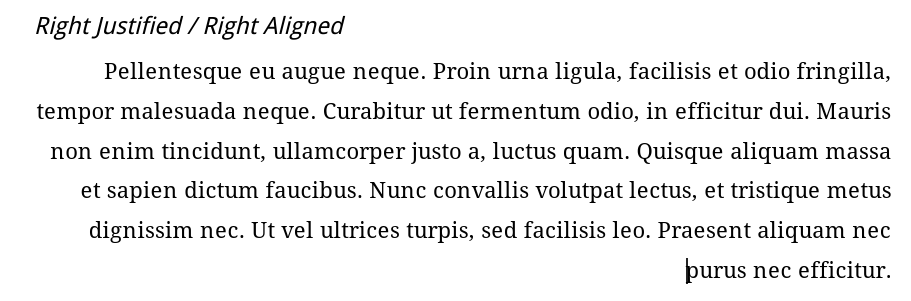
“Right justified” (or “flush right” or “right aligned”) is just the reverse. The last letter of each line will be at the far right, lined up with the letters ending each line above and below. There will be some empty space at the far left side of each line.
The above assumes that we are talking about languages written left-to-right, such as most (all?) European languages. Right-to-left languages (such as Arabic) still have right and left justification, but instead of left being the default, right is the default. Probably many teachers reading this book won’t have to worry about it. Those who do have to worry about it, may already know about it.
Justified or “full justification” is commonly seen in newspapers and books. Text goes fully from the left side to the right side. There is no extra empty space at the start or end of a line. In my experience, typical word processors don’t do a great job with full justification. To do full justification well, the software needs to carefully tweak the space between words and the space between letters. The best will even tweak paragraphs so that as many lines as possible look as good as possible. Because most wordprocessors try to be WYSIWYG, they often don’t go back and try to redo the spacing on a sentence, paragraph, or even document level.59 More advanced software (but usually not word processors) will do this.

The good news, though, is that teachers probabably don’t ever need to use full justification. Usually, students have an easier time reading left-justified paragraphs. I’m told that dyslexic students definitely have an easier time with left-justified text (when reading English). Fully-justified paragraphs can look a lot like a wall of text to young or inexperienced readers. So, unless you are teaching college-level readers, you probably will normally use left-justified paragraphs for most English text.60
With this in mind, we can move on to tabs and other word processor features.
Tabs
Yes, this is “tabs” like the key. The tab key is usually set up to add about 5 spaces or maybe 1/2 an inch of space, The most common use is of is probably indenting the first line of a paragraph. But, tabs are more broadly about placing text on the line.61 Too often, students and teachers use the tab key like a big space — they move some text to the right side of the page by hitting tab a few times and then maybe the space bar a few more times. This is using your powerful word processor like an old-fashioned typewriter!
Of course, one (seemingly) good reason to use the tab key and then the space bar is because you need some text on the left of the line (left aligned) and some text on the right of the line (right aligned) on the same line.62 A common example is space for the student’s name on the left and then space for the date or a point score on the right. But, because justification affects the entire paragraph, you cannot both left and right justify with a lot of empty space in the middle without putting a lot of space in the middle! So, some students (and teachers!) use the tab key and the space bar to add that space.
Yes, sure, okay. But, you are thinking about this as if you are using a typewriter! You aren’t. With word processors, you can set up the tabs to go to exactly where you want the text on the line. When you need some text flush left and other text flush right, you can just insert a right-justified tab at the far right of the page. Then, when you press the tab key, you will jump to the far right of the page. When you type there, the text will be right-justified and the last letter will stay at the far right.
In Google Docs, you can just click on the ruler at the top of the document. A menu will come up with these options:
“
Add left tab-stop”“
Add center tab-stop”“
Add right tab-stop”“
Show ruler”
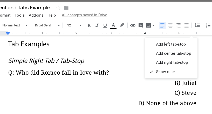
What I am calling “tabs”, Google calls “tab-stops”, which I admit makes a lot of sense here. You literally are setting up where the tab will stop. Think of “tabs” as the general idea or thing that we are using, and “tab-stops” as the places in your document where the “tab” will “stop”.
Choose the type of tab-stop you want, and Google Docs inserts it at that point in the ruler. The left tab-stop looks like a triangle pointing right. A right tab-stop looks like a triangle pointing left. A center tab-stop looks like a diamond (or the left and right tab-stop triangles next to each other).
Note that tabs / tab-stops are for a paragraph. Google Docs doesn’t seem to have a way to set them up as part of a paragraph style.63 So, if you put a tab-stop on a line, and then press enter from that line, the new line will have the tab-stop also. But, any other line that you want to add a stop to, you have to do individually.
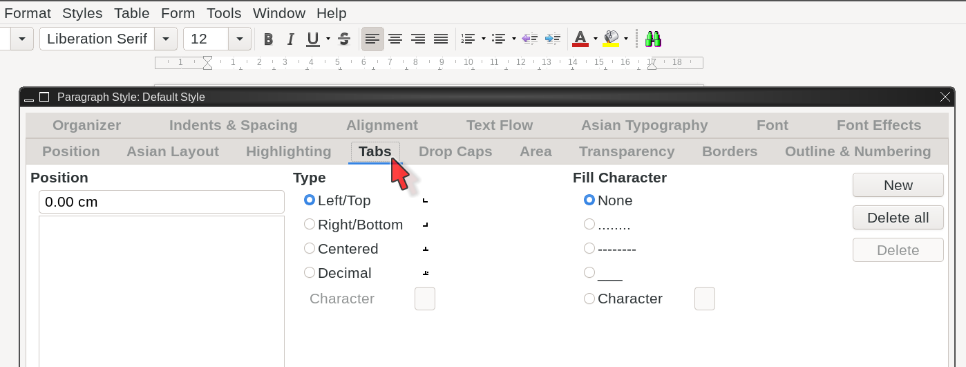
In LibreOffice Writer, you can use tabs in both paragraph styles (page ) and individually for any paragraph. To just change tabs for a single paragraph, double click on the ruler at the top, or right click on the paragraph, chose , then click on the tab in the window that comes up.
Why, you might ask, is this worth worrying about? Well, first, it is actually a lot easier to do (once you get used to it), and looks a lot better (at least to people like me — I can usually see right away when someone has used regular tabs and spaces to move text to the right side of the page). Can you see the difference between Figure 2.5 and Figure 2.6?
It is subtle, but the right justification in the first example is just a little bit off — the 1 and the 0 at the end of the lines are not exactly lined up. These actually came out pretty close (but I can still tell) — depending on the text on the line and the font you use, it could be much worse, actually.
The other, probably better for most people, reason is one I’ll mention a lot in this book; when you use your word processor as a word processor, you can easily make changes.64 When you use your word processor like a typewriter, you might be able to easily make changes (but you also might not be able to) but your formatting will probably get all screwed up.
Figure 2.7 and Figure 2.8 show what happens when you increase the font size.
In the first example (figure 2.5), I used regular tabs and spaces to place the content on the right. So, when those tabs and spaces got bigger, they pushed the content to the next line (figure 2.7).
In figure 2.8, I used word processor tab-stops, and the bigger font didn’t matter. We told the word processor to have the text finish at the end of the line, so it pushed the right-side text to the left when the font got bigger. In the same way, in example 1, the “centered” text was pushed to the right because it had all the tabs and spaces on the left. In example 2 (Figure 2.8), the word processor re-centered the text after the font size changed.
Using tabs and letting the software figure things out is using a word processor like a “processor”, not like a typewriter. As you get used to using more and more features of word processors, you will be able to create better documents more quickly. Best of all, you’ll be able to change them easily when you need to.65
Tabs Not Tables
Tabs are also important for positioning text without using tables. Tabs are for formatting, tables are for showing data.66 You should use tabs instead of small, simple tables, if you would be using the table to place content on the page (aka page layout).
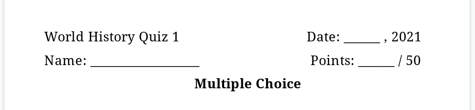
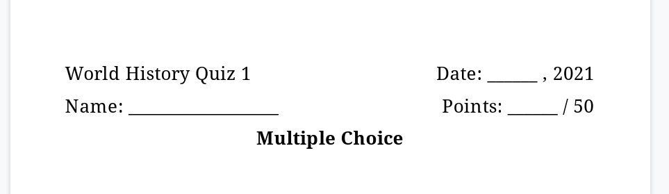
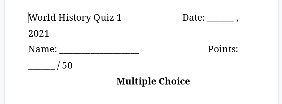
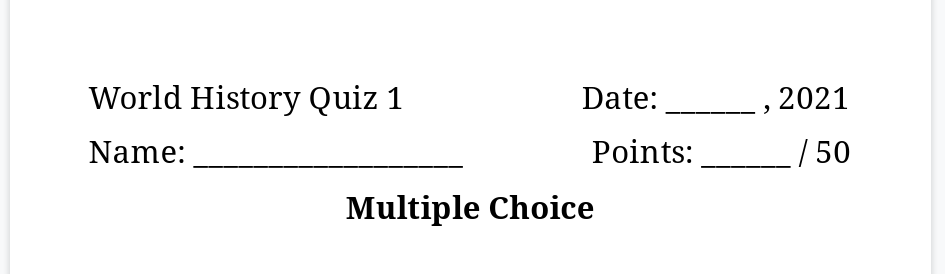
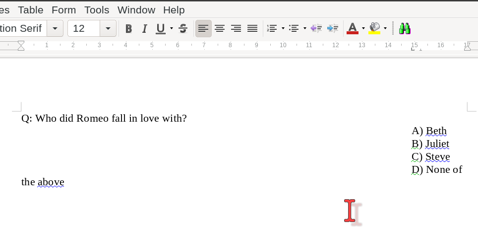
For example, if you have a multiple choice quiz and you want to put all the answer choices at the far right, you can set up a right-justified tab at the right margin. Press the “tab” button and the cursor will jump to the end of the line. It might look like this:
Q: Who did Romeo fall in love with? A) Beth
B) Juliet
C) Steve
D) None of the above
Or maybe you want them left-aligned, but at the far right side:
Q: Who did Romeo fall in love with? A) Beth
B) Juliet
C) Steve
D) None of the above
Or, maybe you want the answers spread out neatly below the question:
Q: Who did Romeo fall in love with?
A) Beth B) Juliet C) Steve D) Someone else
One thing to be careful of with center-aligned and right-side left-aligned tabs (like the second example) is text that is too long for the space available. In the second example, the “D) None of the above” could end up doing weird things if you set the left tab-stop too close to the end of the line.67 If there is a problem, you can just select all the lines (from the question and answer choice “A)” through the answer choice “D)”) and then drag the problematic tab-stop to the left until the answer choices all fit on the line.
All of these layouts are best accomplished with tabs — set them up (either directly in the paragraph settings or in style settings) and then use the key to jump to each one. Some teachers use tables for the above formatting, but you really, really, really, really should avoid using tables for page layout.68 You shouldn’t use tables to make columns or to place graphics on the page or the such. Tables are great for displaying data.69 When used for page layout, they can cause trouble for screen readers, which sight-impaired students may depend on for accessing your materials. Screen readers can handle data tables just fine. Tables for layout, they don’t handle as well.
Rule of thumb: if you have (or could have) headers on the table (“X” and “Y” or “Distance” and “Time”, or “Years” and “Cost”, etc.) it is probably a good use of a table. If not, see if you can’t redo it without the table. When you get a sight-impaired or other student with special needs, you will be so happy that you didn’t use tables for layout.
Teachers need to do a lot of differentiation,70 including modifying worksheets and readings. Using tabs is one way to make modifying text much easier and faster, as well as better serving students with some specific needs (like students who need screen readers).
The next word processor feature we will look at also makes differentiation easier. It is paragraph styles. They are very helpful, and depending on your needs, you may use them more often than you use tabs.
Paragraph Styles
Paragraph Styles let you change the all aspects of the formatting for paragraphs by telling the software what kind of paragraph each one is. Using styles, you can change spacing and fonts, set tabs and justification, and do anything else you might need to do with a paragraph. Common paragraph types include title, subtitle, headings, first-line indent (most body paragraphs), hanging indent (such as for works-cited pages), footnotes, and page header and page footer “paragraphs”. There are also list styles and less frequently used styles such as addresses, signatures, captions, as well as many, many more.
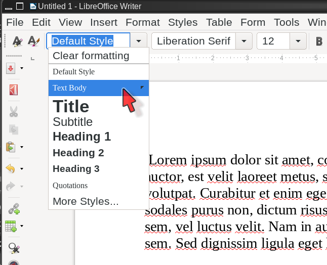
Most of the time, you simply put your cursor in the paragraph you want to change. Then, click on the paragraph style you want from either the drop down menu (in LibreOffice Writer and Google Docs) or the ribbon (in MS Office). Your word processor will automatically apply the formatting information to the entire paragraph. There is no need to highlight the entire paragraph when you apply a style — by default paragraph styles affect the entire paragraph.
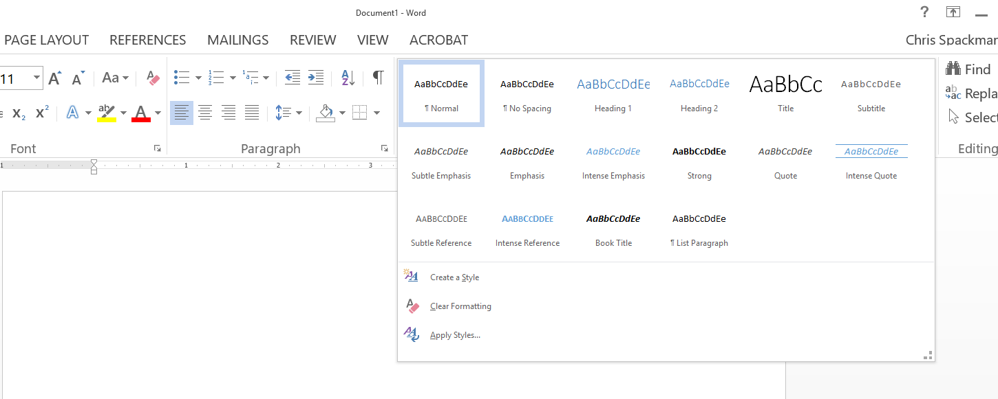
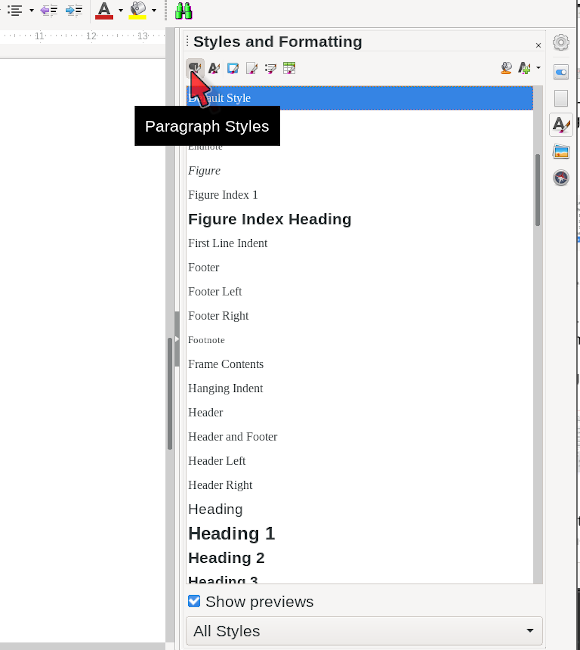
In MS Office, you may have to expand the styles menu to find the style you want because most are hidden. Weirdly, MS Word mixes paragraph and character styles in the same area. Google only offers a few, and most are visible from the drop down. LibreOffice Writer has, perhaps, the most styles; the most common and all applied styles (those in use in the current document) are shown in the drop down menu.
To change the formatting of a style, you can right click on it in the drop down menu in LibreOffice Writer and select . In Google Docs, you click the arrow to the right of the style name in the drop down menu, then select . In MS Office, you can right click on the style icon in the ribbon and select, … wait for it, … . Each brings up a pop up menu with all the options for formatting paragraphs, including tabs, spacing, font, etc. Google Docs has the fewest options. LibreOffice and MS Office have similar options.
If your software allows it, set the default paragraph settings in normal units (such as points, centimeters, and lines), and then set the rest in percentages. This allows you to change font sizes for the entire document with just one or two changes to the default settings. For example, if you set the default font to 12-point Times New Roman, then the Title font to 120% and the Heading 1 font to 110%, then you only need to change the default font, and the font sizes for the rest of the document will automatically resize to match.
I personally find LibreOffice more logical and consistent, but I have also been using it for about 20 years.71 If you have been using MS Office for 20 years, you have my deepest sympathies. And, you also probably think that MS Office paragraph settings make more sense than those in LibreOffice. (Often, “intuitiveness” in software is a function of how long you have been using the software.)
Anyhow, back to styles. Using styles to change the formatting of paragraphs is much better than individually formatting each paragraph in a document (or using the default style for everything) because you can quickly make changes to the entire document just by updating the appropriate styles.72 If you have a new student who needs a different font style or size (maybe for sight-impaired or English learner students), you can change every body paragraph with one style change. Most typical classroom documents can be updated with entirely different formatting after two or three quick style updates (title, text body, and first-line indent paragraphs, usually). If you formatted paragraphs by hand, it could take considerably longer.
A basic rule of thumb is that if your document is more than one page, it is better to use paragraph styles. If it is just one page, you can probably make any changes just as quickly without bothering with styles.
The exception to that rule of thumb, though, is when you have headings or sections (they are basically the same thing). Many teachers just manually add bold formatting to the section titles (aka the headings). They may also manually change the font. A sighted student can see that the paragraph text is bold with a bit more space around it. That student can literally see that it is a header. They probably understand the meaning. But, a screen reader cannot.73 Screen readers can understand bold, but they cannot draw conclusions about a paragraph based on the formatting. Instead, we need to use styles to tell the screen reader “this is a heading”.
Styles do the formatting better anyhow, but more importantly, your word processor can use the section information to automagically create a table of contents and add bookmarks, so that students can easily jump directly to the section they need. Both of these features — table of contents and bookmarks — are bonus for mainstream students but may be very important for some students with special needs. And this is in addition to the information given by the header itself that “this is a heading”.
Be sure to learn how your preferred word processor does styles. MS Word and LibreOffice Writer handle them in different ways. MS Word, for example, will happily create a new style for you almost every time you make any changes to a style or even to a paragraph. If you are not careful, you can end up with almost every paragraph being its own style. LibreOffice Writer, in my opinion, handles styles much better, by requiring you to explicitly create a new style when you want one. That isn’t very often, however, because LibreOffice Writer comes with more than 50 styles by default. Google Docs does not allow for new styles and only has about 10 generic ones. With Google Docs, you may have to re-purpose an unused style (like “heading 4”) for a different one that they don’t offer (such as “works cited”).
Pro Tip: Spacing Within and Between Paragraphs
This one is maybe a pet-peeve of mine, but only if you can use the term “pet peeve” for actually consequential things.74
There are two types of spacing: between paragraphs (added before and / or after a paragraph) and between the lines in a paragraph (known as “line spacing”).75 These are independent of each other.
Please do not use the key to add space between paragraphs. Instead, either modify the paragraph directly (if just one or two) or modify the paragraph style to have space above and below it. This is also how you remove extra space. For example, APA formatting requires no extra space between paragraphs. MS Word used to (and may still) default to having 10pt of extra space below regular text paragraphs. Even with double line spacing (also an APA requirement), this extra space is easy to see, if you are aware of these things.76 To get rid of it, you have to modify the default paragraph style and set the space below paragraph to zero.
Using styles to control spacing between paragraphs gives you much better control over things like document length. Do you have two or three lines going to the third page, and you want to get it all on just two pages? With a full empty line between each paragraph, you can just remove a few of those and bring the widows back home. 77 But, now you have some paragraphs with no space between them and others with space between them.78
Instead, use paragraph styles to slightly decrease the amount of space between paragraphs — say from 10pt above and below to 7pt above and below. Depending on the number of paragraphs, this small tweak may be enough to bring the orphaned lines back to page two. Chances are good no one (except me) would even notice the difference in the spacing.
All of this is true also for line spacing within paragraphs. If double spaced is two long, but you want as much space between lines (in the same paragraph) as possible, try tweaking line spacing down. Maybe from “double” to “proportional” at 190% or 180%. Again, depending on how many lines of text you have, you might save a lot of space without losing too much space between any two lines.
Paragraph styles make this sort of fine-grained tweaking easy to do to your entire document, quickly, no matter how long it is.
Finally, just like there are non-breaking spaces,79 there are non-paragraph-ending line breaks.80 Basically, any time you want text on a new line, but don’t want to start a new paragraph, you want a non-breaking line break, if that makes sense.81 The new line is treated as if it is part of the current paragraph, and not a new paragraph. In Google Docs and LibreOffice, you do this with . In spreadsheets or other software it might be .
Character Styles
“Character styles” are also a thing. They format text that is not by itself a paragraph. Think things like italic or bold or underlined text, Internet links, etc. Character styles are not as useful as paragraph styles unless you are doing a bigger project. For example, often titles and non-English words are both formatted in italics. If you just use the italics formatting button or the generic “emphasis” character style, there is no way to distinguish the two types of italics. But, if you plan ahead and use different character styles for each, you can have one for titles of books, journals, tv shows, etc. and another for non-English words. Then, if you need to change something — for example, maybe a publisher wants book titles in bold and not in italics — you can change that character style without affecting the non-English words style. If you actually have a need such as this, then trust me (I’m speaking from personal experience), character styles are much, much easier than trying to go through 100 pages and change every title by hand, for example. Honestly, character styles can be good to know about, but most teachers won’t need to use them.
That said, there is one time teachers should consider character styles: URLs (web links).82 Printed handouts that have off-gray URLs underlined in the text can seem clunky or ugly. The links are probably off-gray when printed out because the word processor made the link text blue, and then underlined it, because that is traditionally how links on web sites were formatted. When printed on paper, in black and white, the blue link text came out off-gray.
How are blue (or off-gray), underlined links useful on a printed page?83 They can be distracting. So, consider removing that formatting. You don’t have to, of course, but consider how and where you and your students will use the document. If you decide to remove the formatting, use the “Internet link” character style to remove the blue color and the underlining, and maybe also change the link text to a different font. If I plan to make a document available digitally, perhaps as a PDF (and thus, the readers might click on a link), I usually change the link font to a sans or monospace font that is similar to the main font. For school documents that I will only print, I make the link text the same color as the main text, and remove other special formatting, such as underlining. If I will just print the document and give it to students, I format the links the same as the rest of the text, unless there is some need for the students to distinguish the link. Either of these can be done with a quick change of the “Internet Link” character style — make the changes and they are automatically applied to all of the links in the document.
Astute readers will notice that I have colored links in this document, and that I did not change the link font. I tried several things, but I like the font I am using for this book, and I did not like how it looked with sans text inserted here and there for the links. Further, this book is probably equally likely to be read on a device or printed and read. So, it was important to make the links visible for those reading it on a device. Finally, with one or two exceptions, there aren’t that many links on any one page, so gray-ish text on printed documents shouldn’t be too distracting. Point is, I thought about my options, tried some combinations, and decided on what I thought worked best for this document.
Note: unless you are sure you will never need them, you should leave links in documents — just change the style to match the rest of the text. No distracting formatting, but you still have the links in the digital versions, if you need them. However, as I mentioned above, if you need students to recognize and maybe click on the links in a digital version (and why wouldn’t you?), then you should make the font different enough that links are easily recognizable. Recognizable and clickable links are also important for accessibility.
As with the 1-page rule of thumb for documents, if you have only 1 or 2 links in your document, changing them by hand is fine. If you have more links, you probably want to change the URL / link character style. The usual benefit also applies — if you ever need to make a change, you can update all the links just be updating the style.
LibreOffice Writer and MS Word have character styles. If Google Docs has it, I’ve not been able to find it.
Find and Replace
I’m surprised at how often I meet people who don’t know about, or know about but don’t use, “find and replace”. It is very helpful! Just go to and make a lot of changes quickly. A common, embarrassing, error is using something from the previous school year (for example, maybe a student handbook or course syllabus), and just replacing “2018” with “2019” as you go. Of course, once you print 200 copies of it, you find a “2018” that you missed. probably would have caught all of them.
A very common example with students (at least at high school) is fixing an academic paper where the student used contractions. We can easily change all the places the student used “n’t” (from “didn’t”, “won’t”, etc.) into “not” (that is, a space and then “not”).84
Another common situation is that students frequently have multiple spaces between words. Quickly replace every occurrence of “” (two spaces) with “” (one space). No problem! I use these with high school students many, many times every year.
If your word processor supports it, multi-line find and replace is awesome! You can easily fix issues with formatting or paragraph spacing with it. Find, for example, two paragraph returns in a row (meaning, a blank line between two paragraphs) and replace it with a single paragraph return. This is another common need when checking high school students’ papers. Unfortunately, not every word processor supports multi-line find and replace. LibreOffice can do it with an extension. I’ve not found a way to do it with Google Docs, and I’m not sure if MS Word supports it.
This is a bit of an aside, but find and replace is a great example of another issue with technology today — people like to say that young people are “digital natives”, but often times young people don’t know how to use fairly vanilla, standard features such as find and replace (and styles and tabs, and so on …). At least in high school, most students aren’t familiar with these things even though as we saw above, they sometimes have need for them. Like we talked about with “the best tool for the job”, though, people don’t know that they don’t know. I’ve seen students use the space bar to center text and I’ve seen them go through 4-page papers and hand change each instance of a contraction or of two spaces. To be honest, when I show them find and replace, they generally aren’t “wow’ed” by it. I’d like to hope, though, they remember it the next time they are trying to fix their papers at the last minute.
Templates
Templates let you quickly create a new document with most of the specific settings you need ready to go.85 Many people just re-use existing documents, which is not necessarily bad, but there are some dangers. The biggest danger of re-using old documents (instead of using a template) is that previous information may still be in the “new” document. Depending on the document, this could include student grades or other sensitive information. Using a template avoids this by always starting with a fresh document that has all the formatting and maybe some text already set up but none of the information from other documents.
First, you need to create the templates. Create a new file and set up the formatting and any standard information — for example, a worksheet might always include space for the student’s name, the date, the class period, or a point score, as well as generic directions for completing the worksheet. You can also set up the paragraph styles and, if you need them, the character styles — I usually just set the URL link style to match the regular text style.
Usually, to convert a document into a template, you just do and choose “template” as the file type. Or, there may be a straight option. After that, when you need a new document, just go to .
If you create a lot of the same sort of documents, templates can be a huge time saver. I have templates set up for:
short readings — a page or two, just one page style (yes, page styles are also a thing), no page header, simple page numbering, etc.
longer readings — booklets with a cover and left and right page styles, page header, appropriate page numbering, headings, maybe a table of contents, etc.
worksheets, guided notes, exit tickets, and the such
quizzes and tests
common letters home (in a few languages)
MLA and APA documents (with appropriate headings, pages, styles, etc.)
I also have templates set up for many of the other types of files we will talk about, including images (PNG, JPG) at various sizes, desktop publishing files, SVG files, text files, and a few others.
Because templates allow you to quickly create a new document with a lot of repetitive information already filled in, they can often mean the difference between getting something done quickly right now and leaving something for later (and maybe never getting to it).
Pretty much all word processors support templates. You’d have a harder time finding one that didn’t.
Fonts
Be aware of the fonts you are using. There is a fair amount of research into good font choices, but what fonts are best for teachers to use depends on the grade level, the age, and the literacy level of the students.
Sans Serif
Sans Serif fonts do not have “serifs” or adornments on the letters. Arial is perhaps the most widely used sans serif font. Sans serif fonts are good for younger and less experienced readers, who are usually reading short lines with fewer, shorter, words. The simple letter shapes are easier for these learners to recognize. For older and more experienced readers, sans serif fonts are better for headings, checklists, etc.
I put the above paragraph in all sans. How was it to read? Most people find sans less easy to read for long passages. For experienced readers, sans serif fonts are not good for things longer than a short sentence.86 For these readers, sentences and paragraphs should be in a serif font.
Serif
Serif fonts have adornments (called, as you probably guessed, “serifs”) on the letters. Times New Roman is probably the most common, if not the most well-liked serif font. The idea is that the serifs help the eye move from one letter and one word to the next. This is important for older, more experienced readers, who are reading passages that have 50 to as many as 100 or more characters per line and many lines of text per page.87 Look at the text of this book, or any other regular book (not children’s book, picture book, coffee-table book, art book, etc.) that you have. It is probably in a serif font almost exclusively, except for maybe chapter titles or other headings.
Special Fonts
Other font types are more specialized — there are handwriting and literacy fonts, for example, that help students more easily recognize the letters. If you have taught any English Learners (or younger learners), you may have had them ask about the weird “a” and “g” shapes in some fonts.88 Handwriting and literacy fonts help students avoid issues like that until they get more experience with the language or with literacy in general. Also, teachers of beginning readers and writers may need a 3-lined or 4-lined font that shows where, or even how, to write each letter.
There are also special fonts available for dyslexic learners, though teachers may not need them regularly. Research suggests that these fonts may not actually be useful.89 You might ask your Intervention Specialists / Special Education colleagues about them. To the best of my knowledge, we do not use any special fonts for dyslexic or other struggling readers at my school.
There are free versions of many special fonts but your school may already have some, that may be higher quality than the free versions.
Special Characters
Not all fonts have all the possible characters, but most have many many more than most people use.90 We won’t get into Unicode and support for CJK and other Asian text here, though.91 Instead, we are going to talk about some useful characters that you can use with English language text. Specifically, we will talk about em dashes, en dashes, arrows, and non-breaking spaces. Depending on your content, you might have some special characters that you are already familiar with.
- The em dash
is a dash that is as wide as a capital letter M in the font you are using. It looks like this: — . It is used in text — often like this, or instead of parentheses (because not everyone likes parentheses). Don’t use a hyphen.
- The en dash
is a dash that is as wide as a capital letter N in the font you are using.92 It is used between numbers or groups of numbers, such as dates (Sept. 5–8), page ranges (pages 132–158), or phone numbers (867–5309). Depending on the font, you might have a different – for negative numbers (−1) or for subtraction (5 − 3). If the font you are using does not have these, then the – en dash is the dash to use. Don’t use a hyphen.
- Arrows
can be very useful on worksheets, posters, tests, etc. even when just inline as text (that is, not graphical arrows going halfway across a page to draw attention to something — those are not characters, those are graphics).
Most fonts have many types of arrows available.
I like to use arrows to draw attention to examples or hints in worksheets.93
Often better than a generic bullet point. ⋅ ← like that.
- Non-breaking spaces
are so much fun.94[section:special-characters:non-breaking-spaces] If you only use one of the special character types I introduce here, please use the non-breaking space. Why? Because they can help keep important information together on the same line. They basically do exactly what the name says; they are spaces that will not allow the words before and after it to be separated at the end of a line. For example, dates (13 August 2021), titles (Mr. Anderson, Dr. Jones), and numbers (5 apples, iPhone 12) can all be kept together. A common issue I see is history docs that look like the below.95
blah blah blah blah blah blah blah blah blah in World War
II blah blah blah blah.Ouch, that just hurts! A non-breaking space would have helped a lot. The non-breaking space is shown as below.
blah blah blah blah blah blah blah blah blah in World
War II blah blah blah blah.Similarly, I’ve seen letters home to parents that have this:
blah blah blah blah blah blah blah blah blah blah contact Mr.
Jones blah blah blah blah.To me, that screams out “we didn’t check this letter”. Again, the non-breaking space fixes the issue:
blah blah blah blah blah blah blah blah blah blah contact
Mr. Jones blah blah blah blah.
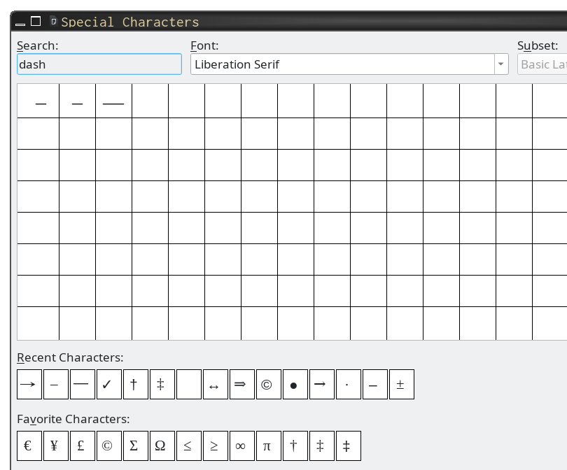
Where do we find these characters, so that we can add them to our documents? Usually, we go to .96 This should bring up a window with options to choose the font and narrow the type of character you are looking for by “subset” of the available characters.97 Examples include extended alphabets (äccèntéd letters and the such), math symbols, spacing, punctuation, arrows, and so on. Narrowing the search like this can help you find what you need much more quickly — there are a lot of characters to choose from. An even faster way is to type in the search box, if one is available. Searching for “dash” should narrow the choices down to just a few, for example, as in figure 2.14.
Lines and Underlines
We have one last thing to look at before we “put it all together”. When teachers make tests, quizzes, worksheets, etc., they often need to create lines / underlined space for students to write in answers.
In word processors, it is often easiest and cleanest to make blank lines (for students to write answers on) by setting a right-aligned tab at the end of the line and then filling in underscores until you get as far left as you need.98 This way works well because it allows you to have sentence starters or other words on the line but still have each line end at the same place. For example, something like this:
If you just use left-justified paragraphs, with no right-tab, your lines won’t end neatly on the right. With a right-tab, though, the underscores will line up neatly on the right, even if you have other characters on the line. Also, if you right-justify the entire line or paragraph, the text won’t line up neatly on the left side. A left-justified line with a right-justified tab stop works best, in my experience.
Some people like to use underlined spaces or underlined tabs for the lines for students to write on. That can be okay, but I’m not a fan. Mostly this is because the tabbing for that can interfere with your use of tabs for formatting. Further, we have a perfectly fine underscore character, so why not use it?
Another way to get a line in a word processor is to put a bottom border on the paragraph. Then, just press return a few times to get several lines for students to write on. This is a great way to do it, if you are familiar with paragraph formatting and paragraph styles. However, because the line extends the entire text width, regardless of any text you add, borders are not the best method if you plan on putting in sentence starters, punctuation, or any other text in the answer area. If you have a sentence starter, you can use underscores on that line, and then borders for the following totally blank lines.
Paragraph borders are universally great,100 however, for putting a box around a paragraph — such as a word bank, score / points area, etc. In LO Writer, you can edit the paragraph style or just the paragraph on the “Borders” tab. I create a “word box” style for this. In Google Docs, go to and to easily set the borders and a background color, if you like. But, you might have to fight with Google Docs if you want more than one line. In that case, you might need to use . (LO Writer has an option for in the tab. Turn that off to get borders on each new line, and not just the last one. Google Docs should have this option, but doesn’t, which is why we have to fall back on using the horizontal line.
WP: Putting It All Together
We’ve looked at tabs, styles, templates, fonts, and a few other things. I’ve mentioned some uses of each of these, but now let’s put them together to see how they can help.
How, for example, can we use these in our daily work? Let’s start with templates. If you make quizzes or tests (and who doesn’t?), start by setting up a template that has all the usual information — title, date, points, directions, maybe some blank questions. Next, set up styles, including any tabs needed for formatting answers to multiple choice questions, or blank lines for writing answers to essay or short answer questions.
Once you have everything set up as you need, save the template. Next time you need a new quiz, test, or whatever, use the template, and you are halfway done with the new document. Usually, you go to and choose the template you want. Make one template for each type of document you make frequently (test, exit ticket, guided notes, etc.), and you are all set. It may take a little while to get these set up, but every time after that, you will save some time that you used to spend setting up the formatting.
For documents that you already have, there is no need to make time-consuming changes now.102 If it is worth your time, update documents as you use them, maybe a few each year. After a few years, all your documents (that would benefit from it) will be using styles, tabs, and other features of word processors.
Next, we will look at some non-text objects in word processors. Namely, images. A few images in a word processing document are not a problem. A lot might be.
Images in WP Documents
Okay, so maybe you only have a few pictures in your document — maybe images on a history test, or a couple of pictures of the characters from the book you are reading, on an English handout. Can’t you still use a word processor for this?
Yes, you can. In fact, you could use a word processor for that yearbook I keep mentioning. It isn’t that you can’t do it, it is often just that some other software would let you do it more easily or just better (or, most likely, both). Luckily, if we only have a few pictures, we can use a word processor, no problem. Here are a few tips for mixing pictures and word processors more successfully.
First, learn how your preferred word processor anchors the picture. Anchoring is sort of exactly what it sounds like.103 Just like a real anchor holds a ship in place, the word processing anchor holds the picture in place on the page. But, unlike (I think?) a real nautical anchor, the word processing anchor has some options to tell the software how you want the picture to behave on the page. For example, is this an image that should be right here and only here and always here? That is, even if you add a lot more text or add another image, should this picture not move at all?104 Letterhead images are a common example of this. In this case, you want the picture anchored “to the page”.
Or, is this a picture that needs to stay with this paragraph? If you add more text before this picture (maybe on a previous page), and the paragraph moves, should the picture move with it? This is common on worksheets or tests when the image is needed for understanding the paragraph or answering the question.105 In this case, you want the picture anchored “to the paragraph”.
Finally, what if you are making an enhanced reading for a young reader or a low-level ESOL student, and you are putting in small images directly into the sentence?106 Maybe you have a picture of a dog after the text “dog” or “Spot”, to help the reader understand.107 You need the picture to move with the text; if “Spot” moves on the line for some reason, the picture of Spot should move with it. In this case, you want the picture anchored “as a character”.
Word processors may have different ways of talking about this, but they should all use some form of “anchor”, “to page”, “to paragraph”, and “as character”. Usually, right clicking on the picture will bring up a menu with as an option, and a sub-menu with the , , , and .
Modifying Images
(We’ll get much deeper into modifying images in Graphics Software on page . Here, we will talk about images in word processor documents.)
What happens when you want to make changes to images in your document? Many word processors include software to do this — you can just right-click on the image and choose something like “edit” or “properties” and then “crop” or the such.108
If you just have one or two images and are only making small changes, the software included with your word processor is probably just fine. However, if you have a few more images, or you need to make big changes, consider using proper image manipulation software to make the changes. Then, once the images are ready, insert them into your document.
It is usually a good idea to keep an original — make a copy of it, edit the copy, and put that into your document.109 Once pictures are in the document, you may not be able to change them externally any more. To check this, right click on the image. If you see something like “Edit with External Tool”, then you can edit externally — click that to open the image in your system’s default image editor (hopefully not MS Paint). When you finish editing and save, the image in the document will be automagically updated with the new version. As you can see in the screenshot (Figure [fig:edit-in-external-program] on page ), LibreOffice Writer can do this. MS Word should be able to. Google Docs cannot.
There are two other options to get access to an image in a document:
Save … As you can see in Figure [fig:edit-in-external-program], LibreOffice Writer also has an option to save the image. This is very handy if you want to get the picture to use somewhere else. Or if you are using Google Docs and cannot edit the image in a file, you can download the file, open in LibreOffice, save the image, edit, and then re-insert it into the Google Doc. It actually isn’t as bad as it sounds. Assuming no problems, you should be able get an image from a Google Doc in about a minute or so.
This is a less good option (so, usually you will want to use the first one, above), but it can be very helpful when you need to get several pictures / images / graphics out of a word processing document. As we talk about later, modern word processor documents are zip files.110 So, if you need to get more than one or two images, you can rename the extension from “docx” or “odt” to “zip” and then open the file. Inside the zip file, you should see a folder with a name like “images” or “media” or “graphics” — it should be pretty self-explanatory. All the pictures in the document are in that folder. Unfortunately, they do not have descriptive names, so you will have to look at each one and maybe rename them by hand. If you are getting more than one or two images, though, it may still be faster than opening the document in LibreOffice Writer and saving each one individually.
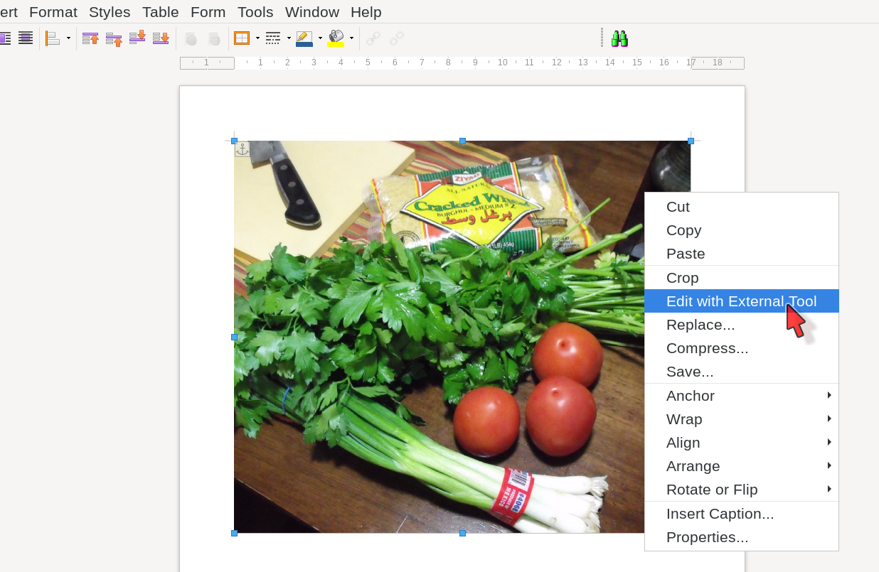
Pro Tip: Image Size
Be aware of the size of the images you include in documents. Photos from your smart phone or a camera, for example, could easily be several megabytes is size and take up the equivalent of a letter-sized page or two. Usually, there is no need for something that big to be in a word processing document. Even if you need a full-page photo or other graphic in your document, you can probably scale the image down a lot before inserting it into the document.
Mostly this is just to save disk space (not always necessary these days), but it is also to save on memory when you are working on the document, or when you are working on an image remotely (like on Google Docs or other online service) and your Internet connection is not great. It might also be important if you have an older machine with less memory. Finally, you might not be able to email a document with several large pictures, because Gmail and other email services do not allow attachments larger than about 25 megabytes.111 A typical smart phone photo can easily by 4 or 5 megabytes, so a document with several of these may be too large.
BTW, see the section on desktop publishing and DPI for more information on scaling images down.112 We’re getting to that soon, but in a nutshell, a typical letter-size image at 300 DPI (more than good enough for most printing) is about 2550 x 3300 pixels in size. My phone takes pictures that are a bit more than 3000x4000 and are about 4 megabytes. These pictures would be too big even for full-page use. If I just needed a quarter of a page for the picture, I would probably scale them down by at least one-half. They would still have plenty of quality left for printing.
Note that “scale down” does not mean “insert the picture, then drag a corner to make it smaller”. That makes the dispayed picture smaller, but does not reduce the total size of the picture. In other words, if you insert a 5 MB picture, it is still 5 MB whether it is diplayed at full size, or at the size of a postage stamp. To scale it down, we need to use external software and change the picture size itself.
I use both the powerful, but unfortunately named, “GNU Image Manipulation Program” (usually called “GIMP”) and the newer and excellent “Krita” programs for image manipulation. Both are Free / Open Source Software and both should run on MS Windows, MacOS, and Linux. Resizing an image in GIMP is as simple as opening it, choosing and then changing it to the size you want.113 A few minutes spent cropping and then resizing an image (and maybe adding or improving labels) can make a big difference in how it looks when added to a worksheet, quiz, etc.
Image manipulation can be important for worksheets and tests and the such, but it is often even more important for posters and other graphics-heavy materials.
Online Documents
In the spring of 2020, teachers around the world moved to what I like to call “emergency online lesson delivery”. Online schools and schools that were already 1–1 probably fared better than traditional schools that suddenly found themselves trying, overnight, to switch to online teaching. Students, too, had to try to make the transition to online learning. In the USA, at least, many districts struggled and many students fell behind, at best.
We don’t need to get into all of that here, except as an introduction to our topic: what are some of the big differences between in-person materials and digital / online word processor materials?
More than when in-person, we need to consider our students’ situation. If they are accessing our content on Chromebooks or other notebook-type computers — which these days pretty much universally have wide screens — why are we using portrait-oriented documents? Especially if they will never print this document, why are we using letter-sized, portrait-oriented “paper” with 1-inch margins and 12-point fonts?114
Many students might be fine with 12-pt font on their screen. Others will quickly go to (if they know about it) to get a size that they can comfortably read. Eyesight and ease of access is an important consideration. Another is the wasted space and needless scrolling. Take a look at all the wasted space on the left and right sides of the document when you view it with 12-point font and 1-inch margins on a typical Chromebook screen. Why aren’t we using that space?
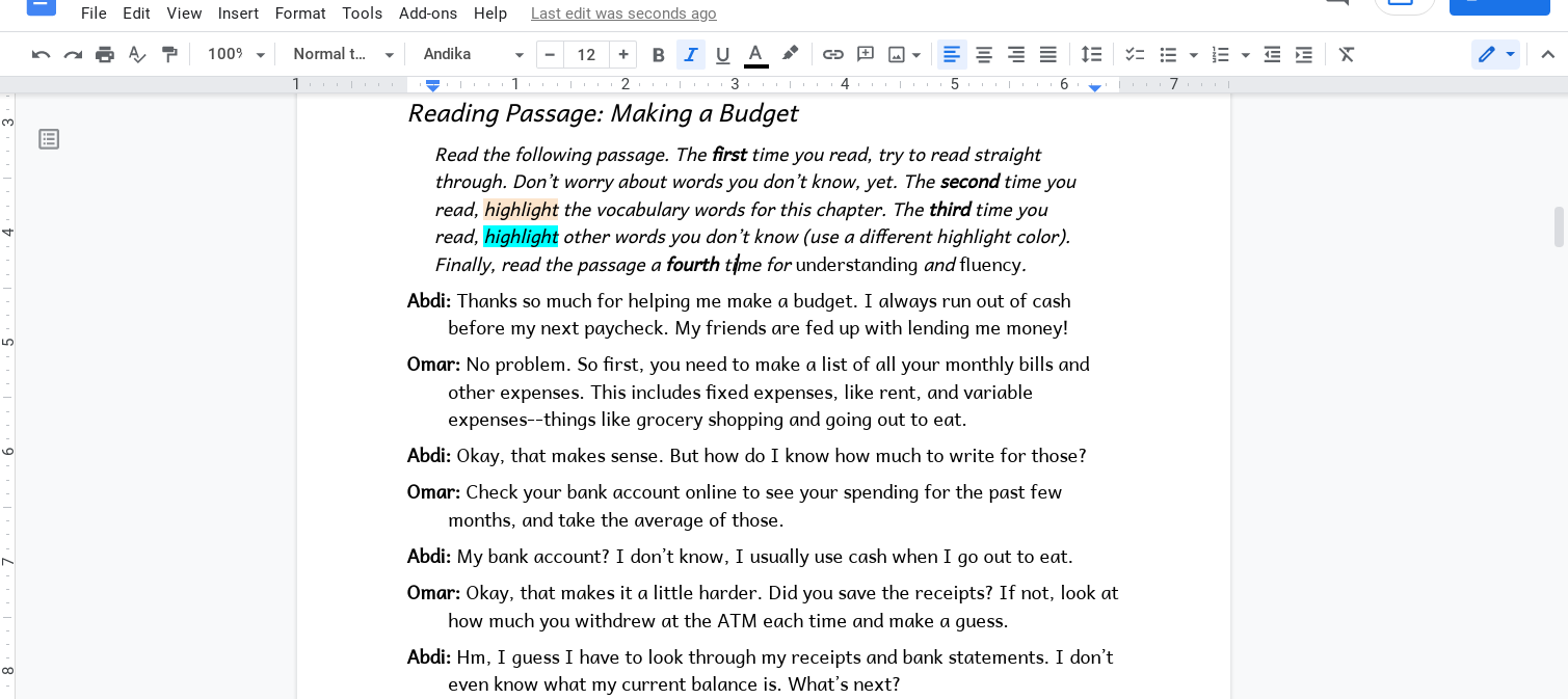
Why not at least make the margins smaller and the font larger? Better yet, why not turn the “paper” to landscape? That gives us room to either use two columns (better use of space) or an even bigger font and some margin notes on the side?115
I used these settings to make Google Doc documents for my students to read and interact with:
B5 paper, landscape orientation (very close to 1 page on screen at a time)
17- or 18-point font
0.5-inch margins on the top, left, and right
0.25-inch margins on the bottom
page numbers at top right, same font size as the rest of the document
1.25 line spacing
either 6pt or 12pt of space above and below paragraphs (depending how set off I wanted the paragraph)
With these settings, using Andika font, each line had about 75 characters per line. That is in line with what most of my students can handle. I tried a smaller font (about 15-point, IIRC) with 2 columns, but Google Docs can be really annoying with sections (which are added when you make columns), so I went back to no columns and a bigger font.116
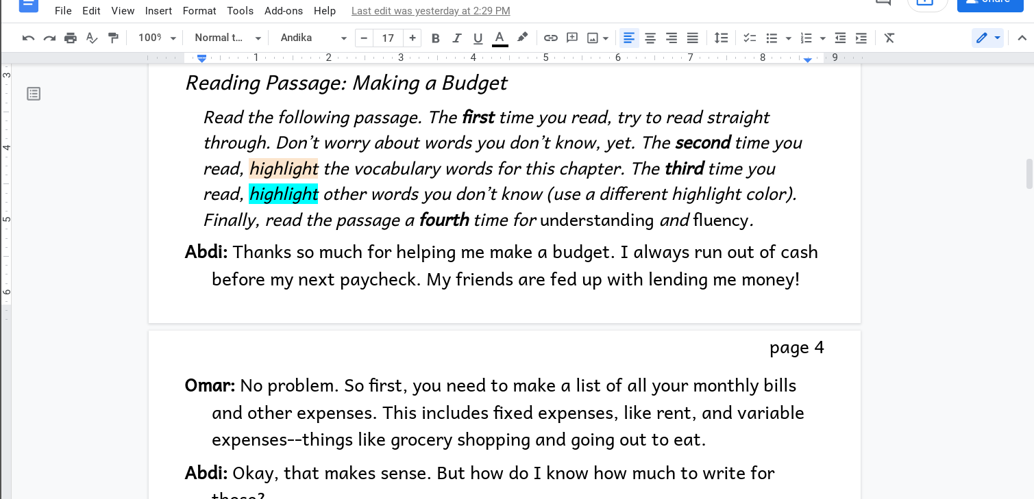
I hope figures [fig:paper-to-digital-not-using-the-space] and [fig:paper-to-digital-use-the-space] give you an idea how much more comfortable to read and interact with the modified version can be. And also, how unfriendly the traditional formatting can be, on the screen. Although many schools and districts are no longer in all-online mode, we can still think about our documents and how students interact with them. My schools are now 1–1, so going forward, I’m going to have some documents formatted for reading on the screen, and others formatted for printing, when we need it. One size does not need to fit all.
Note: it may look like there is a lot of extra space, even in figure [fig:paper-to-digital-use-the-space], the one with the modified layout. But, my browser window in that screenshot is about 1600 pixels wide and 900 pixels tall.117 That window alone is probably bigger than most Chromebooks that students have, which is probably closer to 1366 by 768. The point is that on a student’s Chromebook, the text would fill up more of the window, and there would be less space on the left and right sides.118
Some readers may be thinking that we are practically turning the document into slides. We are, sort of. Presentation slides are meant to be easy to see from anywhere in the room. We’re making it easier for the student to read comfortably. Slides are made to match the screen — wider than they are tall, unlike a (portrait-oriented) piece of paper. We’re also trying to match the screen, to use the space we have.
So, why don’t we just switch to slides for these documents? Fair question. Depending on what you need to do, slides may be a better option. If you have a lot of text, though, Google Docs or other word processor is probably still the best option.
When are slides a better option? Let’s look at them next.
Presentation Software
To be honest, I don’t use presentation software very often.119 I don’t have much to say about them, so this will be a short chapter. It borders on laconic. But, please see Translating Slides for details on the difficulty of translating presentation slides.120
The 6x6 Rule
I mentioned the 6x6 rule earlier, but that is for slides when presenting / lecturing to a group.121 It is not necessarily applicable to slides students will work on on their own computers. If you have 20 lines per slide, with 60–90 characters per line, though, you probably don’t want slides.
The rest of this chapter will deal with using slides with students in more creative / less traditional ways.
Slides Not for Lecturing
Anyhow, we mentioned (on page ) several web sites and software packages you can use to make presentation slides.122 Many teachers use MS PowerPoint or Google Slides to make slides for instruction / lecturing (of course), and also for interactive work with students.
Slides have some advantages over word processors, especially when you aren’t planning on printing a document. Depending on what you need, slides might be the best tool. Aside from the usual slides for presenting / lecturing (which I’m not going to get into), slides can be the best tool when you want students to do work on something that has some text, images, and especially movement to it, but doesn’t need paragraphs of text.123 For example, the teacher might set up a document of slides with places for students to add information and objects for them to move. I am doing a poor job of explaining it, so:
think of things you could do with realia or other materials on a tabletop. You can probably do those with slides.
go check out three sites that have lots of examples and more information:
Mrs. Esther Park’s site at MrsPark.org124 and
SlidesMania, especially their Education section and the By Teachers, For Teachers archive.
slidesgo.com (freemium with a paid tier, not my favorite, but they do have lots of free templates)125
Obviously, slide software and word processing software have very different features. Obvious, perhaps, but I mention this because some things that are easy in a word processor are much harder to do in slide software. For example, almost all the features we talked about in the last chapter — styles, tab stops, and the such. Modifying all the text in a set of slides quickly and easily can be difficult126. Currently, translating a Google Doc is easy.127 Translating Google Slides is much, much less easy. In fact, translating slides in one language into slides in another language is very labor intensive.
Google Slides, at least, don’t exactly have styles, but they do have themes. Themes allow you to change the default text settings quickly, but they are not as powerful as styles. Still, they can be helpful.
To start, go to .128 Slides will switch to theme edit mode. The “Theme” slide at the top left lets you easily change the text properties for most paragraphs.129 If you want to move default text boxes around, or add text or image boxes (or anything else), you can do it from the other slides (under “Layouts”) below the “Theme” slide.
Figure 3.3 (on page ) shows the title style selected and ready to be modified. Just change the settings as you normally would, and then, when you are finished, click the close “x” on the bar just above the main slide (far right side, in line with the “Rename” option).
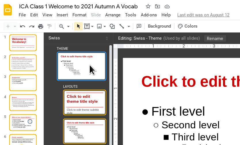
Slides are sort of half way between word processors and desktop publishing software (DTP). Like DTP, slides use text boxes and picture frames. They do not use the typewriter metaphor, so you cannot just start typing on a slide without first selecting a text frame.
Unlike DTP, but more like word processors, with slide software we usually don’t need or want pixel-level control over where text or images are placed. We just drag a text box to where we want it and then treat the inside of that box like a page in a word processor.130
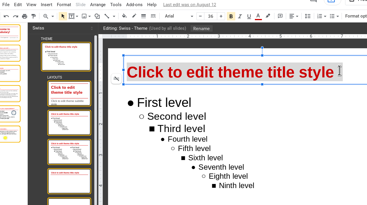
One great use of slides is as a simple web page of sorts. We put text and shapes in the slide with links to other slides or to external resources. If you (and your IT department) are okay with using add-ons and adding scripts, slides can become full-fledged interactive “web sites”.131 For examples of this, see the excellent Mrs. Esther Park’s site and the always amazing SlidesMania.com.
As always,, consider your audience. I work with high school students in person, and currently, adult ESOL learners online. I could use a much more complicated “web site” made from slides with the in-person students, if I wanted to, because I can easily support them, and because I know they have a decent amount of experience with technology. Online, with adults, I do not use more complicated slides — some terms, all the students have tech experience, but many terms they don’t, and I never know until class starts how many students will struggle with technology and how many won’t. For the adults, I have large buttons, only a few buttons per slide, and very little decoration that might confuse a non-tech-comfortable student.
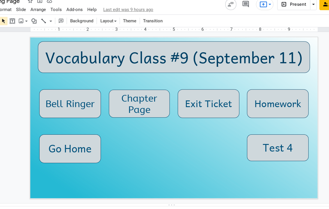
Technical Details
Please do consider your students’ screens as well. You can change the size of slides, just like you do the size of paper in a word processor. In Google Slides, go to and choose between standard, widescreen, or custom. There are currently two widescreen options, 16:9 and 16:10, but if you don’t know the exact ratio of your student’s screens, either is probably fine.132 Standard is closer to the old television (non-widescreen) ratio. That might be good if your classroom projector has an older size like 800x600 (aka 4:3, like it says in the screenshot).
We will get more into this is the next chapter, but if you want to make a background (very common, very useful) for slides, the dimensions in pixels are below.133 The sizes will change if you are not using 16:9 ratio. This will only matter significantly if you are using 4:3 ratio. If students are viewing on a regular computer (that is, not a phone or some super-high-end device), 100 dpi is just fine.
- Google Slides
defaults to 960x540 pixels (16:9 widescreen)
- Google Jamboard
(which we haven’t talked about much yet) defaults to 1,422x800 (again, 16:9 ratio)
In the next chapter, we will talk about how to make images to use as backgrounds for slides, and several other uses for, and features of, graphics software.
Graphics Software
Here are a few reasons teachers might want to do some light graphics editing:
resize an image to better fit into a document or on a slide
crop an image to get rid of unnecessary content and help focus on more important content
add labels to pictures, charts, maps, or other graphics
add transparency or transformations to an image that will be included in another document or image
create an image to use as a background, especially on presentation slides or on “whiteboards” such as Google Jamboard.
For any project that fits the above, graphics software is almost always the best tool for that job. In fact, some, like transparency, you probably can’t even do with most DTP software.134
When a project does not fit simply into the above, the biggest factors, for me, when choosing between graphics software and DTP software is:
new? — creating something new, or modifying something that already exists?;
mixing elements? — combining text and pictures?;
the number of pages — graphics don’t usually have pages;
the amount of text — graphics is better when there is less text;135
the final format — usually with graphics you will save as a PNG or JPG file. DTP projects will often end up as PDF files.
Let’s look at these by going back to our “make a poster” scenario. The poster could include items with all of the elements in the first list.
resized images: yes
cropped images: yes
labels / text: yes
transparency or transformations: probably / maybe
slide background: depends, but probably not if a poster
But, is the poster itself any of those things? More likely, it contains elements that have those things. You put a picture that has transparency into the poster. You add a label or a caption to one of the images but maybe not all the images.
For the second list, things are a bit more straight forward:
new: yes
mixing: yes (adding several pictures, several text elements)
pages: 1, so either DTP or graphics software is okay.
text: if more than just a title, DTP is probably better.
format: whether in-school printing, or for professional printing (for bigger page sizes), a PDF is going to be the better format. If the “poster” is intended for email display, though, a PNG would be better.
If you are mixing several different elements together (text and graphics, mostly) to create something new, DTP is probably better. If you are adding a label to an already existing map, or removing some unnecessary labels or other elements from that map, then graphics software is probably better.136
See figure [fig:wp-graphics-dtp-venn] on page for more information on choosing between word processors, graphics software, and DTP software.
As you may have noticed, even if you are using DTP to make a poster, you will probably use graphics software to prepare many of the images before you put them into the poster.
Okay, enough hopefully-not-too-confusing talk. Let’s look at what you can do with graphics software.
Graphics Software Features
There are several features of graphics software that I use almost every time I need to do something to a graphic.
- crop
— removes parts of the image on the outside, leaving just the selected region. Cropping an image resizes it to the new, selected size and removes everything outside of the selected region.
- resize
— changes the size of the “canvas” without changing the original contents. Think of it like changing the paper size in a word processor. If you change from letter to A4, the text does not automagically change size to fill up the new page (although the text might reflow). Resize is useful if you have an image that you want to add some some more content into and need to make space for the new content. As noted above, you also resize when you crop an image.137
- scale
— this changes the size of the canvas and modifies the content to fill it. It is sort of like “zooming” an image in or out. The difference is that zoom only affects how the image is displayed on your screen. Scaling changes the image, making it actually bigger or smaller. With most image formats scaling will impact quality. How much it affects quality depends on how big the picture was to begin with and how much you scaled it.
- text
— add text to the image. For me, if I am just adding some text to individual images (like the labels on maps or charts that I keep mentioning), then graphics software is the best tool. If I need to add a lot of text and maybe some arrows or other shapes, I will switch to Inkscape, and export the completed file to a new image.
- transformations
— includes things like rotating, skewing, or flipping the image.
- transparency
— makes part of the image “see through”. Honestly, I cringe when I see slides (for example) with a non-transparent image on a non-white background. Recently, I saw a math test with a non-transparent image that partly obscured some text. That could have confused students.
Of course, all graphics software — even the much maligned MS Paint — can do much, much more than this. The above are just the ones that I, as a teacher, use most often. Occasionally, I need layers or color correction tools, but not every day.
Let’s look at the above features in more detail.
Crop
I see a lot of images in presentation slides where the author used the built in “crop” feature to hide parts of the images. This is not wrong, necessarily, but I prefer to save it for minor tweaking after using The GIMP or Krita to crop most of the unnecessary sections out. The main reason, for me, is smaller file size.
Another reason, which will only be an issue after it becomes a big problem, is if you are cropping out students who should not be included.138 If you just hide them with presentation software tools, the students are still there. If someone can download the file, the students’ faces are still there.139
As figure [fig:cropping-example-with-arrows] (page ) shows, to crop an image you …
open the image you want to crop (a screenshot of my desktop, in this example);
you choose the crop tool and then the area you want to keep;140
and finally, you click inside the selection (when using GIMP, as I am here).
Everything outside of the selection is removed. Then, the image is automagically resized down to the new (cropped) size.
Cropping: The Making of The Image
To put together figure [fig:cropping-example-with-arrows], I first took the screenshots.141 Next, I used GIMP to crop the images (of course, as that is sort of the entire point of this section!) and put them together into one bigger image. Then, I used Inkscape to add arrows and the numbers. I could have done that in GIMP, but I prefer Inkscape for anything even remotely text related.
I could also have used Inkscape to put the separate screenshot images together into one bigger image. But, that was not necessary here — I was just lining them up, not doing anything complicated that might have been easier (for me) to do in Inkscape. I already had them open in GIMP, so putting them together was only a few more steps.
To put images together, first create a new image big enough to hold the images you are putting in. Next, choose one of the images, go to , and then .142 This copies the entire image to the clipboard, ready to paste where we need it. And that is exactly what we do next. We switch to the new / composite image and then use . Repeat this process for the other two images. You now have a composite image with 4 layers — the original background layer and the 3 new layers (the screenshot images) that you pasted in. Finally, we use the tool to put them where you want them.143
Resize
Sometimes you have an image and need a little bit more space, perhaps to add a label without covering up part of the main image, or to paste in another image (and you don’t want the new image completely on top of the existing image). This is when you want to resize your image.
When you resize, consider three things:
how big you want the resized image to be
where you want the existing content to be placed on the resized image
what do you want in the background of the new area
I tend to err on the bigger side when resizing, to give myself room to work. When I’m finished doing whatever I need to do, I crop the extra area out. Unless I have specific needs that I can use to calculate a good size, I start with about double the size of the existing graphic. Don’t go overboard though, unless you have a lot of memory in your computer.144 GIMP will give you warning if you resize the canvas to something that will use a lot of memory. The warning doesn’t mean you can’t do it, but be aware it may affect the responsiveness of your computer.
Where you want the existing content depends on what you are doing. Centering it seems good, but think first about what need. If you are adding labels all around the existing image, then center may be the best.145 Are you adding a title at the top? Then, yeah, add the space at the top. You get the idea. Of course, the bigger you make the canvas, the more space you have to work with, and the less important where you put the original is.
When you resize the canvas, the new area can be any color, or transparent (or other things, but don’t worry about those right now). I generally go with transparent unless I know that for whatever reason some color (usually white) would be better. If you end up exporting to JPG, the transparent areas will turn out white.146
In GIMP, resizing is in , because that is exactly what you are doing — changing the size of the canvas.147
You can usually use any unit you want for the new size — I like to use inches if I am making a graphic to put into a document that I will print out. I use pixels if it is something for displaying on a computer screen. (When working on elements inside of an image, though, I might use centimeters or millimeters instead of inches because those are smaller than inches; I have a better idea of what 3cm is than I do what 1.181102 inches is.)148
Generally speaking if you are resizing a document, you want the new size to be bigger than the original size. If you only want some of the content, you probably want to crop (page ) it instead. If you want a smaller size and all of the content, you probably want to scale (page ) instead.
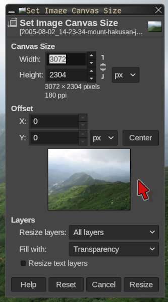
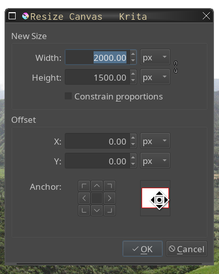
Pro Tip: Resize Before Rotating
If you are rotating an image, you probably want to resize the canvas first so that every part of the image stays on the canvas after being rotated. With rectangular images, it is common for the corners, for example, to end up off of the canvas after being rotated.149 If you copied and pasted an image into another, larger image then this may not be an issue. If you are aware of it though, you won’t be surprised if it does happen, and you will know how to avoid or fix the issue.
Scale
Scale resizes the image and the content to a new size. For maps, charts, and the such (especially when included in a test), I often crop the unnecessary parts of an image (including often the title) and then scale the remaining important parts. That makes it easier for students to see on the document, without taking up more space on the document.150
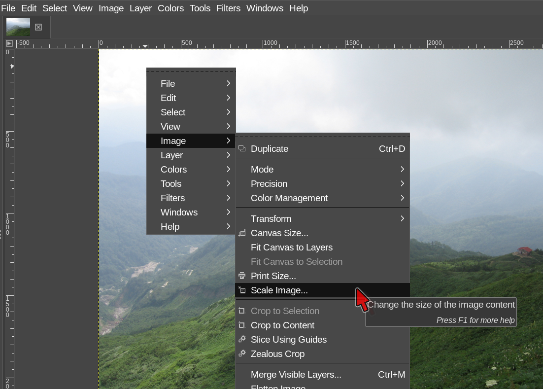
Likely, many teachers are familiar with scaling. When you drag an image bigger or smaller in a word processor and presentation software, that is scaling. The same content is taking up more or less space. The only difference (that we care about here, at least) is that when we scale in graphics software, it is probably because we want to do something else with that graphic as well. If you are just putting an image into a document and need it a little bigger or a little smaller, than you can drag it bigger or smaller in the document.151
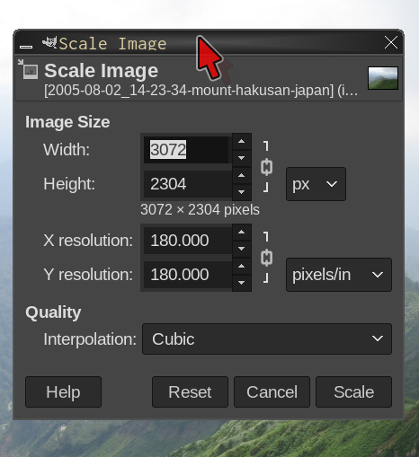
There really isn’t much to consider when scaling — only how bigger do you need to make the image. But, do consider that making a small image a lot bigger will hurt the quality of the image. With most phone camera pictures these days that will probably not matter. With many graphics that you find online or that are otherwise not from a modern camera, you may have to be careful. A couple of times each year I have to find or make a replacement graphic because the one that I was given was too small.
If you don’t mind a little math, you can figure that an 8.5 x 11 piece of paper on a computer screen at about 100 dpi is about 800 pixels by 1100 pixels. Say that you have a map, with text on it, that is 300 x 200 pixels. That might look okay-ish on the screen as is — about 3 inches by 2 inches. The text on that map is going to be pretty small, though. If you scale the map to be about the width of a (letter-sized) document page — generally 6.5 inches (650 pixels) wide — that map itself might look acceptable, but the text is probably not going to be very legible at all. A lot depends on that original size, and in this map example we have taken a fairly small graphic and scaled it to twice its original size.


Legibility is not the only issues with scaling text. Accessibility is another. Screen readers (and, for the moment at least, Google Translate) cannot “see” text in images. Keep this in mind when you add text to images.152
Font legibility in graphics at various sizes is another reason I like to use Inkscape. Inkscape files can scale up or down with no loss of quality. Also, Inkscape can export to PDF files with actual text, so accessibility (screen readers and the such) is not as much of a concern.153 We look at Inkscape in a lot more depth on page . For educator’s needs, Inkscape is sort of part graphics software and part desktop publishing software. Speaking of text and graphics software …
Text
We covered this above, and if you need a lot of text (like paragraphs), I would not recommend using graphics software. But, if you just need to add some labels, or a title, then graphics software may be the best tool.
Considering our discussion above, about legibility and accessibility, I suggest adding text only after you have made any other changes that you need to the graphic.154 Scale it, crop it, rotate it, and then add the text. This ensures that the text will be as legible as possible.
Adding text is pretty easy — select the text tool and click on where you want it in the image. In GIMP, a text entry box will pop up, similar to what you might use in a browser window. You can change fonts and font sizes; make text bold, italics, etc.; change the direction and justification of the text; and so on.
As I’ve said a few times, please do realize that once you export (or overwrite) an image that has text, that text is now pixels, not actual text.155 JPG, PNG, GIF, and other image files have no understanding of text, only pixels and color and the such. If PDF is okay for your final format, it can be better to use Inkscape to add text — Inkscape can as text-searchable PDF.
Transformations
“Transformation” is the term for changing the orientation or location of an object. Technically (as I understand it), moving an object counts as “transforming” it.156 Anyhow, the transformations we are talking about here are things like rotating, skewing, and flipping.
Rotating is hopefully pretty “intuitive”. It is also perhaps the transformation (with “moving”) most applicable to the poster metaphor.157 We do it all the time with real-world paper-based posters — put down an image and then move it around, rotate it a bit, see how it looks.
I should point out here that so far, for cropping, resizing, and scaling, we have talked only about doing it to the entire image. You can also do them to layers or selections. We don’t really get into that here.158 However, if you ever need to scale or crop a layer (for example), it is possible, and you do it the same way as when you are changing the entire image.
I mention this because in GIMP, there are transformation tools under and , and .159 Where you look depends on what you are working on. The first two are fairly clear — they work on the entire image and the entire layer, respectively. Look in those menus for whole-image or whole-layer transformations.
Actually, some of the most common transformations — such as scaling and resizing — are not in the sub-menu because they are so frequently used. They are in or . So, if you are looking for something, check a menu level up and down.
has several more tools that the other menus don’t, and some (like Perspective and 3D Transform) are a lot of fun to play with. These tools work on the selection.160 If you haven’t manually selected anything, then it should default to the entire image. If you try a transformation and nothing happens, try and try again.
Pro Tip: Keep Originals; Make Backups
If you do even light editing on a file, consider keeping an original as backup, and, if possible, also saving the file in your software’s default format. For example, GIMP uses XCF format. Even if you are editing a JPG or PNG file, you can save the work you do in XCF format and then export to JPG or PNG when you are finished. If you are doing significant editing, or especially if you are adding features that the export format does not support (like JPG and transparency), you will want the XCF file (for example) to make changes later with all the original information. For example, if you only have the exported JPG, you will not have the transparency information any more.
Of course, “make backups” is not great advice only when you are editing images. It is really, really, great advice every day for everything in your digital life. See the section Backups on page , in the chapter Advanced Topics, for more information.
Transparency
Transparency is great for images going into slides or onto non-white paper. Often the background of clip art or other images going into something else is white, because the creators assumed white paper or background (or they exported the image to JPG, which does not support transparency). If we want to put an image like that on to slides (or our oft-mentioned poster) with a non-white background, we need to remove that white background.
to add transparency.161 You won’t see an obvious change until you delete something and can see the background layer (which is now transparent).
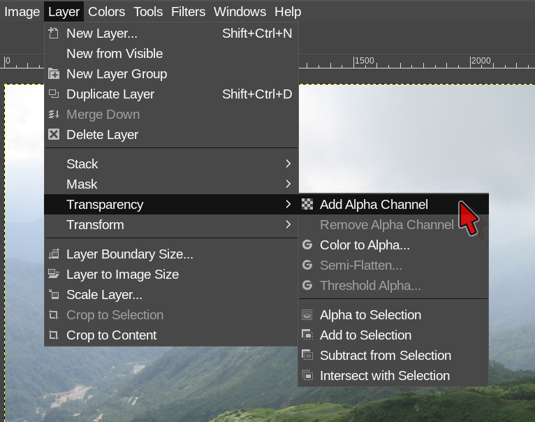
Next, use a selection tool (like the contiguous color tool or hand select tool) to choose the area to remove — that is, the area that should become transparent.
Finally, press or “cut” the selection.162 and you should see a gray checkerboard pattern (or whatever your software uses to show transparency), showing that the area is now transparent.
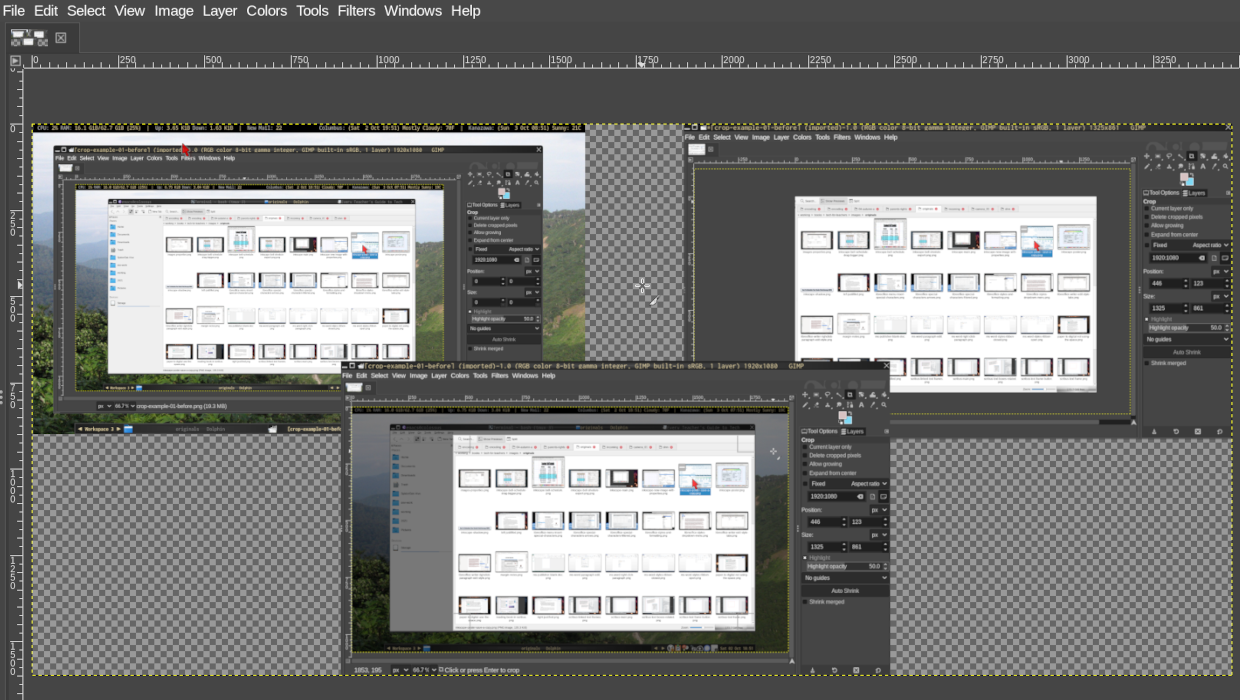
Pro Tip: JPG Transparency
Although JPG files cannot have transparency, it is possible to use transparency while working with the image in graphics software. That is, elements inside of the image can be made transparent, to allow elements below them to be seen. But, when you export the image, the transparency gets “flattened” and, in effect, the color of the transparent element becomes the color of the thing below it.163 Any transparent elements with nothing below them become white.
The most common (though not all that common) use for me is something like glasses on a character’s face. You want the lenses to be transparent to show their eyes, but you might also want a little color or distortion so you can tell there are lenses there (and not just empty frames). You can do this in GIMP or Krita (and probably other software). If you export to JPG, the image should look like you intended, but the actual transparency information will be lost. If you need to edit the file later, you will need the original non-JPG file.
Other Graphics Software
I’ve talked a lot about GIMP and a bit about Krita in this chapter. That is because those are the ones I use the most. I don’t use Adobe Photoshop or other proprietary products for a few reasons. First, they historically haven’t run on Linux systems, so even if I wanted to, I couldn’t.164 Second, they have historically been more expensive than I could afford. Third, I am not willing to pirate software (as sooo many casual Photoshop users seem to do). Finally, every Linux system I have ever used has come with GIMP (and later Krita) by default and for free. I am not a graphics professional, so I had no compelling reason to use any “professional” level software, and several reasons not to. So, why not use GIMP (or Krita)? I think the same logic may apply for many educators — unless you are teaching a graphics design class, you probably don’t need any of the features that professional level software has that GIMP or Krita may not have.
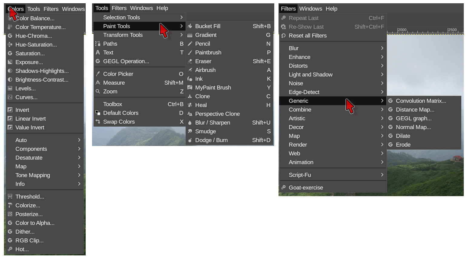
I don’t use Google Drawings for very different reasons. I don’t use it very often because it rarely does everything I need it to do. Also, I rarely have the images I’m working on saved to my Google Drive account — why bother uploading something just to edit it and then download it?165
Further, Google Drawings is actually a bit like software for making that poster we keep talking about. It assumes you are going to insert some images, add some text, maybe make a few simple edits. Great if that is what you want to do.
Although I rarely need the more advanced options, I would rather get used to GIMP and then, when I do need something more advanced, it is available. With Google Drawings, if you need something more advanced, you probably won’t have it. Figures 4.12 (page ) and 4.13 (page ) make the differences pretty obvious.
If you just need a few simple options of the sort that Google Drawings can handle, and if you keep a lot of your graphics in Google Drive, than you can probably get by with Google Drawings. Here is how to do the things we talked about in this chapter.
select an image and use . It doesn’t actually remove the “cropped” content until you download the image. If you share the Google Drawings through Google Drive, other people may be able to see the cropped content.166
do this through , and choose “custom” to make a canvas a specific size.
drag the handles at the sides and corners of the image. By default, Drawings will keep the aspect ratio.167 Use (“Left Mouse Button”) to scale in only one direction (vertically or horizontally depending on the handle you use) without keeping the aspect ratio. I’m told that will allow scaling in both directions without keeping aspect ration, but I use that combo for moving windows, so can’t confirm.
use , then click and drag to draw the box on your canvas. Personally, I turn off “autofit”, but it can have its uses. See Text Boxes on page for more information on text boxes. Note that you can have “invisible” text boxes on your canvas if you insert one but don’t add text. Click in the area until it gets highlighted again. If you have trouble editing, try double clicking to enter text editing mode inside the text box.
go to and then from the sidebar menu. No skew, Perspective, or 3D Transform that I can find.
go to and then from the sidebar menu. Transparency can only be applied to images. You can add transparency to shapes — — by setting a custom background color. Go to and choose “Custom” from the popup color chooser. Below the color box is “Hue” and “Transparency”. Text box transparency works the same way. Text cannot (that I can find) be made transparent.
New Google Drawings drawings start with full transparency by default. You probably only have to worry about losing / not having it if you 1) export to JPG [as we’ve discussed a few times] or 2) insert an image that doesn’t have transparency.
For most of what I do, Google Drawings would probably be okay. But, I’ve been using GIMP for literally decades.168 So, I can do everything I need to more easily and more quickly in GIMP. If you don’t need advanced features, and you have been using Google Drawings, then, stay with it if you are happy with it. Maybe play with GIMP or Krita a bit when you have time. That way when you need a more advanced feature, you can jump over to GIMP (or Krita) and do what you need to do.
Finally, I have totally ignored LibreOffice Draw in this chapter. The reason is simple: I’ve never used it. Like GIMP, LO Draw is included with Linux installs by default, but like I said, I have decades of experience with GIMP. Also, I don’t use LO Writer or other word processors for more complex documents that have lots of graphics — documents that don’t fit the typewriter metaphor.169 If I’m working in Scribus (page or Inkscape (page ), I’m not going to open LibreOffice (a full office suite) to work on a graphic — I’ll go straight to GIMP. So, in short, it’s a me thing, not an LO Draw thing.
Desktop Publishing
I used posters as an example of something you don’t want to make with a word processor. What should you use? You will want page layout or desktop publishing software — these two are basically the same thing, for our purposes. I’m going to use “desktop publishing software” (usually abbreviated to DTP software).
What are the main differences between DTP software and word processors? Pretty much everything you can imagine from the difference between the poster metaphor and the typewriter metaphor: the difference between pasting items onto poster board and typing a paper.
DTP software requires you to place text on the page in “boxes” (also called “frames”) and, outside of text boxes, it doesn’t have the ideas of lines or line returns. Same with pictures — you can put any image or graphic or chart or whatever anywhere on the page. With DTP software, you control exactly where everything goes on the page170. Almost anything you can do with a cut-out picture or piece of text on a poster board, you can do with text and image boxes in DTP software. You can rotate, skew, add borders, round corners, add columns, add drop caps, and so on. I hope you can already see why DTP software is better than word processing software for making things like posters.
Maybe you are saying “but my word processor can do text boxes and things like rotating images”. My reply to that is the never popular “yes, but”. Yes, many or even most word processors have some DTP features. But, you are still fighting the metaphor — the software is still treating the page like a piece of paper in a typewriter. Sure, if you are just putting a few pictures into a document, then it might not matter. But if you are making something with lots of pictures or that otherwise doesn’t follow the typewriter metaphor, why fight the software and deal with the inevitable annoyances when you could just use the right tool for the job?
DTP Software
Okay, so DTP software is great for things like posters that don’t fit the word processor typewriter metaphor, but what software should you use? Do you have it already or do you need to get it somewhere? Good questions! For MS Windows users, popular options are MS Publisher, Adobe InDesign, and QuarkXPress. Your school might already have MS Publisher, if they got it included with an MS Office purchase.
In my opinion, MS Publisher is beginner-level DTP software; professionals don’t use it. That’s not bad, necessarily. After all, we probably aren’t going to become professional DTP users anyhow! Professionals do use InDesign, QuarkXPress, and some others. Most k-12 schools probably don’t have the professional level stuff — it is expensive, and usually overkill at the k-12 level. If you do have it, great! Lucky you. If you don’t, no worries! The beginner level stuff is fine.
Piracy, however, is not fine.171 The professional level software is widely pirated. If your neighbor is an average Joe / Jane and has InDesign, they probably didn’t pay for it. No judgment, but I don’t listen to people who say “ABC is better than XYZ, so you should use ABC!” when ABC is very expensive and XYZ is free or something that your school was able to afford. For educators, especially k-12 educators, free is much more important than pro-level. Most people (not just educators) barely use a fraction of the features of any of the software they use — to be honest, the stuff we talked about in the word processor, presentation, and graphics software chapters is only scratching the surface of what those programs can do, and yet most people don’t even use those features!172 Telling people to pirate, or to pay hundreds of dollars for, software that is much more powerful than they need is not okay.
I say all of this as an introduction to the next program I’m going to talk about — like GIMP and Krita, it is not software that most people have heard of. Some professionals use it, but as I understand it, only a small minority. I recommend it because it is free, it is multilingual, and it is open source.173 And, of course, because it gets the job done.
Scribus
I prefer to use Scribus for DTP. Scribus is open-source / free software. It is not super easy to use, but that is true of all DTP software — more because the concepts are new to most people, not because DTP software is needlessly difficult (it really isn’t!). I’ve said it before, and I’ll say it again: learning the general concepts is better than learning the steps (of how to do something) with specific software. I’ve been using Scribus for years, and when I recently had to use MS Publisher to work on some files with coworkers, I was able to use it easily, because I understood what I was doing. The concepts (text boxes, linking text, image properties, exporting, etc.) didn’t change; how I accomplished them did. The hardest part was finding where menu items were in the new software.
Scribus is great for posters, anything with complex layout (like a brochure), documents with several pages of text with many images or graphics, as well as documents with many pages of pictures with some text — such as yearbooks. I make graduation booklets with Scribus.174 I also use it to make textbooks for adult English Learner classes at the local community college. The first is a lot of pages, a lot of pictures, not much text, and some page layout, so DTP software such as Scribus is perfect. The second (the textbooks) are full books with many pages, many graphics, lots of text, and some layout. Again, DTP software is perfect. You could use a word processor for these two things, but you would be fighting the metaphor. The process would be more painful, and most likely the final product would not be as good.
If you are doing one-page worksheets or posters, and these have lots of complicated formatting and/or graphics, there is another option: Inkscape. We’ll look at that next, and then dive a bit deeper into DTP “concepts”.
Inkscape
Inkscape is actually more of a graphics program and less of a DTP program. But, for educators making worksheets, Inkscape and DTP software both fall in the overlapping area of the Venn diagram; both will work just fine. And, for many worksheets, either is better than using a word processor.
Inkscape uses a different file format than Scribus or other DTP software. The format is called “SVG”, which stands for “scalable vector graphics”. Usually, I emphasize the “scalable” part — with SVG files, you can make one file and print it as a postage stamp and as a poster with the same quality! Don’t try that with a JPG file.
However, here we are more interested in using Inkscape as a sort-of “DTP lite”. It can do many of the things that regular DTP software can do, but it isn’t as complicated and is a lot easier to use. If you are familiar with both DTP software (such as Scribus) and Inkscape, you can still probably get a simple worksheet or graphic done more quickly in Inkscape than you could in DTP software.
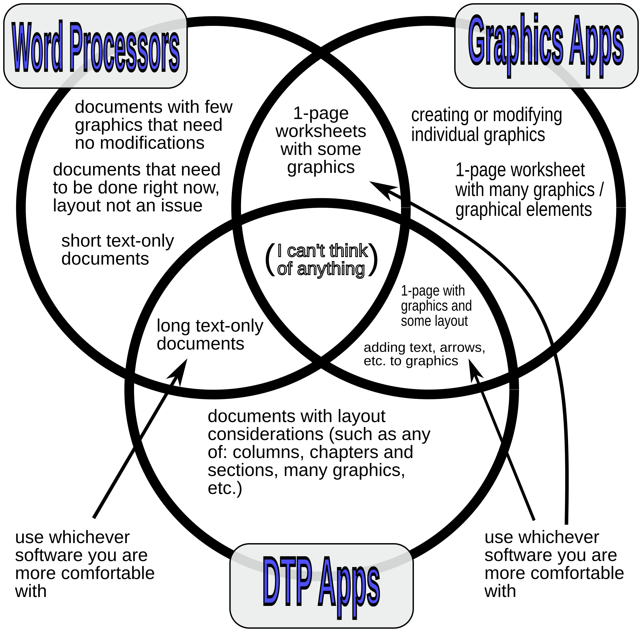
Figure [fig:wp-graphics-dtp-venn] on page gives an idea of what you can do with word processors (such as MS Word, LibreOffice, or Google Documents), graphics programs (such as Inkscape, Photoshop, Krita, LibreOffice Draw, or Google Drawings) and Desktop Publishing software (DTP — such as Scribus or MS Publisher). In the 3-circle Venn diagram, “graphics” refers to anything that is likely to end up in JPG, PNG, or similar format. That would include actual pictures, scans of paper (of whatever content), graphs, figures, diagrams, maps, etc. Figure [fig:wp-graphics-dtp-venn] is itself a “graphic”.
I made Figure [fig:wp-graphics-dtp-venn] in Inkscape. Because there are no pictures and no complex text layout needs, something like Scribus would have been more than I needed. Scribus still would have been better than a word processor for this figure. If you were used to Scribus and not so familiar with Inkscape (or other graphics programs), then Scribus would have been the best tool for you for this job.175 If you had some time and wanted to start learning Inkscape, then a Venn Diagram like this would be a good place to start.
Why is a word processor not the best tool for this job? Think about the metaphors. Are we making something more similar to a page that would come from a typewriter, or more like a poster with elements pasted here and there on the paper? Figure [fig:wp-graphics-dtp-venn] does have a fair amount of text, but it is placed here and there over the page. The text is not going margin-to-margin in paragraphs. Also, the text is in and around the graphical elements (the Venn circles). So, much more like a poster and not at all like something you would do in a typewriter. The poster metaphor is closer to what we are doing, so something like graphics software or DTP sofware is your best option. Yes, you could do this in a word processor, but it would not be as easy and your final product would probably not be as good.176
The Concepts
I have mentioned DTP “concepts” several times, and I’ve mentioned a few, such as text boxes, picture boxes, linking text, and graphics properties. Let’s take a look at these, so you can get up and going with DTP software quickly, whichever software you end up using.
Text Boxes
Text boxes are pretty straight-forward. In DTP, you don’t put text directly on to the page. Instead, you insert a text box and then put the text into that box.177 You can move the box around and resize it to get the text exactly how you want it and where you want it on the page. For most documents, you would have several text boxes on a page — if you only have one text box, you might be better off with a word processor, unless you have lots of graphics.
For example, for a heavily differentiated reading,178 you might have one text box on the left side of the page with the original content, maybe slightly modified. On the right side of the page, you might have several text boxes with explanations, definitions, translations, math formulae, or whatever else makes sense for your differentiation needs. Because you can move each text box individually, you can place each box wherever it can best support your students’ reading of the main text. If you modify the main text, you can move or delete some text boxes without causing any issues with other text boxes.179
Longer documents, such as readings, brochures, and school newspapers, might have text that needs to go across pages. Or, you might have pictures or other graphics interrupting the text. This is where you use “linking”.180
A box on page 1 might link to a box on page 15. Any text that overflows the box on page 1 automagically appears on page 15. More generally, any text that overflows the first box will automagically continue in the second box, wherever it is. The second box could even be linked to a third (fourth, fifth, etc.) box.181 Figure 5.3 on page shows a very simple example of linked text boxes.
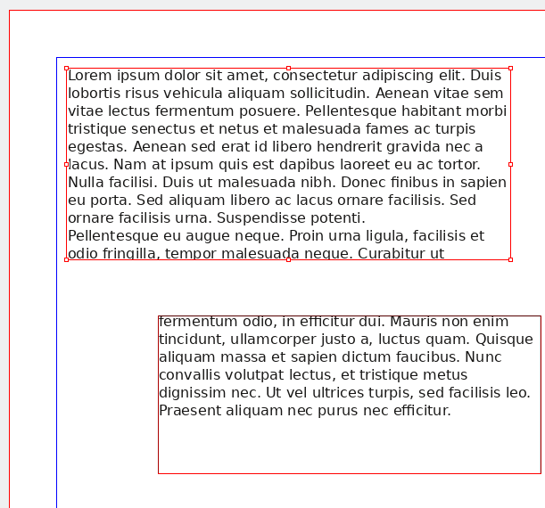
Picture Boxes
I confess, I’ve been using the terms “image”, “picture”, and “graphics” sort of interchangeably. Basically they are, especially for our needs. They all mean something that is not text. With DTP software, these are usually JPG, PNG, or similar image files. Usually, they are kept separate from the DTP file while you work on the document. That is, they are shown in the document while you work on it, but when you save it, the images may be saved separately.182 When you export, though, the graphics files are merged in to the final document.
Picture, or image, boxes are how you add pictures to a DTP document. They have many features in common with text boxes. You can resize them, move them around, add a border, round the corners, and so on. You often have extra features also, such as adding effects to the images, or opening the image in an external program to edit.
One important detail in image boxes is “dots per inch” or “DPI”. DPI is especially important if you print, because low DPI looks bad when printed.183 Your computer monitor probably has about 100 dots per inch.[subsection:picture-boxes:dpi] Your smartphone’s screen might have around 220 dots per inch. A typical personal printer will often default to 300 and can easily do 600 DPI or higher. A paperback novel might have been printed at 1200 DPI. So, if you are resizing pictures in a document, keep an eye on the DPI for the image. For school work, 300 PDI is more than enough, unless you have a map or graph or such that you expect students to read the text on.184 If that is the case, you should probably have at least 300 DPI. Usually, it is enough just to check the final exported file to be sure the text on graphics is legible. If it isn’t, then you might need to find or make a graphic with better DPI.
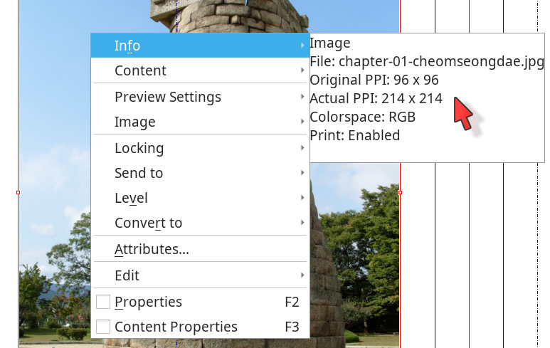
Scribus, and other DTP software, will warn you when you export if a picture is below a certain DPI.
Wait, did he say “export”?
Exporting
Think of “exporting” as “save as” for your finished document. I mentioned earlier that image files may not be actually included in your DTP file, and there are good reasons for doing this. But, when you are done, or when you want to see how the finished document will look in other software (such as PDF viewing software), you will need to export your document. This is when the software will put all the separate pieces together and make the final, usually unchangeable, document.185
One consequence of exporting is that you often cannot just send the DTP software file to someone else to look at. Scribus documents, for example, are SLA files and do not include any images. Instead, they contain information on where to find the image files. So, if you send someone the .sla file, they can open it with Scribus, but they won’t see the images unless you also send those. This is normal for many non-word-processor files. A student one time sent me a “video” she made that was 17 kilobytes, which is very really too small for a video. Sure enough, it wasn’t the actual video, it was the MS Movie Maker file (she was using that software to edit the video). The file only had the information that MS Movie Maker used to show and edit the final video. Until she exported her video, there was no final edited version of her video. The same is the case for DTP software.
End result here: if you are sending a DTP file to someone to check, you probably want to export it first. And, when you are all finished, you will certainly want to export it. Usually, people export to “portable document format” or PDF. You’ve probably heard of it. PDF is great because it looks the same on any computer, and more importantly, it will print the same on any printer.
Pro Tip: Send a PDF file
When you send a document to someone, send a PDF. Only send the DTP or word processing document if you want the recipient to make changes. PDFs look the same everywhere, are basically a standard, and are universally understood. The only disadvantage of PDFs is that the page size is fixed (because that is one reason they look the same everywhere). Looking at a PDF on a smart phone screen can be a nightmare. Other than that, though, there are no drawbacks to PDF when sending documents that don’t need to be edited.
Differences Between Scribus and Inkscape
As we said, Scribus and Inkscape can both be used to make single page documents. But, because they come at the job from different specialties — DTP for Scribus, and SVG documents for Inkscape — there are a few differences that impact how you do some things.
The biggest difference is that Inkscape basically doesn’t understand pages.186 Think about most image formats you are familiar with (JPG, PNG, GIF, maybe a few others) — how many have “pages”? None, right?187 So, don’t try to use Inkscape to make a yearbook. However, because many worksheets, fliers, posters, etc. are single page documents, you may find that you use Inkscape more than you use Scribus. I use Inkscape a couple of times a month, at least, during the school year. I usually only need Scribus at the end of the year, when I make the diplomas and the graduation booklet.188
The second biggest difference is probably that Inkscape doesn’t use text boxes, exactly. Usually, it treats text as an object, like a picture or a shape. The nice thing is that in Inkscape, you can drag a text object and the font size will increase to fill the space.189 To make a title that goes all the way across the page, for example, you can add the text, click on the box to get the handles, and drag one to fill the width of the page. You can’t do that in Scribus. Scribus will happily give you a bigger text box when you drag the handle, but it won’t change the content of the box at all, except to wrap the text as the length of the lines changes. Scribus assumes you will go back later and add more text, or that you already have a bunch of text in the box and are making it bigger to show more of that text.
Because Inkscape doesn’t have traditional text boxes, you can easily change the text attributes (color, fill, outline, etc.) by changing the object properties.190 But, you don’t actually want . Instead, you want . In Scribus, you make changes like this by changing the text (paragraph and character) styles.191
Another consequence of Inkscape’s more graphics-oriented focus is that if you want a border around your text, you need to put in a shaped box below the text and then use “ to set up the colors, line thickness, transparency, etc. for that box. In Scribus, these are all part of the properties for the text box. In Scribus, as I mentioned above, you have to format the text separately from the text box.
My advice to novices is: if you need single page things like worksheets with lots of graphics, fliers, or posters, use Inkscape. It is a sort of mid-point between true graphics programs and true DTP programs.192 The bonus is that because it uses SVG format, you can export to almost any size and get a good quality image. It can also export to PDF.
DTP: Putting It All Together
Now that we understand the concepts, lets look at how we can use DTP software concepts to create common classroom teacher documents. We already touched on posters and briefly on modified readings. Let’s look at a schedule and a flier next. We’ll use Inkscape for these because they are single page documents. You could use true DTP software like Scribus, if you wanted. How you did things would be a bit different, but almost all the concepts would be entirely the same.
A Bell Schedule
People who use MS Word or other word processors to make bell schedules make a few sub-optimal choices. First, they used a word processor for something that is better done in graphics or desktop publishing software. Yes, a bell schedule is mostly text, but it is columns of text, not paragraphs.
Second, and more importantly, they don’t use all the space. If I’m putting something up on a wall for students to see, I want them to be able to see it from a few feet away, not just from three inches away. A 12-point font is great — if you are holding the page right in front of your face.193 One-inch margins are great if you are planning to write comments in them. Both of these are less great for something going on your wall.
Third, teachers often don’t line up the times vertically, meaning that 9:00 and 10:00 don’t line up underneath each other neatly. It is a small thing, but go check a professionally made schedule — the times will line up nicely, right-aligned.
To start, set the margins to zero. Next, make a tall, thin, text box on the far left for the start time. Put in the start times, using the enter key to move down each line — we could use a new text box for each line, but we probably don’t need to get that extreme for a bell schedule. Format the times to be right-aligned; this will help them all line up nicely because they all have 2 digits on the right side of the colon.
If they don’t line up, the reason is probably the font. You may have to switch to a “monospace” font. Monospace, literally, “one space”, is exactly what it sounds like, once you know what it is. All the letters in a monospace font take up the same amount of horizontal space. A ‘1’ and an ‘M’ take up the same amount of space on the page. Very helpful when you want to line things up vertically.194 So, if your times aren’t lining up, check the font and switch to a sans or a monospace and see if that doesn’t fix the issue.
Next, if you want a “–” dash between the start and end times, copy and paste the first text box. Put the copy to the right of the first one. Change the text to be one “en dash” (“–”) on each line and set it all to be center-aligned. You will probably have to go to to get an en dash. The en dash is literally an “N” dash — a dash the width of the letter “N” in the current font and font size.195 The easiest way to find it is usually to search for “dash” in the box that pops up. You’ll see things like non-breaking dash, em dash, en dash, and possibly many more. For separating numbers like times, you want an en dash. (For more on non-breaking spaces, see page .)
Next, copy the first text box, the one with times in it, and paste it to the right side of the page. Go in and change the times to match the times that all the classes end.
Line up all the text boxes so their tops align. You can try adding a guide by clicking and holding in the ruler at the top of the page and then dragging down. You should see a line come down with your pointer. This is a horizontal guide, which you can use to help line up your text boxes.196
If you want, you can add another column on the far left to include “Period 1”, “Period 2”, or maybe information about which are lunch periods. You might also include a text box at the top with a title like “2021-2022 Bell Schedule”. Some teachers may want to add a few graphics — for example, maybe a clock in the background, appropriately faded out so that it doesn’t interfere with people trying to read the times.197 Another option is to add a plain box (not text or picture, just a shape), give it a mostly transparent background, and put it between the clock and the text. Play around, have fun.
When you are ready, you should be able to select all the appropriate boxes — click and hold somewhere outside all the boxes (the top left, for example) and drag across to the opposite side (like the bottom right).198 If something like a background graphic gets in the way, you can always move it off to the side until you are finished with the other boxes. After you select them, you should see all the boxes highlighted as one group. Now, if your DTP software allows it, you can click, hold, and drag a corner to make the entire selection bigger or smaller, including the fonts in the text box. (This works in Inkscape, but not in Scribus.)
Make it as big as you can, to use as much space as you can on the page. Hopefully, you now have three or four columns of text, all lined up, showing the start and end times for classes, and they are taking up most of the page. The goal is to use as much of the page as possible, to make the text easy to see from anywhere in the room.
You can do this (dragging the text and making it bigger) in Inkscape.199 DTP software like Scribus won’t allow you to drag the boxes bigger and resize the font. With DTP, you have to either increase the font size in a text style (the best way) or manually resize the font in each text box (the “I’m still treating it like a typewriter” way). Because we are making a one page document, in this case, a graphics program like Inkscape is the best tool for the job. Honestly, unless you have lots of graphics or want to add more complicated layout, a word processor might actually be the second best choice because it is so much simpler than DTP software.
When you are finished, Inkscape can export to PNG files from .200 PNG is useful when you are making something that is going to be added to something else — for example, you make or modify a graphic that will go into a test or worksheet, or be used in a bigger graphic (such as on a poster). I often create or tweak graphics in Inkscape that I then use, as PNGs, in a bigger project in Scribus.
Remember when we talked about DPI — Dots Per Inch? That comes in when you export to PNG from Inkscape. On my system, it defaults to 100 DPI.201 That is fine if you are looking at it only on a screen. If you are planning to print the document, you should probably change the DPI to at least 200. Three hundred DPI is not uncommon at all. On the computer, the only effect is to make the picture bigger on your screen. A 100x100 pixel image (very small these days) is 300x300 if you export it at 300 DPI because your screen is about 100 DPI.
If this confuses you, don’t worry. Just know that you should change the DPI to 200 or 300 if you are exporting something that you will print. If you are using it on a computer screen, then 100 DPI is probably fine.
You can also export to PDF with . That saves a PDF copy that has searchable text — always the best sort of PDF. PDF is great if you (or someone else) will read or print the document as is.202 If you will print your document without doing anything else to it — that is, it is stand-alone and not going to be used in another document — then exporting to PDF is almost always better than exporting to PNG.
A Small PDF Detour
Let’s pause to talk quickly about PDF files. PDF stands for “Portable Document Format”, and as you may know, PDFs are great for printing but hard to change.203 In our Bell Schedule example, we are exporting our finished product to PDF for printing, so making changes isn’t a worry. We care about PDF here because of how smart PDF software is about printing. Basically, you can leave zero space on the margins of your document and then the PDF reader software will include some margin space when you print. The software usually does this by shrinking the entire page down to fit. How much it will shrink the page depends on the software settings and on the printer you are using.
Better printers can print right up to the edge of the paper. If you have one of those, you might want to turn off “shrink to fit” in printing options and see how your schedule looks. Many printers, however, will have a small area near the edges where they cannot print. PDF software is pretty good about shrinking the page down a bit to fit the printer margins. If you do end up with text off the edge of the page (or the print area of the page), look for that “shrink to fit” print option.204 Basically, if it is going on your wall, or is otherwise intended to be viewed from more than a foot or two away, there is no reason to have any more margin than your printer requires.
Zero margins are also useful for things like vocabulary “flash” cards205 as well — if you or the students are cutting off the outside margins of vocabulary cards, you might be wasting someone’s time. Instead, set the margins to zero and don’t bother cutting off the small amount of margin that your printer ends up putting in.
A Flier
A flier is usually a one-page document with a mix of text placed here and there and images also placed around the page. They are often meant to be printed, usually because they will be posted on walls or bulletin boards around the school. Of course, in 2021, they could also be send out in an email blast from the school. I’ve not noticed a huge difference in layout between fliers that get printed and those that get emailed. At my school, at least, they just make one and use it for both print and email.
You will use the same basic objects in a flier — text boxes and image boxes — that you used in the bell schedule. The difference between a flier and something like a bell schedule is that you are probably going to be a bit more creative with the flier. As a consequence, you will also probably also use a few more features of the text and image boxes, things like rotation, shadows, rounded corners, maybe some skewing, and maybe some others. Also, everything we use to make a flier can also be used on a poster — scale is the main difference.
Maybe you want some shadows on your flier’s title. That is actually very easy — duplicate206 the title text box, change the colors, and move it a couple of pixels down and a couple of pixels to the left or right. Voilá, instant shadow.
You can also play with the colors of the text and the line around the text. For example, you can make the letters transparent but then change the thickness or color of the lines. This will give you outline letters. (Transparency can be fun, or a headache, when you are printing on paper that isn’t white.)
If you are searching the Internet for pictures / graphics to use in your flier, be sure to first read the chapter Copyright and Fair Use starting on page . In a nutshell: everything is copyrighted; try to find something that is either public domain or Creative Commons licensed.207 Also, remember what I said about SVG files? They look good at any size, so if you find one that is otherwise perfect for your flier, but it isn’t the best size, you don’t have to worry. You can resize the SVG file to the best size for your flier, without losing any quality.
A Poster
As I mentioned, a poster is basically a larger version of a flier. One thing to be aware of, with fliers but especially with posters, is text size. The smallest font size in the poster below is about 40 point. The largest text is around 80 point. For anything you want students to read at a distance, I would not go smaller than 40 point.
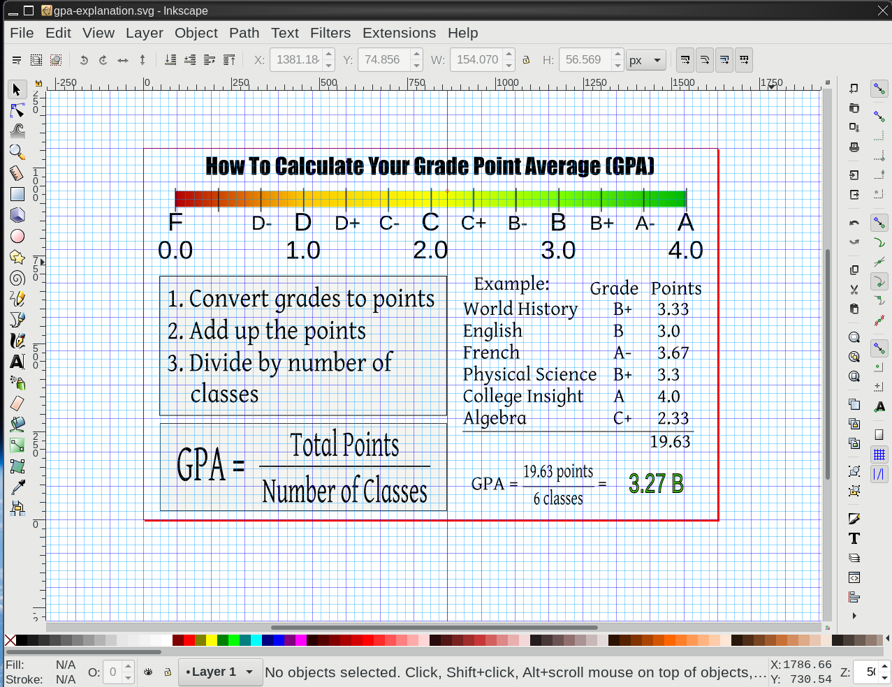
Pro Tip: Word Wall Entries
Font size is important when making word wall graphics. Be sure you can read all the text on the word wall from anywhere that students would be expected to be able to read it. When in doubt, make the font bigger. Remember, there is (usually) no good reason for big margins on things you are hanging up for students to see from far away.208
If you can’t read all the text on a word wall entry from anywhere in the room, either make the text bigger (easy in Inkscape), or be okay with students getting up to go to the word wall to read it. Make sure they know that is an okay thing to do.
Making a Book in Scribus
Making a book in Scribus is not much different from making other text documents in Scribus. You might want different page headers for a book with chapters, and you might want a table of contents (ToC), but any given page is going to be basically text and picture boxes.
One big difference between using DTP software like Scribus and a word processor is the use of styles. We talked about them in the section Paragraph Styles, which starts on page . In Scribus, you will use styles for every sort of paragraph as well as every sort of page. I usually have at least regular, indented, list, caption, title, subtitle, and heading paragraph styles and then right, left, first, blank, title, and other miscellaneous page styles. Until you set up a template (), you will need to set up all of these yourself.
I’m working on my third textbook (in Scribus) for the local community college ESOL program, and I made a Japanese language and culture book in Scribus for an elective I taught a few years ago.209 The textbooks include a table of contents; several chapters with readings with margin notes, images, exercises, and questions with space for answers; and a glossary / index (vocabulary words with definitions and what chapter those words are introduced in).
The books also include front and back covers — be careful to have an appropriate number of pages depending on how the book will be printed.210 The covers are a mix of regular text (in text boxes) and images that I made in Inkscape.
Partly because you have so much control over everything in DTP, you also have to do more to get things like page headers and the table of contents. The software may not do it for you, or it may require you to do a bit more set up than is required to do the same thing in a word processor. In a word processor, for example, you can fairly easily create a table of contents just by being sure to use paragraph styles — the ToC may default to including every paragraph with “heading 1” or “chapter” style. (You can change the ToC depth to whatever you need.)
In Scribus, you need to set up a “ToC Item” paragraph style; set up the ToC itself in ; and then add a text box for the ToC where you want it. Finally, you have to set the for each text box you want included as a ToC entry.211 If you want readers to be able to jump straight to each chapter from the ToC, you need to first add blank text boxes on top of each entry; then set ; then edit to be a “Link”; and finally set where you want the link to point to. So, a bit more work.
As you can see from the above, if you are doing a book, a word processor may be a better option. If you have a lot of images, though, the table of contents setup may be worth not having issues with the images (which I guarantee you will have in a word processor). If you only have a few images, and mostly text, you might want to go with a word processor, especially if you do want to have a table of contents or an index (much easier in a word processor — after all, processing words is what they do!).
I helped make some textbooks for the community college in a word processor. One had a lot of layout and images. Worse, the text and the images had to go together, but they also had to leave enough space for students to write in answers and the such. It was a nightmare. That book would have been much easier to make in Scribus (or other DTP software), but the other teachers working on it were not familiar with DTP, only word processing. In the case of that book, a bit of convoluted Scribus ToC setup would have been totally worth it to avoid all the issues we had with images.212
The easiest way (and also the only way I’ve found so far) to get different page headers (or footers) for each chapter in Scribus is to have different page styles for each chapter. This is not great, but it is not as bad as it sounds, especially if you plan ahead. Decide the basic styles you want and once those are completed, copy them and individualize for each chapter. Common basic page styles including having the chapter name and page number at the top of a regular page, but having only the page number at the bottom of the first page in a new chapter.
In Scribus, to get each chapter to have the appropriate chapter name, you have to copy the basic style and change the text in the header, then apply that style to each (appropriate) page in the chapter. As a result, the textbooks I put together for the community college had a few generic page styles (left and right for the first page of chapter, blank page, other pages with no header) and then left and right page styles for each chapter. Because the header was the only difference, it was not difficult to deal with 15+ page styles, though. If I wanted to make bigger changes to page styles after everything was set up, well, that would have been monotonous and time consuming.
In a word processor, you can usually just add a field (such as “current chapter”) into the header of the page style, and it will automagically change when the chapter changes. Worst case, you may have to change some settings in the heading styles to get the word processor to know when a new chapter starts.
My biggest issue with long books in a word processor is that so much of the interface is based on mouse button clicking. Individually selecting every word you wanted to added to the index, for example, and then clicking , and then adding the actual info every time for every word is almost guaranteed to give me carpel tunnel issues. And of course, it is monotonous and time consuming.
All of this may not be convincing you to use Scribus for a book. Certainly, if your book is mostly text, then you should use a word processor for it. This is an even better idea if you only have a few paragraph styles — like chapter heading and regular text.
Or, you could use what I used to create this book — LaTeX (see page ). It has very powerful text features (like indexes, ToCs, etc.), handles images just fine, and is keyboard based (literally no mouse required). But, there is a reason why it is in the “Advanced Topics” chapter (starting on page ). So, maybe not for most people.
Whether you use DTP software or a word processor for your book (or other text-heavy material), please check the first chapter of the next part (page ) for some advice on Typography, Design, & Accessibility. Regardless of the software we use, the goal is still to give students resources and materials that they can easily access. Part 2, TechInEd looks at a wide variety of topics, but it starts by looking at text and design, layout, formatting, and other topics that impact students’ ability to fully access our materials.
TechInEd Topics Deep Dive
I call this section “TechInEd” because, as I discussed in the introduction, this really isn’t about “Educational Technology” as much as it is about using “Technology in Education”. Teachers use a lot more technology than just the tech that they put in front of students. We’ve looked at some specifics in “The Best Tool for the Job” and now we are going to dive deeper into some perhaps slightly less immediately useful topics that teachers nonetheless will benefit from being aware of and familiar with.213 We will start with typography and related topics.
Typography, Design, & Accessibility
By “typography” and “design”, I do not just mean the fonts you use, but also all the considerations about how text and graphics are laid out on the screen or paper — for example, line width, line height, line spacing, choice of fonts for regular text and headings, choice of colors for fonts and graphics, placement of text, graphics, and white space on the page. I am not an expert by any means at all, but I know that a lot of worksheets, readings, other handouts, and of course tests and other assessments are not well laid out.214
By “accessibility” I mean the ability of people to understand the content regardless of their physical and mental situations. Teachers know that they need to meet IEP requirements and 504 needs. Usually this does not involve redoing an entire course worth of materials, but if you stay in education long enough, it eventually will. Many teachers don’t think about the needs of visually impaired students (for example), until they have one in class, and then … oops, time to suddenly redo all your materials. A little thought ahead of time can both improve your day-to-day materials, and leave you well positioned to easily differentiate for the more demanding IEP and 504 needs when they arise.
I mentioned earlier about how things like paragraph styles can make this very easy — use paragraph styles for your documents, and when you suddenly need to have 18pt as the smallest font, you are in a good position to make that happen quickly and easily.215 Same for preparing for screen readers; paragraph styles provide important information (“this is a heading”) to screen readers. If you have been using paragraph styles, then no worries. If you haven’t, you may get a call from a parent about how their student cannot access your reading.
The law can occasionally be a bit confused and confusing — this 2019 court decision that says web sites do need to be accessible to screen readers, but this 2021 court decision says that web sites do not have to be accessible to screen readers.216
In my opinion, though, even without legal force, educators should care about making their content accessible to all their learners, including English Learners, students with IEPs and/or 504 plans, and pretty much everyone else involved. That takes time to actually do, but more so, it requires that you know about what to make accessible and how to do it.
We will look at a few areas:
- Text & Design:
font choices, line length and space, clutter on the page
- Audio & Visual:
subtitles for audio and video, alt-text for images
- Content:
comprehensible content and clear, direct directions
Text & Design
Formatting, layout, and other design choices can have a significant impact on student learning.
- Margins
should be whatever is left over after you set font size and line length.217
- Line length
is about how many characters there are on one line of text. Materials for adult, fluent readers usually have about 60 to 90 characters per line. Materials for young readers have much shorter lines. For struggling readers, stay to the low end of the range for their age and level.
- Fonts
need to be appropriate for the reader. Andika is a good font for students who may be confused by TNR-esque “a” and “g” letter shapes.218
By the way, “Dyslexic fonts” are NOT proven to be helpful.219
Font Sizes
Fonts have different base sizes. 12pt Times New Roman is smaller than 12pt Liberation Serif.220 The font is probably too small if students need to , or if there is a lot of empty space on the left and right sides of the digital page.221
- Printed paper:
12 point for regular text for most students; at least 13 or 14 point for lower reading-level students.
- Screen:
at least 17 point for regular text for most students; 20 point or bigger for lower level students. Consider switching to landscape orientation.
- Projected:
generally at least 20pt or bigger.
- Word wall:
(that is, a vocabulary word card for your wall) generally at least 36pt or bigger.222
But, a lot depends on your situation, your students, and your goals. If your students are writing an academic paper, they should probably use portrait oriented paper with a 12 point, TNR-esque font. is fine in that case.
Three Formatting Examples
Below are three formatting examples: traditional, appropriate for high-school students reading at grade level; “much better”, for many high school students not reading at grade level; and “enhanced” readings, good for pretty much everyone, but especially those reading below grade level.223
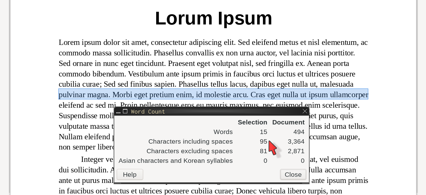
Figure 1.1 (page ) uses a 12-point font, has 1-inch (2.54cm) margins, and 100% line spacing (1.0). It has about ~95 characters per line. That is a lot. On paper or on a screen, this page can be difficult for many learners to read.
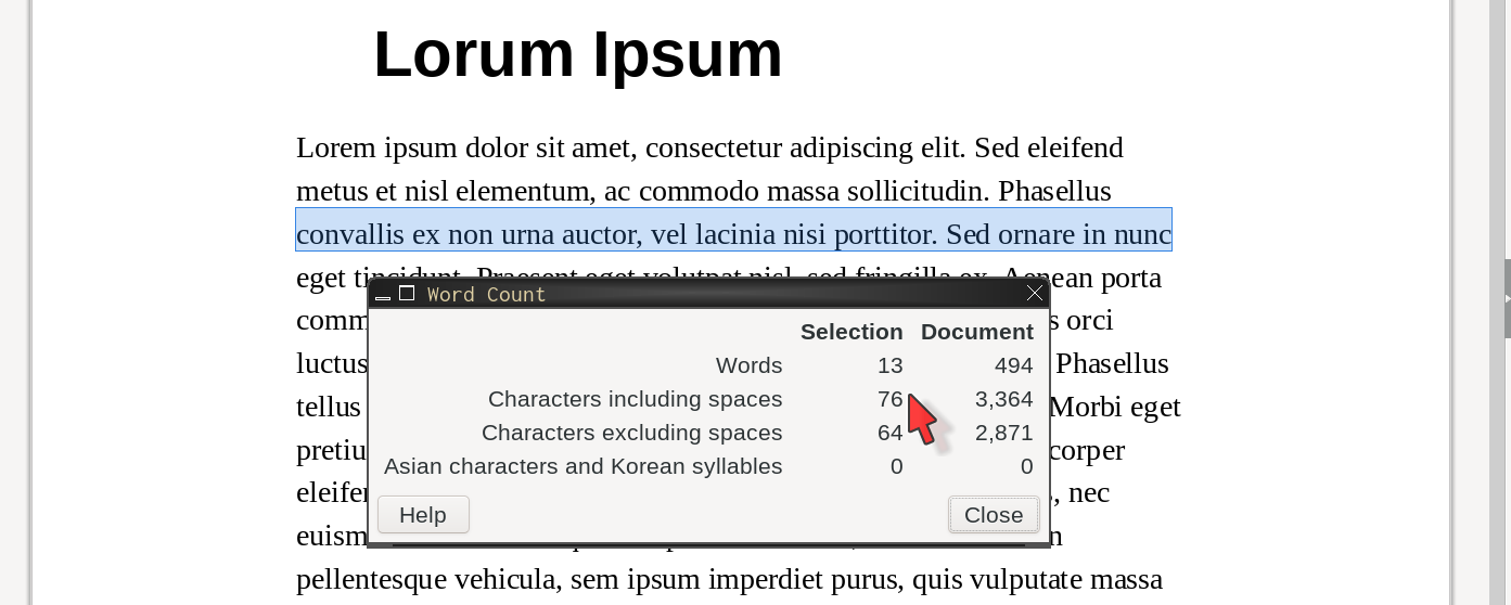
Figure 1.2 (page ) uses a 13-point font, has 1.57-inch (4cm) margins, and 125% line spacing. It has a much more comfortable ~76 characters per line. Content aside, for most high school students, this format will be much easier to read.
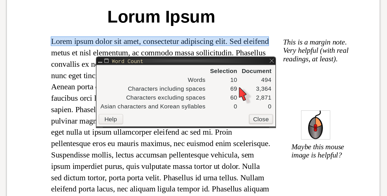
Figure 1.3 (page ) also uses a 13-point font and 125% line spacing, but it has a 2.17-inch (~5.5 cm) wide right margin and a 1-in left margin. It has ~69 characters per line.
Figure 1.3 is easy to read, and the wide right margin gives the teacher and the student room to add helpful information. This is the beginning of an “enhanced” reading. Teachers can take it further by adding images, color, links to resources, and so on, to maximize student understanding.
Creating Margin Notes
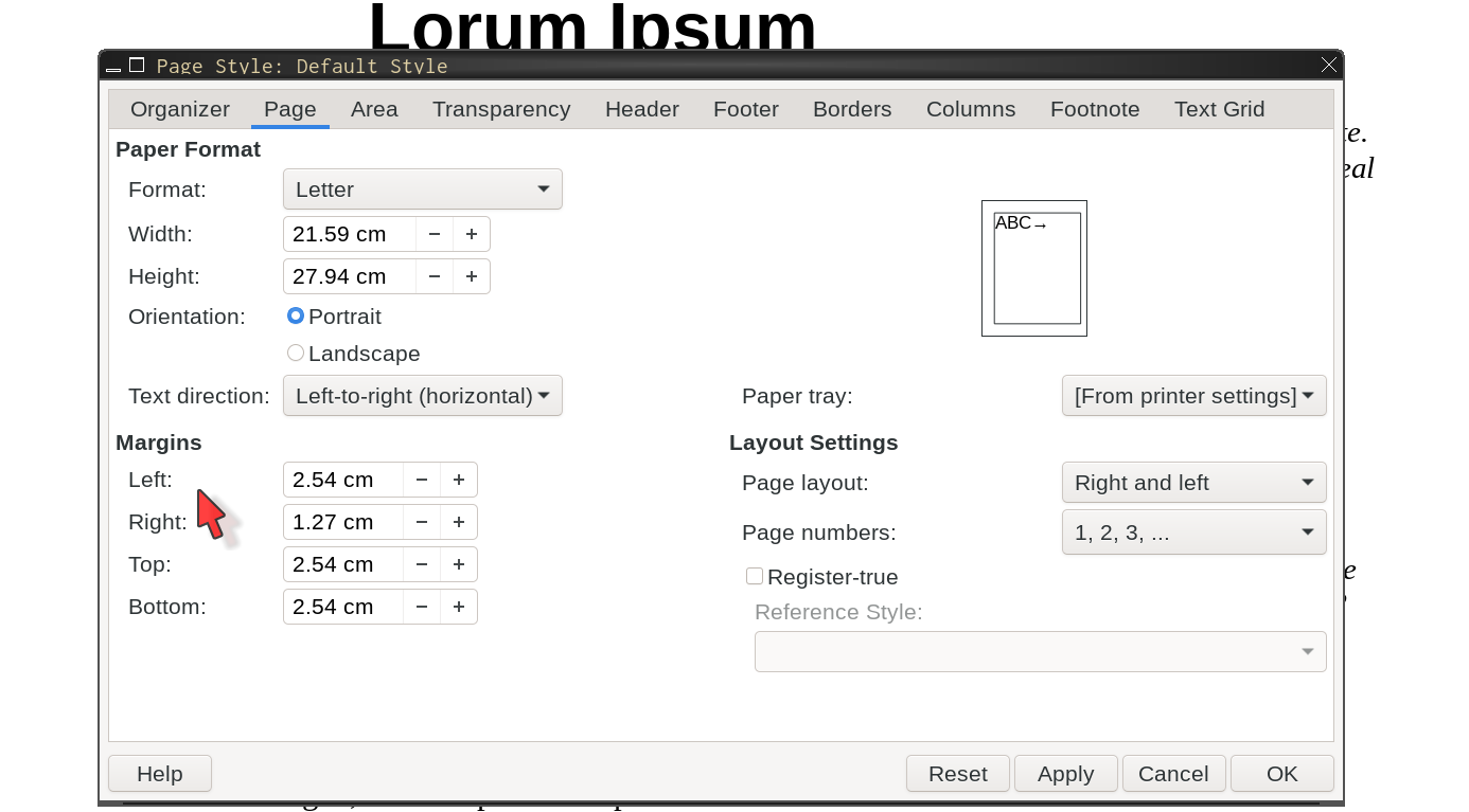
Set page margins
left: 1-inch
right: 0.5-inch
This is for LibreOffice. Process will be similar for Google and MS Word.
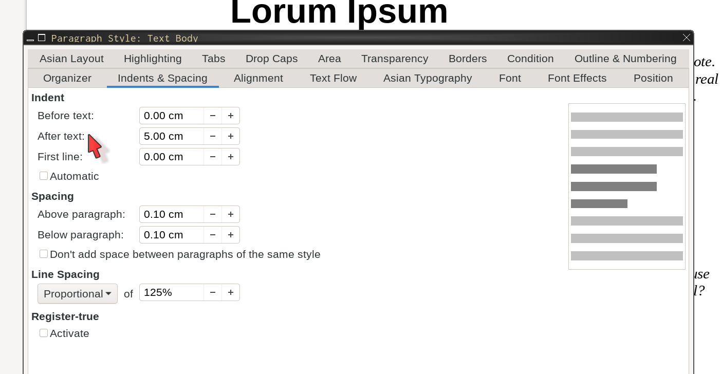
Add space after text
then 224
After text: 1.5-in
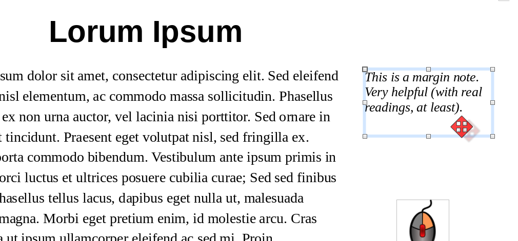
Add text boxes
draw in margin
to edit225
Add images
choose file
put in margin
This is for LibreOffice. Check How to make an enhanced reading in Google Docs on Youtube if you use Google Docs.
Pro Tip: Alt Text
Don’t forget to include “alt text” on images when you include them. Screen readers use the alt text to describe the picture to the sight-impaired user. It is also text, so if you translate the document, it should be translated also (unlike text that is part of a graphic).226
Good alt text should describe the picture as you, the teacher, want the student to understand it. Alt text should not just be the name of the picture or something super generic like “map of the U.S.A.” (unless that is really all you want the student to get from it, of course).227
Clarity
Clarity is sort of the document creation version of “comprehensible content” (see page ). Clarity is about making documents easy to understand for all learners. It is equal parts page layout, typography, and consistency.228 We’ve covered a lot of it in other parts of this book, so I’m going to point you to some resources that go into more detail about designing effective resources.
Bonni Stachowiak’s excellent “Teaching in Higher Ed” podcast has several episodes about design & clarity, materials creation, and the such. Although the podcast is primary aimed at higher ed, much of the content is applicable to k-12 teaching.
Gabriela Kleckova and Pavel Svejda have a great book, Creating Visually Effective Materials for English Learners about this. I highly recommend this book, even if you don’t have any ESOL students. Gabriela Kleckova also has a useful blog post about “decluttering” at TESOL.org.
Robin Williams229 has a great book about design, The Non-Designer’s Design Book. It is not for, or about, education, but the design principles apply to educational materials also. A lot of what Williams explains is also mentioned in Kleckova and Svejda’s book.
Finally, Matthew Butterick has a wonderful typography site / book called, appropriately enough, Practical Typography. There is a huge amount of great information there. One of my favorite pages at Practical Typography is his explanation of typewriter habits to avoid.230 A lot of that page comes down to what I’ve been saying: use your word processor like a word processor and not a typewriter.
Clutter: Typos / Spacing / Etc.
“Clutter” is one (unfortunately very common) element of bad design. Aside from the obvious — things like too many elements crammed onto a page, graphics that have a lot of hard-to-read text, etc — simple typos and spacing issues may confuse students. Below is one real-world example from a few years ago:
3)x + 4 = 6
Something like the above was on a math test. Students were confused by “3)”. The lone ) and no space made students think maybe the teacher meant (3)x.231 In fact, the “3)” was there because it was question #3. To avoid confusion, the below would work much better:
3. x + 4 = 6
The solution in this case is to use tabs (aka tab stops) to tweak the spacing between list numbers and the content.232 Also, if the content you are testing involves parentheses, maybe use a period instead of a parenthesis after the question numbers (as in the example above).
Audio & Visual
Accessibility is also for English Learners and their families. One area that I focus on is subtitles (also good for anyone who has hearing difficulties).
Subtitles / Captions
Subtitles (in English or L1) are helpful for parents / guardians who may have trouble with English or are hard of hearing.233 (And students, too!) Google YouTube and many other sites can automagically add subtitles to videos, for free. Not all sites allow you to edit or download the subtitles for free. Google recently added on-the-fly captions to the Google Chrome browser. Should work on any video played in the browser. Claims to translate, but didn’t work when I tried it in spring of 2021. Honestly, I am not a huge fan — at the moment — of “on the fly” captions. Mistakes always happen, and that is fine, but because they are live, students often do not have time to figure out the actual / intended meaning before the captions are gone, replaced with the next few sentences. In other words, wait time is reduced significantly.
Right now, https://www.Veed.io is the only site I’m aware of that will automagically translate subtitles for your video. It requires the Pro subscription, which is about $30 a month, unless you pay annually.234 I used Veed.io extensively during the 2020–2021 school year. Veed.io is not exactly intuitive, but it is worth learning if you want to provide videos with translated subtitles.
Pro Tip: Burn In Subs
I like to “burn in” subtitles in videos for families, especially during remote learning. This means putting the subtitles directly onto the video. They don’t have to be turned on, but they can’t be turned off. This requires making one version for each language. However, it does ensure that the family will see the subtitles (because they have no choice).235 Alternately, you can include several subtitle files — one for each language — in video files instead of burning the subtitles in, but there are a few risks with this:
families may not notice that the subtitles are there, or may not know how to turn them on
not all software supports multiple subtitles in a video file
the subtitles may get lost if you transcode or otherwise make changes to the video236
A Few More Words About Videos
There are two “sizes” that people talk about with videos. One is the width x height of the video, measured in pixels. The other is the amount of space that the file takes up on the computer disk, usually measured in “megabytes” (MB) or “gigabytes” (GB).237
If you make your own videos, please double check the size of the final version before you push it out to students. This is especially important if they may be viewing them on their own phones or at home on their own wifi. Aside from wasting bandwidth, large videos can use up significant amounts of bandwidth caps.238 If your 10-minute video is over about 150 megabytes (MB), it can probably be shrunk down, especially if it is fairly static (not a lot of motion, action, etc.). Handbrake is a wonderful FLOSS application for resizing and compressing videos. For most chromebooks (as of 2021), a video around 1280x720 pixels in size is more than big enough for most uses. Traditional DVD videos (in the U.S.A.) are 720x480 pixels, and when compressed (“ripped” from the DVD) could be about 350 MB for about 42 minutes (one episode of a typical U.S.A. TV show). If your Screencastify (or similar screen capture software) video is over 1 GB for 20 minutes, it definitely needs to be run through Handbrake. Similarly, if it is recorded at your desktop’s 1920x1080 (or higher) screen size, you can usually save a lot of space (in MB) by resizing it.239
Note: I’m told that Google Drive will automagically resize videos when streaming if the computer’s screen size is smaller than the video. That is great, especially if the “computer” is a Chromebook or phone, but … I still think it is a good idea to be aware of video sizes (in both the width x height and MB / GB senses). If nothing else, you can’t be sure every student will be watching your video streaming from Google Drive.240
Not Just English Learners
I tend to focus on English Learners and sight-impaired students, but we should be aware that there are many other groups whose accessibility needs we need to design for. This includes those on the autism spectrum as well as those with anxiety and mobility difficulties.241 The U.K. Home Office has published a great set of posters showing various “Do’s” and “Don’t’s” for creating accessible materials, for all sorts of needs. See the U.K. Home Office accessibility posters for specific things you can (and should) do to create accessible materials. I have some slightly modified versions, and a highly modified version for English Learners, at my site, also.
Christina Moore at Oakland University has created some excellent resources, including this digital accessibility checklist. For guidelines on general text formatting and document creation, (in other words, a huge part of what this book is about), see her Digitally Accessible Text Formatting document.242
One final suggestion for students with color vision difficulties: Colorblindly is a very helpful browser addon / extension that will show you how a page will look to people with various types of color blindness.243
Comprehensible Content
Whatever level you are teaching, you know your students. I dislike using terms like “reading level”, especially regarding k-12 students, because there are so many factors that are involved. But, as sometimes happens in education, the idea behind the somewhat problematic term is worthwhile — helping students become better readers, perhaps while simultaneously helping them acquire the content, in this case.
I often use the analogy of trying to introduce non-science teachers to quantum mechanics by giving them an academic journal article about the topic.244 Most struggle to understand the article. I don’t want to say “of course not”, but hopefully most teachers would not feel like poor readers if they struggled with an academic journal article about quantum mechanics physics. And, unsurprisingly, most do struggle with it.
The problem isn’t just about the language that the article is written in. The difficulty comes from the content covered, the language structures and vocabulary used, the background assumptions made. If you don’t know the vocabulary of professional physicists, plus the specific language (jargon?) of quantum physics specifically, you will struggle. If you are not accustomed to the writing style of academic journal articles, you will struggle, even if you are a college-educated, native speaker of the language.
We will look at some of the tools you can use to get an understanding of the complexity of texts you are giving to students, and then do what you need to do to help students successfully access the texts. Professionally, I’m usually not as worried about fiction content as much as non-fiction content, so that is what this section focuses on. That said, it would be totally appropriate (and hopefully common) for teachers to use non-fiction readings to help build background knowledge when reading a novel or short story.
I often write (or modify) short articles to help students build background knowledge in science, math, or history. My goal is to help them quickly get “up to speed” on what atoms are, what Pascal’s Triangle is, or who was involved in the Harlem Renaissance. I want the reading to be as easy for them to access as possible — they don’t have time to try to slog through yet another reading that is written several grade levels above where they are reading and then the actual reading that the teacher assigned (which is also likely at a higher level than the student is comfortable with).
Simple Wikipedia is a great place to find a short, simply-written article that you can either use as is, or modify to better suit your students’ needs. If it doesn’t have what you need, you could start with the most appropriate paragraphs from the full Wikipedia page and then modify that. I’ve done both of these many, many, times.
Whether I wrote / modified something, or have a reading already (maybe from a textbook resource, or from another teacher), I try to check the reading level and vocabulary. There are several good sites for this, but the two I use the most are:
Readability Formulas to check the difficulty of a reading. It gives a “consensus” opinion of the text difficulty based on several common tests; and
LexTutor Vocabulary Profiler to check the vocabulary in a reading.
The first site gives me an idea of the “reading level” and also how many words there are in each sentence. Rewriting a few sentences to bring sentence length down is a good start to a more accessible reading. Remember, my goal is to give students a reading they can easily access, so they can spend their mental effort on understanding the content (such as “what are atoms?”). We’re not “dumbing down the content” at all, just being sure that the actual language and grammar used doesn’t interfere with understanding the content.
For vocabulary, I especially check for “off list” words — words that are not on the lists of the top 2000 most common English words nor in the Academic Word List.245 For a quick, build-background reading, we don’t want to have to explain unnecessary words. If it is off-list and not either a) a word students already know or b) a relevant content area word, we can replace or remove it.
Scanning and Optical Character Recognition
Sometimes, you have a picture, a worksheet, or some other resource on paper, but you need to make changes. Maybe you want to simplify the text for students reading below grade level.246 Maybe you need to make the text larger for a student with a 504 plan. Maybe you are as offended as I am by some publishers’ horrible layout and want to redo it so your students can better access the content. Whatever the reason, you find yourself with a piece of paper, or maybe a PDF file, and you need to make changes.247
If the document is short and just text, maybe you can just type it into a new document (or read it into Google Docs with “Voice Typing”). But if it is longer, or if it has graphics you need to keep, things get more complicated.
This is where optical character recognition (OCR) comes in. Computers248 use OCR to convert pictures of text into actual text. We aren’t going to worry about the specifics of OCR software here because hopefully you will only use it as part of other software or services (such as Google Docs). We will look at some things you can do, when scanning a document, to get better results from OCR software, though.
We do need to understand this much: OCR software looks in pictures for blocks of text, then looks in those blocks for shapes that look like letters. We can do a few things to give the software the best chance of finding and correctly identifying the letters and words in our document.
Before you scan, see if you actual need to. If you already have a PDF file, try copying some text from the PDF file and pasting it into a document. If the PDF is already text, you should be able to copy and paste. If you cannot, then the PDF is probably just a picture of the text. This is very common. If that is the case, the easiest thing to do is to upload the PDF to Google Docs for OCR. The process of using Google Docs for OCR is explained below, after the advice for scanning.
Also, check if your copy machine already does OCR. If it has an option to scan to file (it should), see what file type options it has. Look for something like TXT, RTF, or an MS Word format such as DOC or DOCX.249 Any of those allow you to modify the text in the file. TXT (text) is just plain text, however, and does not contain any formatting information beyond line and paragraph breaks.
Even if your school’s copy machine does not have those file options, it may still do OCR. Scan to a PDF and see if you can copy any text out of the PDF. If you can, congratulations — just copy all of the text from the PDF and paste it into a new word processor document. If you cannot copy any text from the PDF, your school’s machine isn’t doing OCR, and you will need to do the OCR yourself (sort of — see section OCR A PDF on page ).250 See below.
If you don’t have a PDF file, you will need to scan the paper to get a digital file (a PDF for uploading to Google Docs, or a PNG or TIFF for old school OCR). Below are tips for getting the best results when scanning.
When you scan, set the DPI (dots per inch) to at least 300. This helps the software recognize letters, because there is more information to look at. Often copy machines and other scanners default to 100 or 200 DPI. Higher is better, but 600 is probably overkill - you will get a very large file, which may not be worth the extra time to process. Scanning at about 300 is usually enough information for OCR software to do a good job.
See what image type your OCR software prefers. The easiest thing to do is to upload a PDF to Google Docs for OCR, but some software may prefer TIFF, JPG, or PNG files. Google Drive can also OCR some images, but for me it has not been 100% successful or consistent. See Pro Tip: OCR Images on page .
Scan in black and white, not in color or gray scale. If the document contains color graphics (pictures, charts, etc.) that you need, scan twice — once in black and white for the text, and the second time in color for the graphics.
Turn up the contrast in the black and white scan. The easier it is for the OCR software to see the edges of the letters, the more accurately it will recognize them.
Cut out extraneous text that you don’t need. Often this is text at the top of the page such as chapter or section titles, and page numbers anywhere.
If columns of text are too close together, they may be seen as one line. If that happens, just cut them apart and scan as two pages. Similarly, picture captions often get recognized and inserted into the OCR text in inappropriate places. You can either remove captions before scanning, or move them to where they should go, after scanning and OCR.
Not strictly for OCR, but you should scan graphics as image files, not as PDF files if you need to get a digital copy of the graphic.251 Image files include JPG, PNG, and TIFF. PNG is usually best for graphics (anything that isn’t a photo, basically), because it supports transparency. JPG and PNG, however, do not support multi-page images. TIFF does, but it is generally hard to work with.252 If you have more than one page with graphics, it is best to just scan each graphic individually into its own image file. You can add the image files to the full document later, after you get the text. Putting a PDF into another document isn’t something that normal computer users do. Thus, best to scan graphics as images, not PDF files.
After Scanning
By far, the easiest thing is to scan your document at 300 DPI, in black and white, to a PDF file and upload that file to Google Docs.253
OCR a PDF
Now that you have a good quality scan of your document (or you have a PDF from somewhere else) and have uploaded it to Google Drive, we can let Google’s state of the art OCR software do its thing.
Double click in Google Drive to view the PDF;
click
Open as Google Doc[convert-pdf-to-google-doc]Google’s software will OCR the PDF file and create a Google Doc that matches the formatting and layout as closely as the software can manage;
wait for that new Google Doc tab to finish loading;
fix the formatting — there will probably be some (or many) errors.
If there are a lot of errors with the text, maybe try scanning the document again at a higher resolution, or with the contrast turned up a bit (that should be in scan settings somewhere), then repeating the steps above.
If Google Drive isn’t an option, or if it doesn’t work well for you, even after trying various scan settings, then you might want to try other OCR software. I like Tesseract,254 but I also like the command line. There are GUIs that can use Tesseract, though.
Pro Tip: OCR Graphics
Technically, doing OCR on a graphic is the same as doing it to a PDF, but I have had much greater success with PDFs in Google Drive than with graphics. This has been especially true when the graphic is part of a page with lots of text. But, if you have a graphic with lots of text inside of it, Google Drive might be able to get that text out. For example, I often have to take fliers that people have made (that I don’t have access to an editable version of) and OCR them so I can translate the text and make a non-English version of the flier. To do this, I follow these steps:
upload the image file to Google Drive;
double click to view it;
click on
Open with Google Docs(in the top center of the document window);a new document containing both the image and, below that, the text from the image will open in a new tab.
If you don’t need the image in the new document, it is safe to delete it.
This is a great way to get text when you have a single image with lots of text. If you don’t see an option to Open with Google Docs, then Google Drive may not support the image format you are using. I’ve had good success with PNG files, but less with JPG files. I am not sure if this is because Google Drive supports one but not the other, but I think that is probably the most likely explanation. So, if you can, start with a PNG file. GIMP can convert a JPG to a PNG — just choose and change the file extension to png.
OCR Reality Check
The reality is that even the best OCR software makes mistakes. Average software can make a lot of mistakes. Depending on the quality of the scans and the quality of the OCR software, you might have to spend a lot of time redoing the text and recreating any formatting. The good news is that you only ever have to do it once for a document — after a little time up front fixing things, you will have a word processing document that you can modify whenever you need to. I have documents for various classes that I still use every year. I spent hours fixing and formatting them years ago, but since then, I’ve only had to tweak for individual student’s needs each year.
Translating Documents
Federal law says that schools need to send documents home in languages that parents can understand. If it is going home to the parents of all the English-speaking students, it needs to go home in Spanish, French, Chinese, Wolof, and any other languages that parents need to fully participate in their children’s educations. This includes everything from enrollment forms, to field trip permission slips, to requests to bring food items to school events.
Few schools255 have enough money to pay actual qualified translators to translate all of their documents to all of the needed languages. Luckily, Google Translate is pretty good, usually. Just be aware that it is not perfect, and it can make very embarrassing mistakes. It is better, though, to pay someone for 20 minutes of checking and fixing a document than for 2 hours of translating it from scratch. (This is general advice — if you are lucky enough to have a translator, discuss with them what works best for your language needs and situation.)
Currently, in 2021, Google Translate is, in my opinion, the very best for free machine interpreting and translating, for the widest range of languages.256 Modern methods require large databases of materials in the target languages to train the translation software. Google has the biggest, best databases, and also has very good software. At least they have the best that any teacher or school on a budget is going to be able to afford. To be clear, though, no machine translation I am aware of is perfect or even close to it, yet.
Translating WP Documents
To translate a word processor document:
Either create the document in Google Docs, or upload the file you have, convert it to Google Docs format, and then fix any formatting or other issues resulting from the conversion. If you uploaded an MS DOCX file, you may need to first go to after opening the file. This is because Google added the ability to work on DOCX files directly. Confusingly, it seems to do this automatically even when you click on
Open with Google Docsfrom the preview.When the document is ready, go to .
A box will pop up for you to choose the language to translate to and to enter a name for the new document. Enter that information and click on
Translate. The new, translated, document will open in a new window.I like to include the language name in the document file name. So, for example, the Spanish version of “Field Trip Permission Form (En)” is “Field Trip Permission Form (Es)”.257 This makes it easier to keep track of translations, and if you need to you can search for (Es) and quickly find all of the Spanish documents.
Translating Other Files
Word processor documents are the easiest to translate with Google Translate (and get a useful document in return). You may not always have a word processing document of the file you need translated. We can still translate other types of files, but a little extra work is sometimes needed. We will look at translating PDF files, presentation slides, and web sites / web pages.
Translating PDF Files
To translate a PDF file, we first convert it to a Google Doc file,258 then translate following the steps above for translating a word processor document.259
You may need to fix some formatting. Also, recently Google Translate has had a weird issue where it combines two words into one (forgets a space, basically) in the translation. Google’s own spell checking almost always catches this and recommends the correct fix, though.
Translating Slides
Currently (late 2021), there is no way to directly translate MS PowerPoint or Google Slides documents into editable presentation slide documents with Google Translate.260 If you need to translate slides (perhaps, for example, for a newcomer student), you have 3 options, none of them great.
The easiest is to convert your slides to PDF format, upload the file and convert it to a Google Doc, then translate that. Depending on the layout of the slides, this may work pretty well, or it may end up a horrific mess. Either way, a fair amount of re-formatting is probably going to be necessary. And, of course, your “slides” are no longer slides — you now have a Google Docs word processing document with the text and hopefully images from the slides.261
The second best way — or the best, if you must have presentation slides and not a word processing document — is to upload your MS PowerPoint slides file to the Google Translate website (using the “Documents” option). After submitting it, Google Translate will open a new window with the text and text formatting (bold, italics, maybe font sizes) from the slides all in one text document. Step 2 is to copy and paste the text from that new window into the appropriate places in your original slides.262 This assumes you understand the target language well enough to figure out what text goes where.
You can also sort of mix these first two options — upload the PPTX file to Google Translate and then copy and paste the translated text into a new document. This is very fast, but loses all the graphics and layout. It does, however, keep text formatting, mostly. I like to use this option for slides that do not have many graphics. Yes, it ends up with a word processing document and not slides, but I change the paper to landscape B5. With a few properly placed page breaks and the graphics added back in, the document is almost as good as slides.
The third way is the worst, but it does have one benefit — you can add text to help you re-format your slides after translating. From Google Slides, download your slides as “plain text”. Go to . The file you get will have no formatting. Open it in a text editor, or, if you prefer, a word processor.263 If in a word processor, you can try adding back formatting, but how useful this is depends on the complexity of your slides. Either way, you can add “markup” or other text to show what slides the content is on, or that a sentence is part of a list, etc. Markup like this is especially helpful when we are translating to a language we are not familiar with — remember, the translation will be all in one document and it won’t necessarily have obvious slide breaks. If you can’t read Thai, for example, how do you know where each slide begins and ends? You may not be able to tell. But, if you add
S-S-1(for “start slide 1”) at the start of slide 1 andE-S-1(for “end slide 1”) at the end of slide 1, it becomes easier to figure out what text to copy and paste into each slide after translating.264Basically, the third way is to markup the plain text (or maybe a lightly formatted word processor document) and then upload that file to Google Translate. Just as with option 2, we still have to copy and paste the translated text into our slides, but hopefully we can more easily see what goes where. Also, as with option 2, at the end of it all, we still have slides. A small bonus is that in both cases, we still also have the Google Translate window with everything as a document, on a single page265 — this can also be very helpful for making worksheets or outlines, or the such for using with students. If you want an English version, just translate your slides from English to English.
Tips for Using Google Translate
Here are some further tips for using Google Translate:
- For “talking” with a student,
the Google Translate web page and the smart phone app are both great. Both allow you to speak and the software will transcribe what you say and then translate it. The app has “Conversation” mode where it will listen for both languages and speak them back and forth. Depending on the situation, that can be a huge help and time saver. Of course, both allow you also to type in one language and see the translation in the other language — good for when you don’t want to disturb a class or draw attention to the student you are talking with.266
- For short texts,
the Google Translate web page is great and more than enough. For longer documents or for things you will share with other teachers, use Google Docs and the built in translation tool (as described above).
- Test the translation
by using the Google Translate web page. This is great when you don’t have someone who can check the target language, or if you are trying to get the translation as good as possible before asking them to check it. To do this …
Go to the Google Translate web page.
Choose the original and target languages. For this explanation, we will assume we are translating from English to Spanish.
Paste the text of your document into the Google Translate web page. Your text should automatically show up translated in the other box (on the right side).
Click the double arrows in the middle (between the original and target language text boxes) to reverse the translation. So now we would be going from Spanish to English.
Check the resulting English. Is the meaning warped? Are there some grammar or vocabulary issues?
If there were no issues, great! You are done. Copy the translation and paste it into whatever document you need.267
If there were issues with the English, click the double arrows again, to put the English back in the left-hand box, and try rewriting the parts with strange English. Try using different words, or rewriting the sentence. I think it is okay to rewrite the English to get a better translation.268 It is okay if the original English, for example, uses passive voice269 and you use active voice in the English for translation in order to get the best translation.
Also, look at the information that Google provides below the text input boxes. They often have useful grammatical information, definitions, and synonyms for both the original and the target languages. Use this to inform your rewriting — for example, maybe a synonym for a word will come through more clearly in the translation than your original word.
Repeat this process until you get fairly consistent results that are close to the original meaning. It may never be perfect, but you should be able to minimize both grammar and meaning errors.
If we have time and a willing victim — I mean volunteer — to check the translation, I stress to them that “we aren’t looking for perfection, we are looking for errors that would embarrass us”. Families know (have figured out) that we use Google Translate, and they are smart enough to figure out what we mean when the translation isn’t perfect (we also include the original English, which can help). Until someone funds us for proper translations, I’m not worried about a few grammar mistakes. I am worried about economics class content like “stocks and bonds” getting turned into “bondage”.270
Pro Tip:
Obviously, if you have the time and the money, pay someone to double check and rewrite as needed. But, most schools don’t have the time or money, much less native-level volunteers for every language they need. If you are handing the translation off to someone to check, they will appreciate the extra few minutes you put in to double check the translation first.
Personally, I do my best to discourage people (admins, content teachers, etc.) from bothering the global language teachers with checking translations. If one of them wants to help, great, but if it isn’t in their contracts, don’t expect them to give up a planning period or their evening to do translations. Not only is it rude, translating actually is its own skill. Just like not every native speaker is automatically a good teacher of the language, not every language teacher is a skilled translator. If you ask them, you are adding to their workload and possibly (probably) their stress levels.
If you are giving a translation to someone to check, don’t just give them the translation. You should also give them the original English and the final English from your translation checking. This allows them to quickly track down the intended meaning if there is an issue that your checking didn’t catch.
Translating Web Sites
In this section, we will look at how you can give students and families a link that will take them directly to a Google Translate version of the web site or web page that you are sharing. On that Google Translate page, any linked pages they go to will also be automagically translated. Honestly, I’ve not tested this extensively with all sites — for example, I’m not sure if it would work on all sites that require a log in. But, for simple informational sites, or pages sent out in emails, the Google Translate links should work just fine.
Another nice feature is that if you hover your mouse over text on the translated page, the original text will pop up. This can be very helpful, as we discussed above, for figuring out the meaning when the translation is less than great.
Best of all, the process is very easy.
Go to the Google Translate page.
Be sure the “from” and “to” languages are set how you want them.
Paste in (or just type in) the link for the page you want to translate.
A link will appear in the “to” language text box.
Click the link; the translated version will open in a new tab.
Check that the translated page looks okay.
Copy the link from the location bar / URL bar.
Paste the link wherever you need it.
I like to check the link by opening it in a different browser. For example, if I am working in Google Chrome, I will switch to Firefox (where I am not logged into any of my work accounts), paste the link into the location bar, and just check that the link works properly.
That is it! If the link worked (and it should have), you can share it everywhere you need to. This is great for if you are sending home information to families and that information has links to external sites that they need to access, but that you don’t control. After the regular link, include the translated link, maybe in parentheses or with a message like “ver en español”.
Copyright and Fair Use
Some teachers don’t worry about copyright and freely use and distribute copyrighted materials in classes and maybe to other teachers. Some of these teachers may honestly not care, or perhaps they think that such use is okay as long as they do it for educational purposes and not for profit. Other teachers go to the opposite extreme — they don’t make use of copyrighted materials because they don’t want to infringe on someone’s copyright or get in trouble for unauthorized copying.
Teachers in both groups have an incomplete understanding of copyright. This chapter will explain copyright as it impacts educators. After reading this chapter, you should be able to make informed decisions about what you can and cannot do with copyrighted materials.
Of course, I do need to add that I am not a lawyer, and this is not legal advice.
Copyright: Definition and Purpose
Copyright is literally exactly what it sounds like — the right to copy. Through copyright laws, the government gives the copyright holder control over three things: copying, distributing, and modifying (including things such as translations and “derivative works”) their copyrighted work. In the U.S.A., copyright is mentioned in the Constitution; Article 1, section 8, clause 8 gives Congress the power to create copyright laws “to promote the Progress of Science and useful Arts”. Originally, Congress set the length of copyright at 14 years, renewable one time for another 14 years. Today, copyright extends for the life of the author plus 70 years for works controlled by an individual and either 95 years from publication or 120 years from creation for works controlled by corporations.
As you can see from the original wording in the Constitution, copyright is seen as a trade-off. Creators get certain monopoly rights to their works as an incentive to create. During the copyright period, the government will recognize and, if necessary, enforce those monopoly rights. After copyright ends, however, those monopoly rights disappear and anyone can do whatever they want with the works. The idea is that this will enrich the culture. (Patents fall under the same laws, for the same reason: inventors benefit from their inventions, but then later everyone can benefit from them.)
Of course modern copyright is much, much more complex than that. Today, companies sue each other over the copyright to things like the colors, shapes, and sizes of designs on clothing, for example, or similarities between fictional characters. In the early years of the World Wide Web, companies worried (or tried to assert) that viewing a web site might involve making an unauthorized copy of the content of that web site! Is a copy of something in your computer’s memory really a ‘copy’ for copyright purposes?271 Luckily, educators don’t usually need to worry about any of that stuff.
Fair Use
We do have to worry about the traditional, easy-to-understand copyright monopoly rights: copying, distributing, and modifying. In general, the law is pretty straight forward. We cannot copy, distribute, or modify copyrighted works. If you do, you are infringing on someone’s copyright. But, copyright law also includes something called “fair use”. Fair use says that there are some times when it is okay to copy, to distribute, or to modify copyrighted works. However, the law is vague about what is fair use and what isn’t. Fair use is usually something decided in court! You have to consider the situation and the rules of fair use to decide whether using a copyrighted work in an unauthorized way is worth the risk.
There are four tests for fair use:
What is the purpose and nature of your use of the copyrighted work?
What is the nature of the copyrighted work?
How much of the copyrighted work are you using?
What is the impact of your use on the market for the copyrighted work?
Let’s look at each of these in some depth.
First, what is the purpose and nature of your use of the copyrighted work? This is usually where teachers get the idea of an “educational exemption” or “okay for educational use”. And, yes, “using for educational purposes” is usually a good argument for fair use. But, consider a situation where a school prints out entire copies of a textbook (maybe they got a PDF of it from the textbook company, or from a random site on the Internet) and distributes the printed version to all of their students. Sure, the school is using it for education, but probably no judge would say that that was fair use.
One important consideration in using something for education is that it must actually be for education! Sounds silly, but imagine this (fairly common) situation: many of your students are out for state testing, and the students who are present just finished state testing. You can’t do any new content, because some students will miss it, and the others are exhausted from state testing. Great time to show a movie, right? Well, in this case, it probably wouldn’t be considered educational use. More likely it would be considered entertainment, and your fair use argument would be much weaker.
Money is also a factor here. Educational use sort of implicitly says “I didn’t do it for profit”. Obviously, we don’t charge students for worksheets or other printouts, but what if a school (a university or a community college, perhaps) charges students for the price of the printing and binding of a copyrighted textbook that they printed instead of buying (such as in the earlier hypothetical example)? In an unfortunately more common example, what if a teacher got a great worksheet from another teacher and then sold it on Teachers Pay Teachers? Again, unlikely that a judge is going to see that as fair use.
(Non-educational fair-use examples, by the way, include things like quoting from a book or movie in a review, or using the outline of a story or its characters in a parody of the original.)
Second, what is the nature of the copyrighted work? In general, use of non-fiction works is more likely to be judged fair use than the similar use of a work of fiction. The reason, as I understand it, is that non-fiction has less creativity involved. We’ll come back to this a bit later, but basically, if there is no creativity involved, then there is no copyright.
Third, how much of the copyrighted work are you using? This is up there with education as a common source of acceptable “fair use”. Some amount of use, and some types of use, are written into law as totally allowable uses. For example, as mentioned above, quoting a few sentences from a book in a review or in a scholarly paper is considered totally acceptable and non-controversial.
Teachers have to be a bit more careful. If you copy a worksheet out of a workbook and give that worksheet to a class, did you use 100% of a worksheet or only 1% of a 100-page book? This can combine with the second factor, the nature of the work: was the workbook intended to be a student book (so each student should have their own book), or was it a book for teachers (and thus no expectation that a school would buy one for each student)? Similarly, a few pages of a novel might be no problem at all, but a single page poem might be too much. Who decides? The judge does, if it ends up in court.
Fourth, what is the impact of your use on the market for the copyrighted work? Basically, are you taking away the opportunity for the copyright holder of the work to profit from it? In the earlier example of a textbook being printed out and given to the students, it is pretty clear that yes, the school deprived the publisher of dozens or even hundreds of sales. But what if the book that you copied is out of print? Good question — and the judge might have to be the one to answer it. Here is a more 21st century example: you download a video from YouTube before class, maybe because your school’s wifi is not great, and you want to be sure your students can see it uninterrupted in class. So, you download it ahead of time and show that video in class instead of going to the YouTube web page to show it. You just denied YouTube 30 (or however many students you have) sets of eyeballs on the advertisements on that page. Is downloading a copy to show in class fair use? Again, that might be something the judge has to decide.
As you have perhaps figured out, copyright is pretty strong and fair use is usually pretty messy. When in doubt, it is probably safer to assume that copyright is going to win. But, if you do your best to take all four of the fair use factors into account, then you are probably going to have a fairly solid case, if you do end up in court. Also, check out the real world examples, below.
What Is Copyrighted? How Can I Tell?
There is one thing that we haven’t talked about yet — what gets copyrighted? How can I know if something I find online, for example, is copyrighted or not? Actually, the answer is easy: (almost) everything is copyrighted. Years ago, you had to register your copyright, but today everything is copyrighted automatically. You can still register your copyright with the government, and doing so will help you in court if you ever end up there, but you do not need to register copyright. If you doodle on a napkin in the break room at lunch, congratulations, your doodle is copyrighted, and you control the copying, distribution, and modification of it — unless your contract says that anything you create is the property of the school or the district, in which case your school or district owns the copyright! (I really wish that last was a joke, but it is not. Have you checked your contract for copyright of created materials?)
I said “(almost) everything is copyrighted”, because some things cannot be copyrighted. Generally, there has to be some creative effort involved, so a list of the numbers from 1 to 10 is not copyrightable. Back at the dawn of the Internet, courts decided that the phone book was not creative enough to be copyrighted. After all, it is just a list of names and numbers; no creativity, no copyright.
Most teachers aren’t going to have to worry about these sorts of issues. Chances are good that anything you use in your classroom or for your teaching is copyrighted. Even a list of the presidents of the U.S.A. probably includes some sort of creative aspect — for example, fonts, design, and layout might be enough to turn that list of facts into a copyrighted classroom resource.
There is one more type of “copyrighted” content — content that once was copyrighted, but has now aged out, for lack of a better term. Copyright laws protect content for x number of years, and then copyright expires, and that copyrighted work becomes “public domain”.
Public Domain
We talked about how long copyright lasts, but what happens when it (finally) runs out? Simple: the content enters the public domain. Public domain content is free for anyone to use, change, sell, whatever. Basically, all of the copyright protections disappear and anyone can do anything with that content.
Probably nothing produced today will enter the public domain “naturally” in my lifetime or yours. But, some creators do give up their copyright protections and place their work into the public domain. This may be more common with the rise of the Internet — some people are willing to take photos, for example, and then make them freely available for anyone to use. MediaWiki is a great resource for public domain as well as “copyleft” (see “Copyleft and Open Content” on page ) photos and other materials.
The great news for educators is that you can do anything you want with anything that is in the public domain. No one controls the original content any more. You can, however, copyright your new material based on the original. For us, that is not that important, but it does restrict teachers a bit. In January of 2021 The Great Gatsby entered the public domain, along with every other book published in 1925. Great! Now we can make copies of all those Penguin Classics272 in our classrooms, no problem, right? Wrong. Penguin (or whoever) owns the copyright to their version of the work. What you can do is find a copy of the book from 1925 and copy that. Oh, that might be less doable.
Luckily, Project Gutenberg273 has been doing exactly this since the early 1970s. Best thing would be to go get The Great Gatsby from them, once they have it ready.274
Real World Examples
Here are a few real-world guidelines on copyright and fair use in education. Remember, however, that I am not a lawyer and this is not legal advice. Following these guidelines should maximize your claims to fair use, though.
You need to have an educational use when you show a video or play music in class. It should not just be entertainment. Can you prove the educational use in court?
You can make videos, music files, documents, and other copyrighted materials available online, but best practice is to put them somewhere that requires a password, and preferably a username as well. If you put something on the Internet for the whole world to access, you are going to have a hard time arguing that it was just intended for your class. But, if you put it on your school’s cloud drive (Google Drive or similar, for example), and students need a school login to access it, you have a much stronger argument.
Be aware of how much you are using. Showing that you considered ways to limit the amount would probably strengthen fair use claims. Copying an entire chapter just for two of the pages would probably not help your fair use claim.
Sharing with teachers or other educators is probably not fair use. Sharing with others teaching different sections of the same class might be more defensible than sharing with a teacher at a different school, though.
Just because you found an image (or graphic or whatnot) on an Internet search, that does NOT mean that you can use the item. As we talked about, everything is copyrighted. Everything. So, if you found the perfect picture for your worksheet on Google Image search, lucky you. The picture is still copyrighted and you still cannot freely use it. Maybe putting it in your worksheet (just for your class) would be “fair use”, but maybe not.
Personally, I like to use images and other graphics from Wikipedia (actually Wiki Commons) because these are either “copylefted” (see “Copyleft and Open Content” on page ) or in the public domain. We will talk about both of these below, but for right now, just know that if it is on Wikipedia and you do not plan to try to make money from your use of the image, then you can probably use any image from Wikipedia without any problem. This is not true for most images you find on a Google search.
Two other good sources of free / mostly-free images are Pixabay and Unsplash. Pictures you find on these two sites are usually free for you to use without worry in your worksheets and other educational resources. If you plan to use them in something commercial, maybe take a few minutes to check the licenses for the specific pictures you are using.
Clip Art and other graphics included with your word processor or other software is almost certainly okay to use, and even share around your organization (assuming the organization bought the licenses), but maybe not in a commercial product.275 You would have to check the EULA of the software that provides the graphics.276
With graphics oriented websites, it may be a different story. Many provide graphics that are restricted. See the incident (on page ) of a teacher sharing a Canva poster they made. Canva users with paid accounts maybe could download for free (or maybe not), but people with free acounts could not download without paying for the image.
Let’s be blunt: almost no teacher ever gets in trouble for copyright infringement. After all, how would the copyright holder even find out? Although, these days, the answer to that question could be “the Internet”. See, for example, this article on a district that got hit with fine of more than 9 million dollars for copyright infringement in 2019. They seem to just have assumed no one would notice. Then they ignored the company whose stuff they were copying and distributing when it did notice. Not smart. Nine million dollars not smart.
Even so, why should we care? We’re probably not planning to share copyrighted stuff with the entire district and even put in on the Internet! Well, first, we should care because copyright is the law, and teachers generally should set a good example by following the law. Second, I confess — I have a slightly devious reason for respecting copyright laws. Copyright laws are the main defense supporting “copyleft” and “open content”. By supporting copyright, we protect copyleft and open content.
“Copyleft” & “Open Content”
The current length of copyright protections is ridiculously long, mostly thanks to political lobbying efforts by the big content creators — movie, tv, and music companies. However, copyright monopoly rights also protect a more recent sort of content, “copyleft” content. The Copyleft and the even more recent “Open Educational Resources” movements depend on copyright to defend their copyleft licenses, also known as “open content” licenses.
Generally, these licenses allow anyone to copy, distribute, and modify the “copylefted” works. However, without the protection of copyright law, the copyleft licenses would not have strong defenses against abuse. Copylefted and open content-licensed works are basically a dream come true for teachers, and we will look at them next.
Copyleft & Open Educational Resources
Everyone reading this is probably familiar with Wikipedia. Wikipedia is the most successful example of copyleft. Because almost everything is automatically copyrighted, Wikipedia articles are, of course, copyrighted. But, Wikipedia makes their copyrighted material available through an open content license. That licenses basically says (I’m paraphrasing here!):277
You are allowed to copy, modify, and distribute this content as long as you also allow anyone you give it to to also copy, modify, and distribute the work. You can even sell the work, but you must allow the buyer to copy, modify, distribute, and sell the work and any derivative works.
What happens if you use something from Wikipedia but don’t allow the person you give it to (or sell it to) to do the same thing? The license says you lose the rights that the license gave you — you broke the agreement, so you no longer have an agreement with the original copyright owner. You are now in a situation where you copied, distributed, and maybe modified a copyrighted work without permission. You against copyright law. Good luck with that.
A concrete example will make this clearer. As an ESOL teacher, I routinely take articles from Wikipedia and rewrite them to be easier for my English Learner students to understand. I’ve modified articles on U.S.A. history, science, and even math. Sometimes, I combine two or three articles into one better suited to something my students need to learn about — such as Pascal’s Triangle, states of matter, or trench warfare in World War I. Sometimes, if I can’t find a good L1 resources, I translate the articles.278 All of that involves copying and modifying the original articles. Then, I give the modified articles to my students or to content teachers for use in their classes. I even put some of the rewritten articles on the Internet, for anyone to use. I could, if I wanted to, sell them on a site like Teachers Pay Teachers. All of this involves distributing copyrighted content. I am free to do all of this because the license that Wikipedia uses says that I can.
But, if I told a teacher “this is mine, you cannot give it to anyone else” or if I sold it as a PDF file, but didn’t also make a text file available to people who buy it from me279[jerk], I would be breaking the license, and it would no longer be in force. That would leave me legally exposed; I’ve done everything with this content that copyright laws say I cannot do. Without the copyleft license, I am infringing copyright and might have to pay significant fines. In this way, traditional copyright is the underlying support for copyleft licenses. The license is layered on top of the law, and if the license is broken, the use falls back into the underlying realm of copyright law. Which could be very bad for the person who broke the license.
Open Content licenses are based on something called (depending on who you talk to) “Free Software”, “Libre Software”, or “Open Source Software”. For our purposes, these three are the same, and you sometimes see it all collectively referred to as “FOSS” (Free / Open Source Software) or “FLOSS” (Free / Libre / Open Source Software). Free Software dates back to the 1980s, and proponents believe that making the source code to software freely available is important for freedom, security, and quality. Mozilla’s Firefox browser is a well-known example of FLOSS software. Another famous (in some circles) example is Linux, which is FLOSS operating system software that started in the 1990s and now runs Android phones, many Internet of Things280 devices, and most of the servers on the Internet. And my home desktop computer, but that’s another story.
Around the year 2000, people began to apply Free Software ideas to more traditional content and not just to computer code. There were several early attempts at open content licenses, and in 2002 a non-profit organization, Creative Commons, released its first license. Today, Creative Commons licenses are probably the most widely used open content licenses. They are used for most of the content at Wikipedia, for example, and a lot of the content at WikiMedia. Also the content at WikiBooks, Wikiversity, Wiktionary, WikiNews, and all of their various non-English sites as well.
Okay, sorry for all of the history and background and whatnot. Why do we care? We care because we can use all of this content in our classrooms. In fact, there is an entire area of the open content world devoted to educational materials: “Open Educational Resources”.
Why Do I Care About This?
After the success of Wikipedia and Creative Commons, academics and other educators joined the open content movement. They started their own open content movement: the Open Educational Resources movement. Today, in addition to the “non-academic” content at Wikipedia, you can find entire textbooks that are written by professionals and published under open licenses. Universities manage open collections and, of course, there are open journals devoted to research into open educational resources.
In other words, there is a lot of content out there that teachers can freely use in their classrooms, share with other teachers, and modify for their students’ needs, all without worrying about infringing copyright. Much of the content is high quality. (One study from many years ago found that Wikipedia and the Encyclopedia Britannica were basically equal in quality.) Even if you find some low quality content, if it fits with something you need to do in your classroom, you are free to redo it and make it better. Trust me, fixing up a bad resource can be much faster and easier than creating a good one from scratch. I say that from sad experience.
File Formats
“File Formats” may not seem like a great topic for a deep dive. Fair enough, and if you already know enough about PDF, RTF, DOC, DOCX, JPG, PNG, and SVG file formats, feel free to skip right over this section. Actually, if file formats make you want to fall asleep or go watch some paint dry, also feel free to skip this section, but remember it is here, so you can refer to it if you ever do have a need to find out a bit about formats (and maybe why you are having trouble with one).
What I’d like to do here is just give a quick overview of some of the most common formats and when and why you might want to use or avoid them. Just as there is a “right tool for the job” there is also sometimes a “right format for the job”.
Text and Word Processing Formats
We only need to care about a few text and word processing formats.
- Apple
has a few of their own formats. In my experience, no one who isn’t locked into Apple products uses them. If your school is all Apple, then you might use Keynote or Pages files. If not, you will probably never see one.
- DOC
is Microsoft’s very old “DOCument” format. Don’t use it. If you come across a DOC file, save it as something else before making many changes. The only real use for it today is if you are for some reason exchanging files with someone who is stuck on a very old version of MS Office and DOC is the only thing their software understands.
- DOCX
is the modern, more open, version of Microsoft’s very old “DOCument” file format.[file-formats-docx-explanation] DOCX format is much newer and similar in some ways to the ODT format. ODT and DOCX are the standards for most modern word processors and are both pretty well supported by most word processors. For the day-to-day stuff that teachers need to do, either format is fine.
- ODT
stands for “Open Document Text”. It is one of the most recent, modern formats. It is also an international standard and used pretty much by everyone who isn’t Microsoft or Apple. LibreOffice uses ODT in Writer, and Google uses a version of ODT in Google Docs. Non-ancient versions of MS Office understand ODT and can read and write to it. Personally, I prefer ODT to MS’s DOCX format, but if your school is an all-MS building, it might be better to stick with what everyone else is using, at least for documents you plan to share.
One[item:file-formats-unzip-docs] great thing about ODT and DOCX formats is that they are just “zip” archives. That means that they are a collection of the files in the document, all put together into one file. This is great because if you have a problem with either format, or if you just want to easily get all the graphics out of the file, you can just do this:
Make a copy of the document (just to be safe)
Rename the file extension to “.zip” (without the quotes)
MS Windows and Apple Mac OSX might complain if you try to change an extension. In this case it is okay, so click “yes” or “I’m sure” or whatever they want you to click to do it.
Now, open the zip file by double clicking on it. Depending on your OS, it may open in a new window or it might just make a new folder in the current folder. If it does the second, just double click the new one to enter it.
Take a look at all the files that are “in” your word processing document! Look around. Have fun. If you need the pictures, they should be in a folder called something obvious, like “pictures”, “graphics”, “media”, or something like that. Just copy or move them where ever you want.281
Sometimes, depending on the software you have and the file format, and what you do in the folder, you may be able to rename the zip file back to “.odt” or “.docx” and then open it again in your word processor. Sometimes it doesn’t work — that is why we made the backup. Usually, though, you shouldn’t open the zip file to make changes to the text. But, if you just want to get a bunch of graphics without having to 20 times, this can be a much easier way to do it.
stands for “Portable Document Format”.282 PDF can be a text format, if it was made as text (and not as images). However, even if it is “text”, normal users cannot edit or change PDF files without special software. The best normal users can do is maybe mix and match pages — for example take out two pages from one file and add them to a few pages from another file. PDF files are not word processing files. They are better thought of as pictures of text. Often, that is exactly what they are.
- RTF
stands for “Rich Text Format”. It is sort of a really, really old word processing format. Although it is not plain text, it is old enough and simple enough that most word processing software understands it without significant issues. There is no reason today to make any document in RTF format, but you may occasionally come across one. If you do, it is better to open it up and save it in a more recent format, especially if you plan on making any changes to it.
- TXT
is plain text format. It doesn’t have any fancy formatting except what you can do with the keyboard (like using space bar for centering). The good thing about it, though, is that it is universally understood. Literally everything that deals with documents (and not, for example, graphics) should understand plain text format. Email was originally plain text, but more and more HTML email has contaminated the Internet.283 However, even HTML is just plain text with some markup.
- HTML
stands for “HyperText Markup Language”. “Markup” is a common use for plain text — add some keywords (also known as tags) with special meaning to a plain text document and then the software can use those tags to format the document before it shows it to you. As I mentioned above, this is exactly what HTML documents (aka web pages) are.284 In HTML,
<p>means “this is a new paragraph”,<strong>or<b>are both used for “bold” text, and<title>tells the software (your web browser, like Mozilla Firefox, Google Chrome, or Apple Safari) that the text is the title of the page. There are of course many more tags and today’s webpages are rediculously complicated. But, they are still just plain text (for the most part).
Other Office Formats
The most common “office” formats after word processing formats are spreadsheet and presentation slide formats.
- CSV
stands for “comma separated values”. CSV files are great for keeping simple tables or spreadsheet data. The reason is because they are just plain text — you can open a CSV file in a text editor (such as the barely-functional MS Notepad or the excellent Notepad++) if you want to, but usually you will use a spreadsheet such as MS Excel or LibreOffice’s Calc. I often use CSV files as an intermediate format when I need something in non-spreadsheet format but need to do some spreadsheet-type work on it. Another common use is to separate family name and given name285 when you get a spreadsheet with both names in one cell — or maybe you have “Given Family” and you want “Family, Given”. In these cases, I export to CSV, open the file in a text editor, then just add a comma between the names. Save and then import into the spreadsheet again. Now, the names should be in different columns.
- Spreadsheets
— Okay, this is not an actual “format”. But, unlike the word processing or other text formats, it is unusual to ever need to do anything with spreadsheet documents outside of the spreadsheet software.286 LibreOffice Calc and MS Office Excel formats are similar to their word processor counterparts — they are zip files with a lot of other files in them. You can open them up just like you can ODT or DOCX files. But again, if you need to for any reason other than maybe getting a graphic out of the file, you probably want to export to CSV format.
- Presentation Slides
— Just like above, this is not a format. LibreOffice Impress has ODP (OpenDocument Presentation) and MS Office PowerPoint has PPTX (PowerPoinT Extended, maybe?) formats. And, just like with the word processor and spreadsheet formats, these are zip files. Slides may have graphics you want to get out, which might be a reason to unzip a presentation document. Unfortunately, it can be difficult to get all of the text from a set of slides. For that, you may want to import to Google Slides and then
Download as \rightarrow plain text. This is a great way to (slightly less painstakingly) translate a set of slides into another language.287
Image Formats
All formats have some things in common. They all are rectangular, for example, and almost all are based on a grid of pixels — like the dots on your TV screen.
There is no one graphics format that is the best for every need. You can easily convert most image types into most of the other types. Usually, though, unless you need to, you probably shouldn’t do that. Not a bad idea, just usually not necessary.
files are not actually images,288 but they can be thought of as image files. They act like images, which is why they look and act the same pretty much everywhere. But, you can’t just open a PDF in graphics software and make changes. Because PDFs are hard to change, they are more like images than they are like word processing documents. That is why PDFs are perfect for making documents available online when people don’t need to make changes. For example, make notes or slides from class for students available as PDFs, not the original ODT, DOCX, PPTX, ODP, or whatever. I always am surprised when someone sends something important as a word processor file.289
- GIF
can be pronounced with a hard or soft “g” sound. That doesn’t really matter, but how to pronounce “gif” is a long-running argument / Internet meme. GIF stands for “graphics interchange format”. The format is old and the only real use for it these days is short animated video clips. However, because it is so old, GIF is very well supported and works well everywhere. For regular images today, though, GIF is usually not the best choice.
- JPG
or “JPEG” as you see it sometimes, stands for “Joint Photographic Experts Group” — they are they people who created the format. JPG is probably the most widely used picture / graphics format on the Internet, because it is used on many phones and digital cameras.290 There are two things we need to know about JPG. First, it is a “lossy” format. That means that it loses some quality when it is saved. These days, many pictures are big enough that you probably would never notice the loss, unless you opened and re-saved a picture a couple of hundred times. But, if a picture starts out low quality, or if there is small text in a picture (like on a map or a graph), the text may become hard to read after a few re-saves.
Second, JPG doesn’t support transparency. This is not a problem, until it is a problem. Like when you put a graphic into a document and then print it on non-white paper. Oops, there was a bunch of white background around the picture. You need transparency, but JPG can’t. That is when you might want a PNG image.
(See the discussion below about “HTML” vs “HTM” for why this file format is usually known as “JPG” and not “JPEG” even though the latter is more accurate.)
- PNG
are “portable network graphics” files. The format is fairly modern, and is considered a replacement for GIF files. It is also a great replacement for JPG files, both because it supports transparency and because it is lossless. The drawback is that PNG files are a bit bigger than JPG files. Today, though, that is not as big a problem as it was a few years ago.[item:png-file-type]
Fun fact to keep in mind when you are searching for an image, or working on one in a graphics program: transparency is usually shown by a gray and white checkerboard pattern where the image is transparent.
By the way, just in case you’re not sure what these three-letter file type names are (PDF, HTM, DOC, etc.), they are called “file name extensions”. They are often three letters because early versions of MS DOS and MS Windows could not do more than that — file names had to be no more than 8 letters, a period, and then 3 letters. After a while the convention just kind of stuck (at least for the extensions), even though today MS Windows can handle longer file names and extensions. For a while, the web went back and forth with “HTM” and “HTML” for web pages.291 “HTM” because that was all that MS-DOS could handle. The computers that actually powered the Internet, though, were running Unix and later Linux or one of the BSDs (don’t worry about it) and those computers could handle longer file extensions, so they used the full actual name of the format, “HTML”. Yes, there is gray in my beard. Why do you ask?292
Pro Tip:
If you are on MS Windows, turn on “show file name extensions” in MS Windows Explorer. In MS Windows 10, just open an Explorer window, click on the View tab in the ribbon menu (that big, confusing menu at the top that takes up around one-fourth of your laptop screen), and find the checkbox for File name extensions on the center-right side of the ribbon.
You should always have file name extensions shown for a few reasons. The first, and most common, one is because you cannot change the extension if it isn’t shown. If you right click and choose “Rename”293 on a file in MS Windows Explorer (the MS Windows file manager), you can change the name of the file, but not the extension. It is still hidden from you. This is a problem when a file has the wrong extension. A while back, a coworker was trying to open an MS Word document, but it kept just opening like a folder and showing weird files and folders that she was not expecting and didn’t know what to do with. Somehow the file had gotten the ZIP extension. As we talked about, DOCX and ODT files are really ZIP files.294 So, with the ZIP extension, MS Windows didn’t know it was an MS Word file, and did what it does with ZIP files — Explorer just opened the file as a folder right in the Explorer window. To fix this, we had to change the file extension. So, we had to turn on “show file extensions”.
The second, thankfully less common these days, reason is because some bad guys try to trick people by sending “pictures” with names like “cool-pic.jpg.exe”. Of course, by default, MS Windows will only show you “cool-pic.jpg” — seems legit, right? Oops! That last part, that was hidden, was “exe”, which means “executable”, which is computer speak for “this is a program that you can run”. Guess what kind of a program “cool-pic.jpg.exe” is likely to be? Did you say something like “a bad program” (literally “malware”)? Yes! You are correct. So, please turn on “show file extensions”.
This is not a joke or a far-fetched threat, by the way. In 2001, a virus spread through the Internet by tricking people into clicking on a file called “AnnaKournikova.jpg.vbs”.295 The supposed picture arrived in their email, and people who clicked on the file did not get to see a picture of the beautiful tennis player. Instead, they ran a program that sent the virus on to everyone in their address book. This worked exactly because everyone is familiar with “.jpg” pictures and MS Windows very thoughtlessly hid the actual extension — “.vbs”.296 Thank you very little, MS Windows!
Portability
I’ve touched on this here and there throughout this book, but in this chapter I want to get more explicitly into what I mean by “portability”.
When looking for “the best tool for the job”, one factor — which to me is very important, but which to you may be less important — is how easy it is for me to move my data from one site or service to another in a usable format. If I make a lot of documents in MS Word or in Google Docs, how hard is it for me to edit those documents in other word processors? Same if I edit pictures or make graphics; can I take the file and open it somewhere else and continue working on it?
Quizlet297 is a real world example of a service that does “portability” right. Quizlet, as you probably know, is a site for creating sets of vocabulary cards and practicing those cards. Quizlet has been around for years, and for a modest yearly payment teachers can create classes with sets of cards for members of the class to practice. Even the totally free version allows you to create and share vocabulary sets.298
But, back to portability. I have spent hours and hours putting words and definitions into sets in Quizlet. I have lots of sets — including daily life vocabulary for newcomers to USA schools, content area vocab for almost all the content area courses299, and even technology vocab for MA candidates in the TESOL graduate course I taught. So, lots of sets. How hard is it for me to export this data? The actual sets are very easy to export. Every set has a “export” button right on it, next to “share”, “edit”, and the such. Just copy and paste into a spreadsheet or a document and you have your words and your definitions. No problem. I’m not sure if there is a bulk download, but I’m not worried if there isn’t. Quizlet isn’t doing anything to try to lock me into their service. I can get my data out, fairly easily and intuitively.300
Google also does portability well, for the most part. Each Google Document and Slide has Download as … under File right in the main toolbar menu. So, “intuitiveness” 301 is high. More importantly, the formats you can download in are usable. For Google Documents, you have the choice of DOCX, ODT, PDF, RTF, HTML, TXT, and even EPUB. Of those, only PDF and EPUB are difficult for normal users to edit (and in the case of EPUB it is more because of unfamiliarity — EPUBs are just zipped XML files with special requirements, so easy to edit if you are familiar with them.)
The situation is similar with Google Slides. You can download them as any of a number of common presentation slide formats — PPTX and ODP — as well as other formats such as TXT and PDF. So, again, easy to take your slides and work on them somewhere else.
In other words, I know that with Google Docs, Google Slides, and Quizlet, I can take my hard work somewhere else if I decide to or need to.
Why do I care about this? Google is unlikely to go out of business soon, and they are very useful, but what if your school wifi goes down (or Google’s servers do)? What if your school decides that they are switching from Google to something totally different? What if you have a personal account and Google suddenly wants $100 per year and you don’t want to pay it? There are many, many possible reasons you might want to be able to work on a document you made in Google Docs outside of Google Docs. Google makes this possible. They don’t try to lock you in by making it difficult to get your data out.
In fact, Google has something called “Takeout” that makes it relatively easy for you to download ALL (or just some) of your data from Google at once. I use it occasionally to download large folders of my Google Drive at once — such as everything of mine from the 2019–2020 school year at the end of the school year.
Quizlet is not quite as advanced (as far as I am aware), but they also do not try to lock you in by trapping your data.
This is the “portability” I am talking about — can you take your data with you in a usable format. Not every site provides portable data. For example, if you make lessons in Nearpod, you can only download a lesson as a PDF file. As we have said a few times now, PDFs are not (easily) editable. You can’t open a PDF and just start editing your lesson like you did on the Nearpod site. The PDF is no longer in a usable format.
Canva is another site that does not provide portable data (for free accounts).302 Canva is a great site for easily making posters and flyers. I think of it as a sort of “online Inkscape lite”. It does some of the things that Inkscape does, but in your browser. Unlike Inkscape, Canva provides many ready-to-use images and templates.303[canva-pay-for-image] But, you cannot download your creations from Canva in a format that you can use anywhere else. Yes, to be very clear, you CAN download your creations from Canva — but only as PDF or image (PNG, JPG, etc.) files (unless you pay). Again, those files are great for using, but they no longer have the information you need to make changes easily. You can easily make changes to PNG and JPG files, but you cannot re-open a text box and edit the text. That information is gone. You would have to edit the image, not the “Inkscape-lite” file.
In other words, unless you purchase the option from Canva, you do not have an option to download an SVG, XCF, or similar editable file. All of your data, all of your posters, are only available on Canva. Switching schools / school districts and losing access to your Canva account? You might lose access to your creations, unless you or your district paid for an account.
Sites that do portability right — such as Quizlet and Google304 — are not as common as sites that, for whatever reason, don’t make your data portable. Canva is still a very useful site, as is Nearpod. What I mean to be is careful. I want to know my options and restrictions. I may decide to use Canva for a quick flyer that I won’t use again, but make a poster that I will edit and reuse every year in Inkscape. Sometimes Canva may be the best tool for a job. Sometimes maybe not. Emergency global pandemic lesson delivery? Nearpod might be the best tool for the job. But maybe not always.
Security Basics
Speaking of viruses, worms, and email from bad guys, let’s take a few pages to talk about security.
I originally had this chapter as a section of the next chapter “Advanced Topics”,305 but I decided security is important enough to warrant its own chapter.
Computer security is not usually an “ed tech” issue, but in today’s everything-is-on-the-Internet world, no one can afford to be careless with security. Entire school districts have been shut town (temporarily) because someone clicked a link in an email and unwittingly invited ransomware onto the network.306
However, teachers are usually “end users”, so we don’t have to worry about too much. We can just take a few small steps to greatly increase our security, and probably don’t have to worry about too much after that.
The first rule of computer security is “use a password manager”.307 Passwords can be effective security, but a good rule of thumb is “if it is easy to remember, it is a bad password”. You probably have way too many logins, even just for your work as a teacher. For example, school email and documents system (like Google Apps for Education or MS Office Online), maybe a content management system (Blackboard and friends), certainly a student info system (such as PowerSchool, PowerTeacher, and similar), and a myriad of EdTech sites (NewsELA, IXL, NearPod, PearDeck, etc., etc., etc.).
Some of those sites, it is not a big deal if you use a weak password308 but for some it is very important that you use a strong password. If you have a choice, it would also be good to have a random user name as well. Problem is, normal humans cannot easily remember strong passwords. Even random user names at various sites is not a fair ask.
The answer is a password manager, sometimes also called a password wallet. With a password manager, if you can remember one strong-ish password, all of your other passwords can be extremely, ridiculously, strong. Password managers are basically just programs that keep your user names, passwords, and other information saved securely.309 When you log in to a site, you open the password manager and either copy / paste the user name and password or let the manager fill it in for you automagically. Some password managers are add-ons (extensions) to your browser — and thus your data is online and accessible from any computer you log in to — or local (offline) software. Local is safer, but less flexible because if you log in to a site from a different computer, you don’t have access to your data.310
Which is better, online manager or local manager? It depends; there is no correct answer. It depends on your comfort level with the security of the online company, and of course your needs — if you never need to log in from more than one computer, why not use local? Personally, I keep a lot of account info in an online manager (I use BitWarden for that) but keep more sensitive logins — such as banks and other financial accounts — local only (I use KeePassXC for that). For many education sites, I log in from various computers all over the place. For my bank? I only every log in to my bank from my main home computer. So, good reason to have education sites in an online manager, and an equally good reason to not put my bank info in that manager.
Common and popular password managers / password wallets include:311
BitWarden (online)
1Pass (online)
LastPass (online)
KeePassXC (local)
In general, at the time I am writing this, I would suggest NOT using the “save my password” features in Mozilla Firefox, Google Chrome, MS Edge, and other browsers. There are two reasons. First, by definition, these are not cross browser.312 Passwords saved in Firefox are not available in Chrome, and vice-versa. Second, there can be odd issues with how well the browsers secure the passwords. Chrome used to (and I believe still does) allow anyone with access to your computer to see the saved passwords easily. If a student (or a malicious coworker) got access to your computer for just a minute or so, they could take a picture of many or all of your saved passwords. Firefox (again as I am writing this — it may have changed by the time you read this) has a weird issue where passwords may not be saved securely on your phone, if you link your Firefox account from your desktop with Firefox on your phone. My understanding is this has something to do with the data being synced across all your logged in Firefox browsers, but the Android version doesn’t support the same password security as the computer version (or something like that).
Point is, browsers do a lot more than just save passwords, and sometimes that may be in conflict with saving passwords securely. Password managers have one job: save your passwords securely. Add in cross-browser compatibility (you can access your passwords from any browser), and it is clear that having the browser save your passwords is usually not the best option.313
Account Security Basics
The list below shows basic steps we should take these days to protect online accounts. The bad guys these days are very smart, and even the dumb or inexperienced ones314 can automate pro-level attacks that they don’t even understand. Six- or eight- character passwords are not safe any more.
use a password manager (and choose a decently strong password for it
You can write the password down! Just don’t indicate what it is for. Keep it on you if you don’t control the physical space (at work, lots of people in the house, other situation where people may have access to your computer).
xkcd’s excellent Password Security315 advice is very helpful for passwords that you cannot put into a password manager (like the password to open the password manager!). Basically, choose some unrelated, random words to use as your password.
let your password manager create a random password for each site — use the longest password allowed (or at least around 20 characters, if allowed)
don’t use the same password on different sites
as much as possible, use a different random user name for each site — not always possible, because many sites these days require you to use an email password as the user name
use random strings as the answers to your security questions — don’t use real information (keep the answers in the password manager)
mother’s maiden name? “knTahsg!cgrl4gc”316
name of street you grew up on? “Pei1sha3Iequii3P”
If you are wondering “why would an attacker want to go after my computer?”, the answer is simple: they probably don’t care about you. They just want to get into any account they can. Best case scenario, they get in and just use your machine to mine crypto-currency.317 Worst case scenario, they use your machine to host child pornography and you go to jail for 1,000 years. More likely scenario, they either encipher all your data and demand ransom to get your data back,318 or (if you don’t have interesting data) they may use your machine as part of a botnet that attacks other computers across the Internet — maybe as part of a DDOS attack that the bad guys are getting paid to launch against someone.319
Still, you might be saying, “my computer isn’t overheating, my data hasn’t been ransomwared (I think that is a word now) and I’m pretty sure I’m not part of a botnet, so why should I worry?”.
Good question. You are an educator. “Your data” includes a lot of “your students’ data”. Data that, if it was released on the Internet would cause all sorts of legal headaches for you and your district, not to mention the damage done to your students.
Forget something as blasé (but also illegal) as accidentally revealing your students’ grades to the world, what if you accidentally gave access to the student info database to the entire world? No social security numbers, because schools shouldn’t be collecting those, of course, but addresses, emails, phone numbers, family information, IEP details (gulp!), etc. When we are talking about your work computer, we aren’t just talking about your lesson plans, worksheets, rubrics, tests, and the such.320
2FA
I hope the above gave you some helpful tips on upping your password security. Coming soon, though is the next step on the future of password security: two-factor authentication, also known as 2FA. Your district IT people are probably looking into it right now. The weakest and most common 2FA is when a website (like your bank, or Gmail) sends a text message to your phone. You enter the six or eight character code they send you into the web site, and you are able to log in. You need to know a password and have your phone to get in. Thus, “Two Factor Authentication”.321 There are several other 2FA methods. One is authenticator apps that show a new code every 30 or 60 seconds. These are more secure because they only have to communicate with an external server once — when they are being set up. After that, no communication (outside of the website) is needed, so no chance for some one to intercept the code before you use it. Another, less common, way is an actual hardware key that you insert. It functions basically the same as the authenticator app, but is self-contained and fits on your key chain.
Two-factor authentication is the future, and it is coming soon, I think, as IT departments can get authorization to roll it out. Faster if too many school districts get shut down by ransomware or any suffers a serious data breach. If your bank supports one of these methods (even just text message 2FA), it is better to turn it on — 2FA is almost always better than 1FA (password alone).322
Botnets and DDOS Attacks
Want to knock someone off the Internet? Maybe a rival company, a gamer you want to beat, or a state standardized testing site (oh, hey, …)? You can pay to have a botnet323 flood the target site with more data that it can handle. So much data that it cannot respond to anyone as long as that fire-hose of data is aimed at it. With botnets, that data is coming from thousands of computers around the world, all at the same time. This is known as a “Distributed Denial of Service” or DDOS attack.
A lot of the “computers” used these days in DDOS attacks are “internet of things” devices such as light bulbs, thermostats, network storage devices, “security” cameras, and the such. Of course, a lot of them are also regular computers that have been pwned. ArsTechnica reported that one reason all the data from many Internet-connected home-user backup drives was erased (via the Internet!!) was because one bad guy group was using them as part of a botnet and another group wanted to take those bots away from the first group. All those owners had been unwittingly participating in criminal activity and then had their data erased remotely. And those were drives meant to be connected to the Internet, made by a reputable company. Imagine what might happen to that $10 internet-of-things light bulb from a no-name Chinese company.
So, to recap, here is a list of reasons people might want your computer:
add to botnet, sell access to it to whoever, to do whatever
mine crypto-currency
host (probably illegal) content
exfiltrate your data, encrypt your data, sell you decryption key, demand you pay to avoid data release
Notice that none of the above requires anyone to directly, specifically, target you. They just target as many people as they can and get in wherever they are able to. Of course, ransomware groups may target school districts specifically, if they think they can get a nice payout. Guess who they will go after then? Is your school email address listed on a publicly accessible web site?
Anyhow, that is probably a lot more than you wanted to know about the basics of computer security. It isn’t as much, I admit, about doing technology better to support your teaching, than it is about doing technology better to ensure you are able to teach without serious interruption. The take away is “use strong passwords (with a password manager) and bad things are less likely to happen. If something does happen, it probably won’t be your fault”.
Next, we’ll look at some more advanced topics, some of which can be a bit more directly helpful with day-to-day teaching. And some that are maybe less so.
Advanced Topics
Please feel free to skip this chapter if you don’t care about taking your tech knowledge up a few levels. Some of these topics are pretty useful, though. Others are a bit more …extreme.
That said, maybe stick around for at least this next section, on keyboard shortcuts. It may save your wrists.
The Tyranny of the Mouse
The content of this chapter is actually good for you! And for your productivity. Typing is not good for your hands and wrists, but the computer mouse is worse for you. You should set up an ergonomic computer work area. There is a lot of info on the Internet about how to do that. Of course, for many teachers, “an ergonomic work area” may be a luxury. Still, there are many things we can do to protect our hands and wrists. Some, like changing to the Dvorak keyboard layout,324 are probably not for most people — but I do recommend it; your hands / wrists will thank you. Others, like switching your mouse between the left and the right hand, are easy and anyone can (and probably should) do them. Another easy thing that you can do is use the keyboard more, instead of the mouse.
The keyboard is also faster — reaching for the mouse, taking your hands off the keyboard, slows you down. Learning a few keyboard shortcuts is well worth the time and effort.
Many people are familiar with shortcuts like (pressing the (Control) key and the key at the same time) to save a document, to undo a change, as well as the shortcuts for copying, cutting, and pasting. There are, of course, many, many more. The most useful, in my opinion, when creating or editing text documents, are:
and to jump the cursor word by word.
to select text (for copying or cutting, for example).
- Both of the above
together to quickly select several words or lines. This is a huge time saver once you get used to it.325 You can quickly and easily select entire sentences or paragraphs to cut and then (maybe) paste, without using the mouse at all. (This also works with other movement commands, too.)
jumps you to be beginning of the previous paragraph. Similarly, jumps you to the start of the next paragraph.
You can see a pattern here — most shortcuts involve plus another key for movement or for actions such as “save”, “undo”, etc. plus movement keys is for selecting. Selecting and moving can be used together — as I said above, this is very powerful, and also has the benefit of helping you avoid using the mouse.
In most word processors, you can also use to make a paragraph into a heading. So, “heading 1” is , “heading 2” is , and so on. Check your word processor — there are likely also shortcuts to set other paragraph styles.
There are many, many more. There is no need to learn them all, or to try to learn several, all at once. I showed the movement and selecting ones above because they are ones that most teachers can put to good use right away. After these, you may want to look into keys that fit your needs. For example, Global Language teachers probably already know some shortcuts for entering non-English letters. Math teachers might already be using shortcuts for entering math symbols. Science and Math teachers might benefit from shortcuts for superscripts and subscripts.
See https://help.libreoffice.org/latest/en-US/text/shared/04/01010000.html?DbPAR=SHARED#bm_id3149991 for more information about shortcuts in LibreOffice.
To get started with the most common shortcuts see my 4-page handout at (direct link to PDF!): https://www.chrisspackman.com/educator-resources/pd/2021-05-04-escco/practical-tech-tips-pd-keyboard-shortcuts.pdf. There are also slides from a PD that I did for teachers at https://www.chrisspackman.com/educator-resources/pd/2021-05-04-escco/index.html.
OS-Level Shortcuts
The shortcuts we talked about above are for applications (aka programs). There are also shortcuts that go directly to the operating system (like MS Windows, Mac OSX, or Linux window manager / desktop environment (don’t worry about it)326 These can also be a huge time (and wrist) saver.
One very helpful shortcut in MS Windows is to press the key and then start typing the name of the program you want. When you press the key, the start menu may come up, but don’t use it yet — just type “excel” or “firefox” or whatever program you want. The start menu should show you the matches and you can press / to open that program. Much faster and easier on your wrists then using the mouse to click , for example.
When I had a Mac OSX machine at work, I installed “Alfred”, which provides very similar functionality. If you use MacOSX and aren’t familiar with Alfred, I suggest checking it out (need link).
Not to repeat myself, but you can find more OS-Level shortcuts on my 4-page handout at (direct link to PDF!): https://www.chrisspackman.com/educator-resources/pd/2021-05-04-escco/practical-tech-tips-pd-keyboard-shortcuts.pdf.
And now, as they say, for something completely different.327
Backups
There is a famous (in some circles) saying about backups. “There are two types of people in the computing world — those who make backups, and those who haven’t yet lost all their data.” It is true, in a way. A lot of people know that they should be backing up their data, but they don’t. And then, something bad happens — their hard drive dies, or their computer gets stolen, for example. Suddenly, they really, really wish they had backed up their data.
The cloud can be a great place to back up your data. Aside from the convenience of accessing your data from anywhere, cloud backups also give you an off-site backup (an important consideration!). But, if your data is only in one place — even if that place is “the cloud” — then you don’t have a backup.
When I used Google Drive for my class documents (lesson plans, slides, worksheets, etc.), I downloaded the entire course folder at the end of each term. That way, I had two copies: one in the cloud and one on my computer. I trust Google not to suddenly go out of business or lose my documents. But, what happens when Google’s servers goes down (it has happened, temporarily, to both Google and Microsoft) and you can’t access your documents? Or, more likely, your school’s wifi goes down and you can’t access your documents?328 Oops, suddenly no documents. This has happened to me, which is why I moved away from keeping my main copy of class documents “in the cloud”. Now, it is just the backup copies.
“The Cloud”
You’ve probably heard about “The Cloud”.329 What you may not have heard is that it is, in some ways, a step backwards. Or, really, more like back in time — to the early days of computing when everything was on a central server, and users logged in from what are known as “dumb clients”. At a university or a business, you logged in from any terminal and you had all your files right there. Not because they were on your computer,330 but because when you logged in, you connected to the server where your files where. This was before “personal” computers. So, in a way, everything old is new again.
Of course, today’s “cloud” is much different. Thanks to the Internet, your cloud can be anywhere in the world. That wasn’t the case way back when. Back when, if you weren’t physically at a terminal on campus, you probably had no access to any of your files. The cloud was limited to the university or the business.
Storage today is unbelievably cheap and plentiful compared to back when. Of course, we also have a lot more to save today than most people did back when. Pictures are bigger, and most everyone has lots of them. Most people didn’t keep their music collection on any computer before.331 Many people today work in jobs that involve creating documents and writing emails (and similar) for large parts of the work day. So, lots and lots and lots more data to store today.
Anyhow, the point is that all “the cloud” really is is “storing your files on someone else’s machine” — the opposite of “personal computing”. Which is fine, of course. There are many benefits to having files in the cloud. We already touched on accessibility.332 When Google has your files, you can access them almost anywhere in the world, on any computer. Security, both in the “from theft” sense and in the “don’t lose it” sense, is another important consideration.
But, data isn’t the only thing the cloud is good for.
Future Signals
An interesting “signal” of what may be coming in the near future333 is the move of software and even the operating system to “the Cloud”. We are used to checking our calendars, checking and writing email, and creating all sorts of documents online, but what about having your browser online? In the sense that Google or some other company runs the browser for you, on their servers, and then sends you the final page to view.334 This is already happening with gaming, for example. Google’s Stadia service does all the heavy graphical computations so that you can play a game that normally requires a powerful computer or a console (such as an XBox or PlayStation) on your phone.335 Or, in your browser on a puny Chromebook.
The benefits for gaming are pretty obvious — you don’t need a super-powerful machine to play games that need a super-powerful machine. For browsing or for the full desktop experience, the big benefit is security.336 Don’t be surprised if in the next few years schools and businesses move your “desktop” entirely to the cloud. The IT department trusts Google (or Microsoft or Apple, etc.) security practices a lot more than they trust their own users’ security practices. For starters, typical users are not good at keeping their devices updated.
Privacy and Online Services
Privacy is another important consideration. People are kind of used to and kind of not worried about sharing their data with big corporations. We know that Google, Microsoft, and Yahoo337 use (or used to use) the content of our emails to target ads at us. Every site that allows photo sharing is probably using your photos to train their facial recognition algorithms. There is a phrase “if you aren’t paying for the product, you are the product” — Facebook, and other free services, do not cost the users any money because selling subscriptions is not their business model. Selling your attention to advertisers is their business model. You are the product that they are selling to others. When your documents, pictures, music, and other files are “in the cloud” (in free services, at least) they are usually more data for the companies to mine to sell more ads. Just something to keep in mind.
Of course, all of this gets a lot more complicated when you mix k-12 education into the mix. Does your school use online products from Google or Microsoft? Do the students use the products? What information are the companies collecting from the students?338 What other services do you use, and what data do they collect from or about students? What do they do with that data? Khan Academy, one well-known example, collects huge amounts of data about students’ use of their site. How long were they on a page? Where did they click? What did they click? Where did they go next? Of course also things like what questions did they get correct? What incorrect answers did they give?
There are good pedagogical reasons for collecting a lot of that data. Just like Google and Facebook use people’s tagging of friend and family in photos to train and improve their facial recognition software, academic sites like Khan Academy can use students’ use of their site to improve their site for the next group of students. But, what happens when these sites have 10 or more years worth of data on individual students? How will it be shared with other sites? Will it? When will it? What will they be able to determine about students, especially if data from several sites339 is matched together? It is already possible to de-anonymize data in large sets. Figuring out which students have IEPs or are English Learners would be no trouble at all.340
I don’t want to get into tinfoil hat territory. To be realistic, though, we have no idea what will be possible nor what will be done in the future. No one has had access to this amount of data about so many people for so long a time ever before. Judging by the lengths advertisers go to now to collect data on adults, and how they use that data, I’m not hopeful for how students’ data might get treated.
For a whole lot more information about passwords and computer security, see my book Every Sentient Being’s Guide to Password Security.
Don’t worry, that is all on the security, privacy, and tinfoil-hat content. The next section gets back to creating content and ways to make better content faster. We start with a few thoughts on the interfaces people generally use to create content.
WYSIWYG
WYSIWYG stands for “What You See Is What You Get”. The software that most people use to create documents is WYSIWYG. Literally, what you see on the screen is what you should get on the page when you print it out.
WYSIWYG is great for many things and many reasons, but it does have drawbacks. One is that usually, WYSIWYG software doesn’t do a great job of arranging words on the line or lines on the page. It can’t know until after you write how much you will write. But, it has to show you what your document will look like as you write it. So, it doesn’t adjust the space between words or the space between lines. Some software allows you to redo / update the spacing, but I’ve not seen anyone use it in years.
Another thing that WYSIWYG software does poorly is showing you things like where formatting and other styling starts and stops. One issue that I see frequently is numbering (for quiz or test questions, for example) — sometimes the item numbers are in different fonts, or some are bold and some aren’t. Or, the numbering may look okay, but when you try to make changes, it may suddenly not work as expected. I’ve also seen numbering where the word processor did some of it automagically and the teacher did some manually. Again, if the teacher just uses it like that and never changes anything, it may work fine. But try to change something, or even just open it in a different word processor (or a different version of the same word processor) and suddenly the numbering is all wrong or the styles are different or something else has happened to give you a headache and waste your time.
Separate Content and Formatting
As we have seen, the difficulty with “WYSIWYG” is that the software has to try to show you the finished product while it is still an in-progress product. That is not easy and it leads to results that are almost never optimal.
Sort of indirectly, this leads us into another issue — mixing formatting and content. Of course, for the final product you have to put the two together. But (you know there was a “but” coming, right?), it is usually all around better for everyone if you do the content first and then worry about the formatting after you are finished with the content. Separate the formatting from the content, at least while you are creating the content. Styles are one way of doing this — do the content and then later go back and tell the word processor what sort of paragraph (for example) each one is. Then apply list formatting — it works a lot better341 when the list is complete.
What “separate content and formatting” means in the real world is simply write your test or make your worksheet first, then go back and do all the formatting. It is not guaranteed to be faster, but it likely will be once you are used to it. What should be better without a doubt is your focus on the content. It is easier to stay focused if you aren’t stopping every couple of questions to highlight a word or change a list level. Just write the questions or the reading or whatever. Then worry about making it look pretty.
Another benefit is consistency in the formatting. Did you use underlines or ellipses for missing content in multiple choice questions? Are all the answers indented the same amount? That is, are the answer choices for question 20 indented the same amount as the answer choices for question 2? Did you use bold or italics for important terms?342 If you do this all together at the end, rather than as you write the content, your final product should be more consistent. (Also, your lists are also much more likely to be properly handled by the word processor. This is because you are already done with the list content, so you aren’t continually adding, deleting, indenting, un-indenting, etc.)
Actually, you could even write your entire quiz, test, or worksheet in a text editor343. Text editors don’t support formatting, so you just do your content. Then, save it to a file, open that file with your word processor (File \rightarrow Open…, you may have to tell it to show you txt files) and then add the formatting.
Again the real point here is just to focus on the content and get that right, without being distracted by the entirely different job of formatting the document.
Snippets
Snippets are sort of a cross between a document template and a text abbreviation.344 Actually, a snippet could just be a text abbreviation — you type in “TDY”, for example, and the software converts it to todays date or the day of the week when you press space or tab. That is a typical text abbreviation, and many word processors support them. Even just using a few text abbreviations can have a huge impact on your productivity.
Snippets, though, usually have much more power. They can add information such as the date (similar to the above example) or a title but also automatically put that text into several places in your document. Snippets can add any type and amount of text as well — links, full paragraphs, titles, headings, etc. Like text abbreviations, snippets can be a huge time saver, but they can do much more than just expanding text.
For example, I have snippets that run scripts and insert an entire math worksheet into the current document.345 I have one snippet each for addition, multiplication, and division worksheets. The scripts randomly choose the numbers for the math problems, within a range I defined, and put them into the snippet text, which is then put into the document. Creating the first math snippet (multiplication) did take a while — an hour or two, I think — but after that, the other math snippets only took a few minutes each to make, because I could re-use the first one with just some small changes.
I have other snippets to put in worksheet headers (title, name, date, points, and generic directions) or set up the page for a longer reading (double sided, larger margins, a larger font, space for pictures, etc.) and then adds an appropriate header (title, date, a heading, but no space for name or points because it is a reading, not a worksheet).346
A final example is of snippets that I literally use every day. These are for my school and home journals. At school, I keep track of which students come to see me, what classes I push into, etc, each period. It is not a big deal, just a line or two of text for each period — “with (students’ names) in math 1” or “met with deans re:next year budget” or whatever. Each day I create new file,347 type dj (for “daily journal”) and and the snippet software automagically adds the date, links to the journal files for yesterday and tomorrow, and headings for each period. My class journals include headings for absences, homework, the topic and goals of the class, notes, etc.
Snippets don’t have to be this big though. A good way to get started is to just have one that adds some text you use a lot — school address info, your contact info, order form info, or feedback for common student errors — and use it to simplify your life a bit. For example, type in (after you set it up, of course) mycontactinfo348 and press to add your (you guessed it) contact info to an email or a word processing document. It might take 5 minutes to set up the first time, but than save you (and your wrists) a minute of typing each time you use it.
Although many (maybe most?) text editors and word processors include support for text abbreviations, you might have to install snippet software separately — and you might have to purchase it. Although I have never used it, TextExpander is highly recommended by Dr. Bonnie Stachowiak, who does the excellent “Teaching in Higher Ed” podcast.349 Personally, I use “YASnippet” in Emacs (don’t ask), and don’t know much about other snippet software. However, https://alternativeto.net is a great resource for finding alternatives to any software. If you want to explore snippet software more, maybe start by looking at some of the options at https://alternativeto.net/software/textexpander/.
LaTeX
Remember how we talked about WYSIWYG? LaTeX is an example of software that is not WYSIWYG. Instead, you write all your content in plain text.350 You include information about sections, formatting, tables, pictures to include, and whatever else you need. Then, you use the LaTeX software to turn your plain text into the format that you will use, very often PDF. The software looks at all of the content, makes some decisions about the best layout, and then creates a PDF (or whatever file type) for you. Because it is doing the work after you finish the content, it can tweak the spacing between words and between lines to get the best looking output. If you have pictures and tables, it will decide the best places to put them. If you make changes to the text, it may decide the next time that something needs to move. You can override it, but it probably knows formatting and layout better than you (or me), so it is usually best to just let it take care of it.
LaTeX is very, very, very powerful. It has been around since the 1980s — and it is based on TeX which was created by Donald Knuth in the 1970s. LaTeX can do almost anything text or document related. Seriously, that is only slight hyperbole. Any sort of regular text document such as articles (APA, MLA, and many other styles), books, calendars, letters, and reports? Not even a challenge. Crossword puzzles and flash cards? Can do. Advanced math? No problem — Knuth created the original TeX for professional math publishing. Linguistics and world languages, and chess and musical notation? Yup. All totally doable.
The reason I mention LaTeX here is because it may be of use to math teachers. With LaTeX, you can easily add complicated math to your documents. For math teachers, at least, it may be worth looking at. LaTeX is totally free, and because it has been around (and stable) for literally decades, there is a wealth of help available online. A web page from 1999 about how to do something in LaTeX is probably still accurate today.
One nice thing about LaTeX is that you don’t need to understand all of it to create good looking documents. Once you know enough to do what you need, you can create great-looking documents easily, and not worry about how the software is doing it.351 If you find you need to do something new — like create sheet music, maybe — you can check a few websites, load a few packages, and get started. Everything else about creating your documents will be the same.352
LaTeX is command line based, but you can get GUI front-ends to it for MS Windows and for Mac OSX. For MacOSX and MS Windows users, MikTex.org is probably the best way to get started using LaTeX. Another option is Lyx, a cool program that is kind of / sort of (but not really) a GUI WYSIWYG version of LaTeX — what the Lyx people call a “What You See Is What You Mean” (WYSIWYM) document processor.
If you are interested in giving LaTeX a try, I have a LaTeX tutorial that I wrote around 2001 available on my other, non-education related, web site at OsugiSakae.com.353 Of course, this is just one of many introductions to LaTeX on the web. If you try MikTex, then maybe start with their documentation.
Plain Text and Scripting
Plain text is universally understood and simple for people and programs to work with. Because LaTeX is just plain text, it is possible to script it easily. Of course, first you need to be familiar with scripting (or be familiar with someone who is familiar with scripting). You can easily use scripts and LaTeX to create worksheets or other documents quickly and easily.
For example, I already mentioned how I set up a snippet (see page ) in Emacs to automatically create math worksheets. You won’t be surprised to hear that those worksheets are written in LaTeX. I create a new, blank document, type the snippet trigger text, and voilá, I have a new worksheet that is totally different from the last one I made. I spend a minute to double check that there are no problems with the questions, and it is done. Another command converts it to PDF for printing. Once the snippet is set up, creating a new math worksheet takes about 2 minutes total. It is very convenient.354
A bigger project was when I worked with a math teacher who wanted to give her students short worksheets she called “math facts”. The goal was to give each student one sheet a week at their current level. She started all her students at the same level, and the next week students who scored over a certain percent got the sheet for the next level up. The problem was that after a few weeks she was creating and keeping track of too many student levels and too many worksheets.
Enter me and my LaTeX. I scripted creation of unique leveled worksheets each week. All she had to do, after grading the worksheets each week, was to update a spreadsheet with who had moved up a level. I spent about five minutes updating my lists of who was at each level, and then the computer spend about a minute or two making worksheets for the students — including their names, the date, and their class period. I emailed her one PDF for each class period, and she printed them. She was going to give up, but thanks to bash and LaTeX, she was able to continue to do “math facts” worksheets with her students for the entire school year.
All of that might be possible with scripting in MS Office or LibreOffice, but I would rather learn a generic scripting language (just bash, in this case) rather than a program-specific scripting language. Because I spent the time learning bash, I was able to take some of the scripts I wrote for the math worksheets and use them to automagically create practice quizzes (multiple choice grammar questions — totally different content and layout) with random questions for my English Learners. That wouldn’t have been (as easily) doable with MS Office or LibreOffice scripting, I don’t think.
Resources
Part 3 includes many resources, some maybe you have heard of or use already. Some, you may not have even known were a thing (such as profiling the vocabulary in a reading, or using a password manager, for example). The resources here are ones that I use (or that I am aware of as alternatives to ones that I use). These lists are not meant to be complete in any way.
If you have attended much technology PD, you’ve probably heard presenters talk about a fairly well-known site as if it was brand new; or you’ve seen them not be aware of a new-ish site. I mean no disrespect in either case. My point is that it can be difficult to know what other people are using, as well as to keep up to date with new EdTech sites (or software).355
This is especially true after we find something that works for us; we often stop looking for alternatives. Or, we see an alternative but don’t like something about it, so we don’t use it much, preferring to stick with the one we already know. I am certainly guilty of this. I’ve been using some of the resources in Part 3 for close to 20 years. For many of those, I’ve not bothered to look for a newer resource in years.
Two points here: first, don’t worry about always finding the newest “best” tool. But, also, be open to trying new tools, at least enough to see if they might have solved a problem you had with an old tool, or if they can do something your old tool can’t.
Teacher Productivity Sites
These sites provide services that can make teachers more productive, both before and during classes.
- ArmoredPenquin.com
is a great site for creating various word and vocab puzzles, with answers. This includes typical crossword puzzles, matching, word scrambles, and word searches as well as less usual games such as anagrams, ciphers, and logic puzzles. Very handy. (If you only need crossword puzzles, maybe also check out Crossword Labs, below.)
- Classroom Screen
is a useful site with many tools for teachers to use in their classrooms. Has text box, timer, traffic light, sound level monitor, qrcode generator, and a few other things. Very well done, very good looking. Very useful.
- Crossword Labs
is like a newer version of the Armored Penguin crossword puzzle maker. Unlike Armored Penguin, Crossword Labs only seems to do crosswords (hence the name), but it is a bit easier to use, and makes it easy to download crosswords in various formats, including editable ones.
- OnlineClock.net
big clock, countdown timer, etc.
- PlanBook
is a site for lesson, week, and term planning. Can create, print, and share lesson plans. Simple, but also affordable.
- Random.org
great anytime you need a random number, coin toss, whatever. Also, www.random.org/lists/ is useful.
Reading Passage Analysis
- ReadabilityFormulas
is a great site to check the difficulty of a reading. It is at http://www.readabilityformulas.com/free-readability-formula-tests.php. The site does around eight tests on the text you give it and gives you their “consensus” opinion on the difficulty.
- LexTutor
gives you both lots of great information about a reading AND bleeding eyeballs. It is at http://www.lextutor.ca/vp/eng/.356 The main site (http://www.lextutor.ca) has more great tools as well.
- Grammarly
analyzes text and reports on various grammar issues. Grammarly costs money and is at https://www.grammarly.com/.
- Readable.io
looks like a combo of Grammarly and ReadabilityFormulas. Readable costs money and is at https://readable.io/.
EdTech Books
Okay, technically some of the items here are web sites or otherwise not books.
- Creating Visually Effective Materials for English Learners,
by Gabriela Kleckova and Pavel Svejda, is great. I highly recommend it, even if you don’t have any ESOL students. Improving layout of materials is one area I think teachers can get a lot of good outcomes from with minimal effort.
- Learning First, Technology Second:
The Educator’s Guide to Designing Authentic Lessons, by Liz Kolb, is a must read. It has lots of great advice about exactly what the title says — putting learning goals first and then deciding which technology, if any, to use with students to achieve those goals.
- The Non-Designer’s Design Book,
by Robin Williams, is not specifically for education, but the design principles apply to educational materials also. A lot of what Williams talks about is also mentioned in Kleckova and Svejda’s book. If you cannot find this book, Williams has several others that seem to be (from quickly skimming) similar and equally helpful.
- Tidying Up Your ELT,
a blog entry by Gabriela Kleckova, is also very useful.
- Practical Typography,
a website / web book by Mathew Butterick, has a huge amount of great information. If nothing else, check out his page on typewriter habits to avoid. In other words, use your word processor like a word processor, not like a typewriter. Sound familiar?
News Sites
Education News
These sites are useful for keeping up with information about education in general, as well as news related to educational technology, special groups (English Learners, IEP, etc.).
- Education Dive
is useful for keeping up with k-12 and HigherEd news. They provide their opinion on what the news means or why it is important. Recently, they have split into two, a k-12 site and a higher ed site:
Higher Ed Dive for news relating to college-level education and institutions
K-12 Dive for news relating to public k-12 education
- Education Week
(EdWeek) is another great site for keeping up with k-12 education news. They have news, of course, but also feature high quality opinion and informational pieces. Some articles are free for everyone. Others require a log in to read beyond the first paragraph or two. The site does cost money, but should not be unreasonable for U.S.-based teachers.
Tech News
These are general technology news sites that are a good way for non-specialists to keep up to date with technology.
- ArsTechnica
is a tech news and information site that usually has interesting, intelligent articles. As with Education Dive, they will often explain why some news is important, as well as the context around it.
General Web Sites
These are sites that do not fit neatly into the other categories.
- DuckDuckGo
is a popular Internet search engine. No one is as popular as Google, but DuckDuckGo is one of the most popular among the runner-ups. They have several features that Google either does not have or did not have first — competition is a good thing.
- Academia
and English at StackExchange are great places to check for serious answers to questions about English language or ESOL / EFL at the university level.
Open Content
All but one of the links below are “open” in my preferred meaning of “Creative Commons (or similar) licensed”. The one that is not is Baen Books, a traditional publisher that “gets it”. They make some of their books freely available (not “open” but “available”) digitally on their website. This allows readers to decide if they like a series or an author. They also sometimes include all of the previous books in a series on a CD in the hardcover print version of a new book. That allows a reader to catch up if they missed part of the series, without having to buy each book.
In general, Baen has a very enlightened view for a “traditional” publishing house. The fact that they also specialize in science fiction is another reason I include them here — probably many middle school and high school students would be interested in Baen books. The Baen Free Library is a free and easy way to find out.
A Pet Peeve
I have a pet peeve, that I’ve touched on a bit before, with many “open” textbook sites: they publish under legitimate open licenses, but then make it difficult to get a version of the book that is actually editable. Usually, this takes the form of having each chapter split up into many individual web pages (often with lots of javascript).357 That seems reasonable when viewing on the web, to be sure. But, if there is a download option, it is often just PDF and maybe epub (for ebook readers). Neither of those is exactly a format that your typical teacher is going to sit down, open up, and make changes to.358
Contrast this with most open source software, where you can download a zip file of all the necessary files right from the web page. GitHub and similar sites allow users to fork projects and work on them on GitHub (and similar), just like OpenStax, PressBooks, and many other open textbook sites do.359 But, unlike, GitHub, most PressBooks-like sites do not make it easy to just download and make your own version. So, “open” but sort of inside a walled garden.
I’ve talked to authors who wrote their entire book inside PressBooks-like sites, who don’t even have a more traditional version of their work.360 No MS Word backup, for example. Aside from the damage if ransomware was to take down that site, how “open” is something if I can only use it inside that site’s ecosystem? Worse, some sites require an institutional account to duplicate a work to start making your own version.361 If you don’t have an institutional account, the best you can do is download whatever format the author decided to make available. At least that is my understanding, as a k-12 teacher who does not have an institutional account.
Anyhow, rant mode off. On to the links.
The Sites
- CK-12.org
has an awesome collection of OER textbooks. You can mix and match chapters from textbooks and then edit before downloading your “personalized” textbook. The URL is http://www.ck12.org.
- Creative Commons
http://creativecommons.org/choose/. You can find more info about the various licenses at https://creativecommons.org/share-your-work/licensing-examples/.
- CC BY-SA
is the Creative Commons Attribution (BY) ShareAlike (SA) license. The various Wikipedia / Wikimedia Commons sites use this license. Like many of the CC licenses, CC BY-SA allows commercial use. http://creativecommons.org/licenses/by-sa/4.0/.
- Curriki
as you might guess from the name, in as OER site dedicated to curriculum and lesson plans. It is at http://www.curriki.org.
- EdTechBooks
is yet another collection of “open” textbooks. Despite the name, they have books in a variety of disciplines. https://edtechbooks.org
- LibreTexts
is yet another collection of “open” textbooks that would very much like you to please stay in their ecosystem. They say everything is CC-BY-NC-SA, “[u]nless otherwise noted”. I looked at a few books and saw no way to download. They said to register on the “register” tab, but I couldn’t find that either.362 https://libretexts.org
- Project Gutenberg
[gutenberg] is the grandparent of open resources. They make public domain (out of copyright) works available in a variety of (mostly open) formats. Unlike some “open” sites, PG makes everything easily downloadable in several formats. https://www.gutenberg.org
PG does not use a Creative Commons license, because PG has been around for many more decades than CC has. Also, most PG content is public domain (see page ), so copyright doesn’t apply, exactly. Instead of a Creative Commons license, Project Gutenberg uses it’s own, available at https://www.gutenberg.org/policy/license.html. If you are not doing anything commercial with a book from Project Gutenberg, you are probably fine to do whatever you want. For example, I know of schools that have had books from PG printed out for students to use in class.
- U Penn’s Online Books Page
has a wealth of, well, online books.
- The Open Library
is a great resource for finding Open Educational Resources.
- The Hathi Trust Digital Library
is another useful site for open resources.
- LibreVox
has free audio books.
- Baen’s Free Library
is great for finding science fiction you might like. Although a traditional, for-profit publisher, Baen makes many of their books available for free in open formats (such as HTML and epub). Their thinking — and there is research to back this up — is that if you can try the book for free, you might buy some more of the books in that series or by that author, for example.
Software
The software presented here is all FLOSS (Floss / Libre / Open Source Software). Most of it runs on Linux, MacOS, and MS Windows. Where that is not the case, I make note of what it does and does not run on. Another great benefit of FLOSS software is that it is usually available in almost any language. If some students are more comfortable using something in their native language, it is possible. Outside of Google and maybe Microsoft products, I’ve not seen to many commercial software that has Japanese, Spanish, or other versions easily available.363
I do love web sites for information, and to some extent for managing things like my calendar and some files. But, for creating or managing content, I prefer locally installed software. For example, I would rather use Inkscape or similar locally-installed software to make a flier than use an online service such as Canva. Canva is sort of an Inkscape-lite. It makes it easy to create documents with images and text. In my opinion, Canva’s best feature, aside from collaboration, is the huge selection of templates and images that you can use.364 However, the much bigger drawback, a deal-breaker for me, is that you with a free account, you cannot download your documents in a format that allows you to make changes somewhere else. Data export or data portability is a hugely important reason to stay local — you will always have the original, editable, document.365
The only exception to my “prefer local” rule is when sharing or working collaboratively is an important element of a project. Collaboration can make the downsides of an online service much less of a consideration. The obvious example is Google Drive,366 and especially Google Documents and Slides. Even then, however, I still ask questions like “how can we export our data”. If we cannot, or if we can only export in a hard-to-work-with format such as JPG or PDF, then I would ask if there was another way.
Even with Google Drive, I generally download all my class data (lesson plans, slides, documents, etc.) at the end of each term. Even the big companies like Google and Microsoft have outages, occasionally. If one of those hits right when you are trying to teach a class, well, oops. (And of course, it is even more common for school wifi to go down right before or during class as well.)
Anyhow, that is a fairly long introduction to why you might want to consider checking out some of the software here, perhaps in tandem with online options, or perhaps instead of online options.
- Audacity
is the premier open source audio editor. Like GIMP, it has been around forever, and looks it. Recently (spring 2021), there has been some drama between the owners of the project and the open source community. But, regular teachers don’t need to worry about that, yet, at least.
Runs on everything. Will probably run on a potato.367
- Calibre
is great ebook management software. It understands, and can convert between, a variety of formats and can connect to many, many e-reader devices. Calibre is available at http://calibre-ebook.com.
Even if you don’t decide to use it for reading ebooks, Calibre can be very helpful when you want to make ebooks available to students in several formats. Any format a student needs, I can give them, thanks to Calibre.
- GIMP
(The GNU Image Manipulation Program) has an unfortunate name, but The GIMP is one of the oldest, most widely used Open Source software projects around. Its first release was in 1998, the same time as Mozilla’s first web browser suite. By the year 2000 or so, every school I saw in Japan had The GIMP installed. Same with the few universities I have seen in the USA.
Professionals insist that The GIMP is not a Photoshop replacement, but if you really need Photoshop, you probably don’t need this book. For what most classroom teachers do with images / pictures / graphics, The GIMP is more than powerful enough. I’ve been using it for decades and haven’t touched perhaps 80% of its features.
Multilingual. Runs on Linux, Mac OSX, and MS Windows.
- Inkscape
is SVG graphics software that is great for worksheets or other single-page documents with light layout or graphics needs. SVG files can be easily resized for anything from a postage stamp to a poster. Exports to PNG and PDF. Similar to, but more powerful than, Canva. Doesn’t have Canva’s templates or pictures, but also doesn’t cost any money and with Inkscape you have an editable file you can use with other sofware also. Multilingual. Runs on Linux, Mac OSX, and MS Windows.
- Krita
is a newer, less controversially-named graphics program. Although Krita is more focused on drawing, for what teachers need, it is just as good as GIMP. And, it has a more modern interface. Multilingual. Runs on Linux, Mac OSX, and MS Windows.
- LibreOffice
is an excellent full-featured office suite of programs. It includes word processor (Writer), spreadsheet (Calc), presentation slide software (Impress), graphics software (Draw), math formulae editor (Math), and a database (Base). Uses an open format (ODF — Open Document Format) that is an international standard (and supported by Google Documents, Sheets, and Slides). For most of what teachers do, the compatibility with MS Office formats is excellent.
Multilingual. Runs on Linux, Mac OSX, and MS Windows.
- PortableApps
are great if you work on several different MS Windows computers, especially if you don’t have admin rights on one or more of them. Exactly like the name implies, PortableApps are portable — instead of installing them to a computer, you install them to a usb drive and run them from that drive, on any MS Windows machine. The Portable Apps Suite software makes it easy to find and install portable software. Much of the software they have is FLOSS.368 Last I looked, they had all of the other FLOSS software that I describe here available as portable apps.
Multilingual. Runs on MS Windows.
- Scribus
— Page-layout / Desktop Publishing software. Used by some companies professionally, so more than powerful enough for what teachers need to day. Great for books or booklets that have many pages or shorter ones that have significant page layout needs (like lots of images, text that is not just in paragraphs running down the page, etc.).
Multilingual. Runs on Linux, Mac OSX, and MS Windows.
Back Matter
Links
Below are all the external links from this book. Note that if there is a hyphen at the end of a line (in a URL), then that hyphen is part of the URL.
- ASCII Art
- Academic Word List
https://www.wgtn.ac.nz/lals/resources/academicwordlist/information
- Accessibility Law
https://arstechnica.com/tech-policy/2019/10/accessibility-the-future-and-why-dominos-matters/
- Accessibility Law
- Alfred App
https://www.alfredapp.com/ (great utility for Mac OSX)
- Amy Webb
- Amy Webb
- Andika
https://software.sil.org/andika/ (easy to read font)
- Armored Penguin
http://www.armoredpenguin.com (free online puzzle creation)
- Ars Technica
https://arstechnica.com/ (great tech news site)
- Audacity
https://www.audacityteam.org/ (popular audio editing software)
- Baen Books
- Calibre
http://calibre-ebook.com (ebook management)
- Casablanca (Film)
- CC BY SA 4.0
- Chris Spackman
https://www.chrisspackman.com (my personal “professional” site.)369
Every Sentient Being’s Guide to Password Security site: https://www.chrisspackman.com/technology/every-sentient-beings-guide/index.html (site for my password security book)
Every Teachers Guide to Technology site: https://www.chrisspackman.com/technology/every-sentient-beings-guide/index.html (site for this book — yes, it is the same as the password security book)
Keyboard Shortcuts: https://www.chrisspackman.com/educator-resources/pd/2021-05-04-escco/practical-tech-tips-pd-keyboard-shortcuts.pdf (4 pages of useful shortcuts; direct link to pdf)
Materials from May 2021 PD: https://www.chrisspackman.com/educator-resources/pd/2021-05-04-escco/
- CK12
http://www.ck12.org (open texts)
- Classroom Screen
- Click Here
http://stephanieleary.com/2015/05/why-click-here-is-a-terrible-link-and-what-to-write-instead/ (Stephanie Leary’s article) 370
- Click Here
https://webaccess.berkeley.edu/ask-pecan/click-here (Q and A at Berkley)
- Colorblindly
https://github.com/oftheheadland/Colorblindly (check accessibility for colorblind people)
- Copyright infringement
- Creating Visually …
- Creative Commons
https://creativecommons.org/choose/ (licenses)
- Creative Commons
https://creativecommons.org/licenses/by-sa/4.0/ (BY SA 4.0 license)
- Curriki
- Dangers of Piracy
https://www.theregister.com/2021/04/13/cracked_copies_of_microsoft_office/ (pirated software installs malware)
- Data Breach
- Declutter
http://blog.tesol.org/tidying-up-your-elt-3-simple-ways-to-declutter-your-teaching/ (what, no httpS???)
- Design Flaws
http://blog.tesol.org/teacher-made-materials-design-6-flaws-and-fixes/
- Digital Accessibility Checklist
https://docs.google.com/document/d/1DOpUlvxmV-pwykzlOzpokxM3pfmCCBblhvo3ehcuzXU/edit#!
- Digitally Accessible Text Formatting
https://docs.google.com/document/d/1mNVlwmio7DANtRR4VgMbxeP0GWCJ6fl486B5q8kYrHo/edit
- Donald Knuth
- DuckDuckGo
https://duckduckgo.com/ (privacy respecting alternative to Google search)
- Dyslexic Fonts
https://eyeondesign.aiga.org/can-fonts-really-help-those-with-dyslexia/
- Dyslexic Fonts
https://link.springer.com/content/pdf/10.1007%2Fs11881-016-0127-1.pdf (PDF)
- EdTechBooks
https://edtechbooks.org (open texts)
- Education Dive
https://www.educationdive.com/ (education news, now split into two sites)
Higher Ed Dive: https://www.highereddive.com/
K-12 Dive: https://www.k12dive.com/
- EdWeek
https://www.edweek.org/ew/index.html (education news)
- Emacs
https://www.gnu.org/software/emacs/ (the thermonuclear text editor)
- Enhanced Readings
https://youtu.be/Muf3VNbmpnY (using Google Docs)
- Font Awesome
- GIMP
- Gentoo Linux
- Google Translate
- Grammarly
https://www.grammarly.com/ (grammar checker)
- Handbrake
https://handbrake.fr/ (re-encode and re-size videos)
- Hathi Trust open texts
http://www.hathitrust.org/ (open texts)
- Inkscape
- JET Program(me)
- KDE
https://kde.org KDE (Linux desktop environment)
- Krita
- LaTeX
https://latex-project.org (typesetting tool)
- LaTeX Beamer
https://latex-beamer.com/ (great looking slides with LaTeX)
- Liberation Fonts
- LibreOffice
https://www.libreoffice.org (Free/Libre/Open Source office suite)
- LibreOffice Help
https://help.libreoffice.org/latest/en-US/text/shared/04/01010000.html?DbPAR=SHARED#bm_id3149991 (keyboard shortcuts)
- LibreTexts
- Librivox
- Linux on a Potato
http://www.bbspot.com/News/2008/12/linux-on-a-potato.html (install Linux on a potato)
- Lost Data
- Lyx
https://www.lyx.org (WYSIWYM document creation — kind of revolutionary, really)
- Miktex
https://miktex.org (GUI for LaTeX on MS Windows)
- MrsPark
https://www.mrspark.org (great slides)
- Notepad++
https://notepad-plus-plus.org/ (great text editor for MS Windows)
- OCRfeeder
- ODU
https://www.ohiodominican.edu/academics/graduate/ma-tesol (Ohio Dominican University MA TESOL)
- Online Clock
- OpenHistory
https://www.openhistory.org (my original “open content” site — from like 1998; pre-dates Wikipedia)
- OpenLibrary
- OsugiSakae
https://www.osugisakae.com (my personal, not ESOL site)
- Paper2Screen
- Pining for the Fjords
https://www.youtube.com/watch?v=vZw35VUBdzo (Monty Python “Dead Parrot” skit)
- Pixabay
https://pixabay.com/ (good source of free-to-use pictures)
- PlanBook
- Pointillism
https://en.wikipedia.org/wiki/Pointillism (painting style)
- Portable Apps
https://www.portableapps.com (run software on MS Windows from USB drive)
- Portmanteau
- Practical Typography
- Project Gutenberg
http://www.gutenberg.org/ (The grandparent of all open text projects)
- Project Gutenberg License
- Quizlet
https://www.quizlet.com (maybe the original flashcard studying site?)
- Random.org
- Randomize Lists
- Ransomware attack
- Readability checker
- Readability checker
http://www.readabilityformulas.com/free-readability-formula-tests.php
- Robin Williams
https://en.wikipedia.org/wiki/Robin_Williams (the comedian, not the author)
- Screencastify
https://www.screencastify.com/ (screen recording tool)
- Scribus
- Script Kiddie
- Security Now!
https://www.grc.com/securitynow.htm (Security Podcast)
- Simple Wikipedia
https://simple.wikipedia.org/wiki/Main_Page (Wikipedia articles written in “simple” English)
- Skeuomorphism
https://www.interaction-design.org/literature/topics/skeuomorphism
- SlidesMania
https://slidesmania.com/ (great slides)
- Slidesgo
https://slidesgo.com (free slide templates)
- Spectacle
https://apps.kde.org/spectacle/ (screenshot software)
- Stack Exchange
https://stackexchange.com/ (the best Q and A site? Yes.)
- Stack Exchange: Academia
- Stack Exchange: English
- Teaching in …
https://teachinginhighered.com/episodes/ (Podcast)
- Teacher Tech Literacy
- Teaching Tips
- Tesseract
https://en.wikipedia.org/wiki/Infinity_Stones#Space_Stone (the Infinity Stone from Marvel comics)
- Tesseract
https://github.com/tesseract-ocr (OCR software)
- TextExpander
- The Great Gatsby
https://gutenberg.org/ebooks/64317 (TGG ebooks at Project Gutenberg)
- The Hitchhiker’s Guide to the Galaxy
https://en.wikipedia.org/wiki/The_Hitchhiker's_Guide_to_the_Galaxy
- Translating Slides
- Tufte LaTeX
https://twitter.com (that bird app)
- Typewriter Habits
https://practicaltypography.com/typewriter-habits.html (at Practical Typography; habits to avoid)
- UK Accessibility Posters
- Unsplash
https://unsplash.com/ (good source of free-to-use pictures)
- UPenn open texts
http://onlinebooks.library.upenn.edu/ (open texts)
- Veed.io
https://www.Veed.io (for translating subtitles)
- Vocabulary Profiler
http://www.lextutor.ca/vp/eng/ (there are newer profilers on the site, but they are even more complicated) (download wordlists at https://www.lextutor.ca/freq/lists_download/
- Vocabulary Tools
http://www.lextutor.ca/ (main Lextutor site, lots of great tools)
- Wiki Books
- Wiki Commons
- Wiki News
- WikiSpaces
https://www.wikispaces.com (pining for the fjords [aka dead link])
- Wikipedia
https://en.wikipedia.org/wiki/Main_Page (version 0.00001 of The Hitchhiker’s Guide to the Galaxy)
- Wikiversity
https://en.wikiversity.org/wiki/Wikiversity:Main_Page (Wiki university)
- Wiktionary
https://en.wiktionary.org/wiki/Wiktionary:Main_Page (Wiki dictionary)
- xkcd comic
https://xkcd.com/936/ (“correct horse battery staple”)
- xkcd comic
https://xkcd.com/1053/ (“Ten Thousand”)
- Xubuntu
https://xubuntu.org (a lightweight Linux distribution)


(this page intentionally left blank)
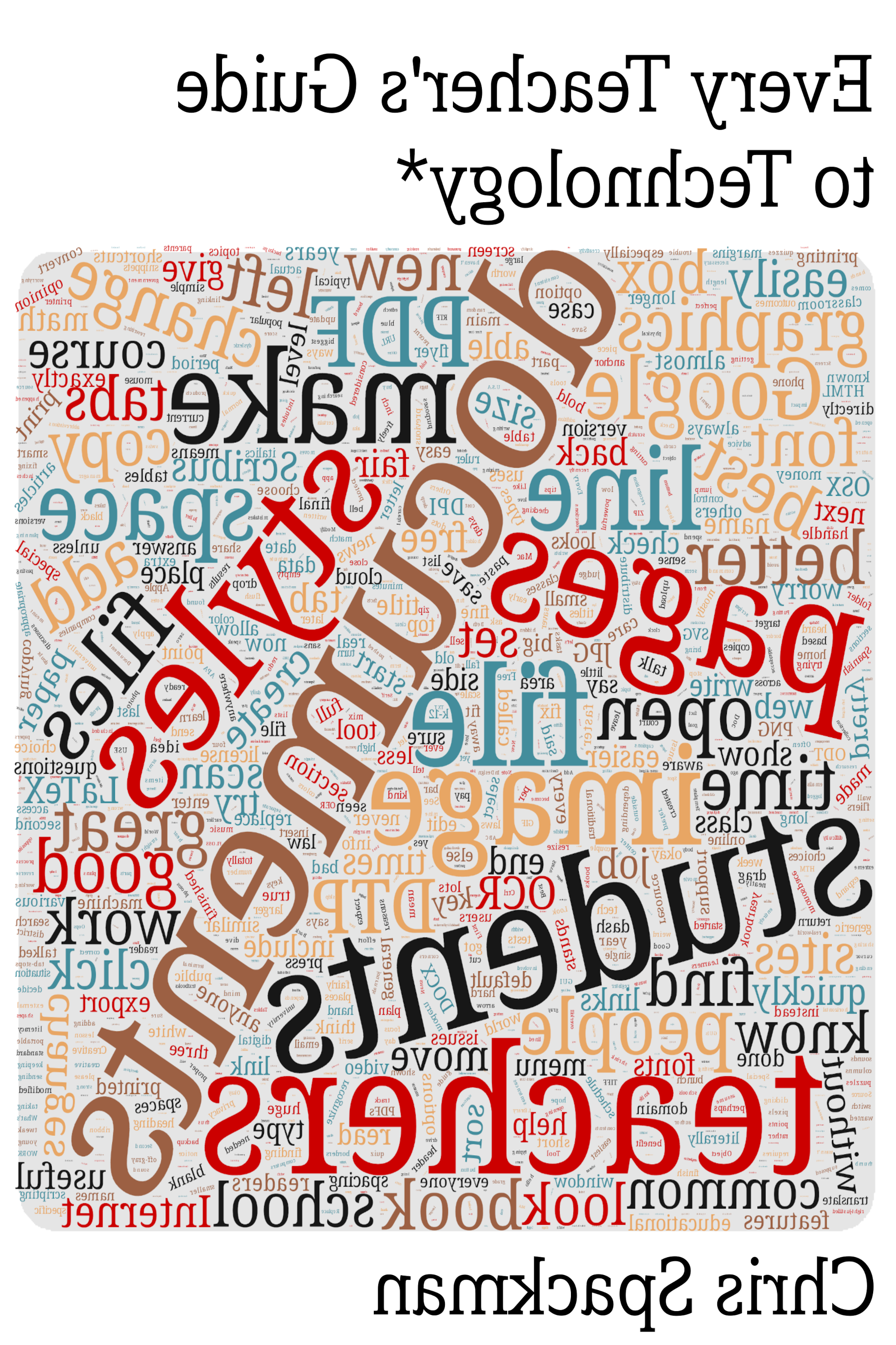
sentient: yes, it technically refers to the ability to feel, not think. But, most people don’t use it that way, and most people, I think, are more familiar with “sentient” than with “sapient”.↩︎
ESOL: English to Speakers of Other Languages↩︎
Odyssey2: IIRC (If I Recall Correctly) — it has been a very long time.↩︎
ALT: Assistant Language Teacher. JET Program: The Japan Exchange and Teaching Program.↩︎
ODU: Ohio Dominican University.↩︎
@OsugiSakae: long story, going back to my time studying Japanese history.↩︎
Tufte style: I hope they will forgive me the damage I did to the style to personalize it for this book.↩︎
individual chapters: such as Scanning and OCR on page and Translating Documents on page ↩︎
1-to-1 programs “give” a computer to each student in a school.↩︎
“automagically:” is one of my favorite words. As you can probably tell, it is made of “automatic” and “magically”. It is the perfect word for how a lot of people understand the internal working of computers.↩︎
Of course, the bigger issue is the inequity around access to, and understanding of, technology.↩︎
better materials: including and especially differentiated materials↩︎
what could: aside of course from the obvious “better pay” and “smaller classes”↩︎
online learning: more accurately known as “emergency online lesson delivery”. How much actual learning took place is a matter of some argument.↩︎
or A4, if you are outside the U.S.A.↩︎
If using tablets, different advice may apply.↩︎
Changes: generally at least 17pt fonts, maybe 0.25-inch margins (but also consider line length). For more info, see page .↩︎
frustration: if you think that is hyperbole, you’ve not seen a student try to do math problems on a Google Jam slide with a touchpad.↩︎
Advanced Topics: page ↩︎
But, please do look at the chapter Security Basics (page ), because ransomware.↩︎
“currently”: I almost didn’t include Part 3 because technology changes so quickly. I think, though, that the books, software, web sites, etc. in Part 3 are likely to still be around a few years from now. Many of them have already been around for a decade or more.↩︎
Hopefully the completed parts are accurate.↩︎
Part 1: page ↩︎
Part 2: page ↩︎
technology topics: for slightly broad definitions of the term in some cases↩︎
OERs: I am maybe irrational about this, but I think that “open” means “free to copy and distribute, and maybe modify”. Some people think “open” is a synonym for “available”. That would mean that every video on Youtube is an “OER”. In my mind, this latter is mistaken, at best. I will never use “open” or “OER” in that way.↩︎
File Formats: This chapter might be boring for many people. I won’t be offended if you skip it until you need it. Of course, if you read it, you will have a better chance of knowing when you need it.↩︎
my feelings: spoiler alert — I prefer portability and openness↩︎
Part 3: page ↩︎
Pet peeve: academics who put their “open” content in Pressbooks or similar sites. Those resources generally are open, but keeping the content in that ecosystem is often the easiest option for actually modifying and sharing. So, semi-free.↩︎
Part 4: page ↩︎
type in URLs: the next edition of this book will include QR code images of the links, for ease of use. I added a few this time, to see how it would work.↩︎
noticed: or not, because we’re only on page 15.↩︎
EdTech sites: well, I guess Canvas and Blackboard are actually “content management systems”, or “learning management platforms”, or whatever the term is this week.↩︎
 Gratuitous Graphic: Use of Italics and Bold in this book.↩︎
If you’re interested, check out the wonderful books When You Catch an Adjective, Kill It by Ben Yagoda and the classic Eats, Shoots & Leaves: The Zero Tolerance Approach to Punctuation by Lynne Truss. My opinions are my own, however, and do not reflect on Yagoda or Truss in any way.↩︎
word processor: such as Google Docs, LibreOffice Writer, or MS Word↩︎
Just like real world swiss army knives and screwdrivers, the “best tool for the job” in the digital world depends on what you need to do.↩︎
There is a saying that the only truly “intuitive” interface is the nipple. I can’t speak to the accuracy of that, but I think the general idea is fair — we have to learn how to do everything. The purpose of GUI metaphors is to make that learning easier and faster by linking it to things the user already understands. Hopefully you are thinking “schema” right now. Pretty much the same idea, for the same reasons.↩︎
real-world metaphors: the technical term is skeuomorphism. Of course, sometimes the metaphor breaks down — how many young people today know what a floppy disk is? But, it is still the symbol for “save”.↩︎
typewriters: another thing young people may not remember↩︎
problems: of course, you can still make that poster in a word processor — the metaphor may break down, but the word processor is not a literal typewriter. It just wouldn’t be the best tool for the job.↩︎
excel: no pun intended↩︎
lots of text: but maybe look at some advanced features if you have more that a few hundred pages.↩︎
free-as-in-beer: in contrast to “free-as-in-speech”↩︎
multilingual: means that the GUI interface can be set to other languages. For example, Spanish-literate students could switch the GUI language to Spanish.↩︎
older than 25: and you have used any word processor at all↩︎
use case: if you need online (not local) access, and 1) don’t want to use Google or MS and 2) don’t need to share documents with more than a few people, maybe check out ONLYOFFICE.↩︎
audience: such as, perhaps, your students↩︎
6x6 rule: I rarely follow the letter of the “rule”, but always keep the spirit in mind. Try to minimize the amount of text on a slide, especially one used during lecturing.↩︎
pixels: are basically the dots on your screen that we see as a single image.↩︎
“see” text: this in an accessibility concern↩︎
more detail: see Graphics Software on page Desktop Publishing on page .↩︎
not as powerful: just generally true for any “software” that is really a web page.↩︎
GIMP: comes from “GNU Image Manipulation Program”. “GNU” stands for “GNU’s Not Unix”. It is a very old joke. And, yes, open source programmers seem to love recursive acronyms.↩︎
Canva popular: don’t be afraid to remind your schools that anything that goes home to families has to go home in a language families can understand. (Make a Canva image for each language!) Also, see the part above about how text in an image is not really text. (Think about sight-impaired family members.)↩︎
open standards: are important in computing, because they allow software to talk to each other, even if just by one program being able to (correctly) understand a file written by another program. “Open standards” are, basically, standards that are widely and freely understood and available for anyone to use, without restriction. In the bad old days, many formats were proprietary, or secret, and that made inter-operability difficult.↩︎
Feel free to skip this section (just jump to Tabs on page ) if you are already familiar with justification. It is boring, but sometimes can be very important.↩︎
WYSIWYG: is What You See Is What You Get. See page .↩︎
k-12: will usually want to give students left-justified texts.↩︎
Tabs: are about placing text on the line. Not just for indenting text.↩︎
On the same line: when APA started requiring this, some students suddenly had a compelling reason to learn about tabs. Others just used the tab key and the space bar. I’m curious how many teachers noticed the difference.↩︎
styles: see Paragraph Styles on page ↩︎
Important: when you use your word processor as a word processor, you can easily make changes.↩︎
Being able to easily change things is important for differentiation!↩︎
Please do NOT use tables for layout.↩︎
Tables: not for page layout. Really.↩︎
Tables: for data.↩︎
Tabs / tab-stops: make differentiation much easier.↩︎
20 years: LO or its predecessors StarOffice (from around 1998, iirc) and OpenOffice.↩︎
Using paragraph styles means you can quickly make changes to the formatting for the entire document. This can be a huge time saver.↩︎
Screen readers need information about the type of paragraph — formatting by itself is not enough (although they do also use formatting info, but differently). Paragraph styles give this information.↩︎
pet peeve: no, no it cannot be used like that. By definition, pet peeves are inconsequential. Spacing, however, is important.↩︎
spacing: actually, there are two more: between letters (called “tracking”) and between some letter combinations, such as VA, (called “kerning”). But those are, believe it or not, beyond the scope of this book. We’re not going to worry about them.↩︎
Extra space: you will not be shocked to hear that I notice this extra space, and required my MA TESOL students to get rid of it.↩︎
widow: a line by itself on the next page is called a “widow”. A line by itself at the bottom of a page (rest of paragraph on next page) is called an “orphan”.↩︎
Let’s not even get into the idea of changing the font size of blank lines to change the spacing between paragraphs. Changing that by hand is more work than using styles, with none of the benefits.↩︎
non-breaking spaces: see page ↩︎
NPELB: (non-paragraph-ending line breaks) — I believe they are often called “soft” breaks.↩︎
NPELB: are especially useful for poetry or other times you want the line to end early and not start a new paragraph↩︎
Consider using character styles for URLs (links).↩︎
links: BTW, when you are writing content, email, etc. please do not use “click here”. This is not a best practice because the link text has no information about what clicking here is about. See Stephanie Leary’s article on why “click here” is terrible. Or, maybe check out this Q and A at Berkley about using “click here”. Trust me (and them) and don’t use it.↩︎
Pro Tip: first replace words like “won’t” with “will not”, then do the generic “n’t” to “not”. But if you already did the generic replace, you can just search for “wo not” and replace it with “will not”. Easy and much faster than trying to find each instance one at a time.↩︎
If you have to use a copy, do it twice. First, make a copy of the original document. Open up that copy and remove the information you don’t need. Save the document. Next, make a copy of that document (a copy of the copy). Use that second copy as your new document. Chances are good that any extra information is now gone. This is especially important when using Google Docs documents, because they have automagic version tracking. (You can delete the intermediate copy when you are finished.)↩︎
Use sans serif fonts for beginners, or for headings, checklists, and the such (with more advanced readers).↩︎
lines: the lines in this book may seem short to you. They average about 65 characters per line, which is short but still in the typical range for books aimed at literate English readers.↩︎
weird letters: to avoid the weird “a” and “g”, Andika is a good font. It is available in Google Docs, but you may have to go to (from the font chooser drop-down menu), search for it, and then add it to “My Fonts”↩︎
Like “learning styles”, the usefulness of dyslexic fonts may be a myth that won’t die.↩︎
possible characters: OpenSymbol is a good font if you need more symbols. Font Awesome is great if you need “characters” that are more like icons or small pictures.↩︎
CJK: shorthand for “Chinese, Japanese, and Korean” in techie font / language circles.↩︎
inserting dashes: you can set up “AutoCorrect” to automagically insert dashes for you while you are typing. In LibreOffice Writer, go to to add or modify strings that should be replaced. (Also to turn off ones you don’t use.) For example, have three hyphens in a row be “corrected” to — (an em dash)↩︎
please don’t use arrows like this. I’m overusing them to show you what you can do. I don’t suggest doing all of this at once.↩︎
fun: when used in documents and used properly. Too many emails have a huge number of non-breaking spaces for formatting purposes. That’s just a crime.↩︎
Actually, please use the dashes also — not much looks worse than a hyphen standing in for an em dash.↩︎
blank lines: right-align the paragraph and use underscores.↩︎
I might use this sort of scaffolding for some English Learners or other students who might need some help with organizing their answer. Also, I like to leave a space before the punctuation, so students who are less familiar with writing can more easily see the periods, commas, etc.↩︎
Please do not use a table to put a border around a paragraph (or anything else). Tables are for data, not formatting.↩︎
WP: stands for “Word Processor”.↩︎
existing docs: don’t spend time changing all your existing docs. Instead, make updates (tabs, styles, etc.) as you use the docs.↩︎
anchor: learn how your word processor anchors images↩︎
Pictures that should not move need to be anchored “to the page”.↩︎
Pictures that should move with the paragraph are anchored “to the paragraph”.↩︎
Enhanced readings are a great way to scaffold more difficult readings for students who might otherwise struggle with them.↩︎
Pictures that should move with the letters around them should be anchored “as a character”.↩︎
crop: means to cut out an area around the outside of the picture. Cropping is a common thing to do to images, often to get rid of unnecessary blank space or perhaps a title or caption you don’t want.↩︎
Pro Tip: keep backups of your images. Also, give them descriptive names. Finding “DSC29561.jpg” later is not going to be easy. Finding “map of wwi battlefields with labels.jpg” will be very easy. Don’t worry if the names are long — even MS Windows can handle them these days.↩︎
zip files: on page in the chapter “File Formats”↩︎
25 MB: the current limit may be higher, but there usually is a limit.↩︎
DPI: see page ↩︎
When I modify tests for ESOL students, I often edit the graphics to add labels, remove unnecessary details or wasted space, improve focus on relevant content, etc. We’ll get into how to do these things in the chapter Graphics Software on page .↩︎
online “paper”: I made a video about going from paper to screen. It is at https://youtu.be/x7ix4zSC-tU.↩︎
margin notes: like this. Hopefully you’ve seen how helpful (and fun) they can be from reading this book. Right? Right?↩︎
IIRC: If I Recall Correctly↩︎
1600 x 900: screen dimensions are written “width x height”, almost always in pixels. Pixels are independent of actual physical size, so a 32-inch monitor and a 13-inch monitor could have the same pixel dimensions. See page for more info on “DPI”.↩︎
less space: this would be true for both screenshots, of course.↩︎
I don’t use: I prefer to use LaTeX to make Beamer presentation slides. Check out some PD slides on my web site if you want to see why.↩︎
translating slides: starts on page . Spoiler: translating slides is time consuming and annoying.↩︎
6x6 rule: see page ↩︎
presentation slides: I do not call them “powerpoint slides” or the such. MS PowerPoint is one program for making presentation slides. In my (highly under-informed) opinion, it isn’t even the best. In this book, I will talk about “slides” and only “MS PowerPoint” when talking specifically about that software.↩︎
movement: like moving words or pictures into categories, matching words (perhaps with definitions), or arranging words into sentences, etc.↩︎
Mrs Park: kudos on having a dot org, and on using a Creative Commons BY-SA license↩︎
freemium: a portmanteau of “free” and “premium” — a freemium site gives away content but also has a paid version with more features or content.↩︎
modifying text: but see the next paragraph↩︎
translating: see page ↩︎
inside of text box: those do sort of follow the typewriter metaphor, a little bit.↩︎
“web site”: not really, but how students use is similar↩︎
screens: most laptops / Chromebooks sold today seem to be some sort of wide-ish screen, so probably 16:9 or 16:10 is best for students’ computers.↩︎
next chapter: page ↩︎
can’t do: DTP software (and word processors) often assumes you will be using an external tool to edit images, and allows you to do that easily. (See figure [fig:edit-in-external-program] on page .)↩︎
less text: labels or captions, not paragraphs (usually)↩︎
better: and if your document fits the typewriter metaphor, then a word processor might be the best tool.↩︎
cropped: but, in that case, the software resizes the image for you.↩︎
students: this is not a common occurrence, hopefully, but if it does happen, …↩︎
download file: Google Slides makes it very easy to share, and it is very easy to download copies of shared files.↩︎
the area: can only be rectangular, because images can only be rectangular.↩︎
screenshots: I use the excellent Spectacle from the good people at the KDE project. On MS Windows, you might try the Snipping Tool.↩︎
putting them together: we need an entire section on this in the next edition of this book.↩︎
layers: I find it easiest to insert copied images in as new layers, because they are so much easier to work with that way.↩︎
memory: RAM (working memory), not the hard drive (storage memory)↩︎
to center: or not to center?↩︎
white: because JPG does not support transparency↩︎
: if you weren’t aware, the in a menu means that there is more — usually that a new window will pop up. Similarly, if there is a submenu, you might see a > or something like ▸.↩︎
prefer cm: this is probably some sort of “round numbers” logical fallacy.↩︎
off the canvas: this is not an issue in DTP, because there you are rotating an image that is already on a larger canvas.↩︎
cropped title: you can add the title back in whatever way works best for your situation — maybe directly on the image using the graphics software, or as a caption using DTP or word processor features.↩︎
in the document: except when the original file is large. If you don’t need all that data, then you should scale it down before putting it in. See Pro Tip: Image Size on page .↩︎
screen readers: see Typography, Design, & Accessibility on page ↩︎
not a concern: because they can access the text↩︎
legibility: see page ↩︎
pixels, not text: this is an accessibility issue, and can also be a “dang, I need to update the text, but can’t” issue.↩︎
moving is transforming: at least, that is what my wonderful colleagues from the math department tell me.↩︎
most applicable: if you know how to skew something on a paper-based poster, please tell me how to do it!↩︎
not here: maybe the next edition?↩︎
: the blank menu boxes show where something (or many things) would be↩︎
these tools: all of the ones in , not only Perspective and 3D Transform↩︎
add alpha channel: if it is grayed out, then the image already has transparency.↩︎
“cut”: often , but see my keyboard shortcuts handout (direct to PDF link!) for other options↩︎
color of thing below: or a mix of the colors depending — transparency doesn’t have to be a binary “on” or “off”. Any color can be made semi-transparent. Think of glasses with a slight color to them. The color of the glasses will get merged with the color of the face and eyes behind them.↩︎
couldn’t: I said “historically”. They may have web-based versions now, but I’ve been editing graphics (poorly) for 20+ years.↩︎
why bother: obviously, I don’t bother with that.↩︎
see cropped content: if you add a Drawings to a Google Document the cropped content is not accessible, as far as I can tell.↩︎
aspect ratio: the image automagically gets taller as you drag it wider, and vice versa.↩︎
literally: in the literal, not the figurative, meaning of the word.↩︎
don’t fit the metaphor: see figure [fig:wp-graphics-dtp-venn] on page for a nice Venn diagram comparing WP, graphics, and DTP software.↩︎
control everything: which is why it is also known as “page layout software”↩︎
Current copyright laws are a disgrace, but they are the law. “Piracy” of music and software is a complex topic. Did you know that studies show that people who pirate music also buy more music? Complex topic. Still, don’t pirate software. Because copyright, but also because it hurts that software’s competitors. Complex topic, remember? Also, malware.↩︎
don’t use: especially the word processor features!↩︎
“Open Source” — see Copyleft and Open Content on page . Basically software you are free to use, modify, and distribute.↩︎
Each graduate has a page with a few pictures and some information. DTP software such as Scribus is the best tool for that job.↩︎
BTFTJ: Same if you were used to GIMP, Krita, Google Drawings or some other graphics program — that program would probably be your best tool for a Venn diagram job.↩︎
textbook in word processor: we made one of the community college textbooks in a word processor. It was a nightmare.↩︎
text boxes: these are similar to, but more powerful than, the text boxes you may be familiar with from presentation / slides software.↩︎
aka “enhanced” readings↩︎
You can see how this fits in with the poster metaphor of moving and pasting independent elements.↩︎
If you remember paper magazines and newspapers, you will remember how articles often continued on another page, deeper in the magazine or newspaper. That is linking text boxes.↩︎
One nice use of text boxes is that you can leave space for articles or graphics that you don’t have yet, while still laying out the text that you do have.↩︎
There are various good technical reasons for doing this.↩︎
DPI is one reason SVG files (the default for Inkscape) are so great. The DPI and size of SVG files can be changed with little or no loss of quality. This is not the case for image files like JPG or PNG.↩︎
text legibility: we talked about this in section Scale (page ) in the chapter Graphics software. See especially figures 4.8 and 4.9 on page .↩︎
unchangeable: don’t worry, you still have your DTP software file, and can keep editing that.↩︎
Good news everyone!: as of summer 2021, the Inkscape developers are working on adding pages.↩︎
pages: the “TIFF” format does have pages, but if you are familiar with TIFF, you maybe aren’t learning much from this book.↩︎
Diplomas: Scribus is great for diplomas. Each diploma is one page (of course), but I have a regular diploma page style and an honors diploma page style set up. The page styles have the text and images that are the same on each diploma, then I individualize each page for each graduating student.↩︎
fill the space: Google Slides now has this. It is called “autofill”.↩︎
doesn’t have: technically, Inkscape does have text boxes, but also lets you interact with them as objects. Best of both worlds, in my opinion.↩︎
styles: Scribus, being proper DTP software, makes massive use of styles. Inkscape, being somewhere between graphics software and “DTP-lite”, doesn’t have styles.↩︎
true DTP — well, sort of like a one-page-only page layout program.↩︎
Tip: quick rule of thumb is to use 40-pt text for text you want students to be able to read easily from anywhere in a typical USA k-12 classroom.↩︎
monospace font: is also what “ASCII art” depends on.↩︎
With a monospace font, though, it may not make much difference.↩︎
There are also vertical guides. You can get those by dragging from the vertical ruler at the left of the page.↩︎
Transparency is a property of the text or image box.↩︎
Click and hold: Some software will select anything that your click-and-drag box touches. Google Slides does this. Other software will only include elements that are entirely contained in the click-and-drag box. Scribus and Inkscape work this way. You may have to practice a little to see how the software you use does it.↩︎
drag bigger: this is similar to “autofit” in Google Slides.↩︎
PNG files are usually bigger than JPG, but PNG can do transparency; JPG format can not. See more info on page .↩︎
I think it defaults to the DPI of your monitor.↩︎
read or print PDF: there is a good reason why PDF is the main format for this book↩︎
“… Format”: see pages and for more information about the PDF file format.↩︎
shrink to fit: is your friend↩︎
I’ve found that the words “flash cards” don’t translate well into other languages. Because I’m an ESOL teacher, I’ve taken to calling these “vocabulary cards” with students. That translates much more reliably.↩︎
CC licensed: I usually start with Wikimedia Commons and search for what I need. Like “site:https://commons.wikimedia.org svg soccer player” (without the quotes). The “site:” tells the search engine to limit results to that site, not the entire Internet.↩︎
word walls: ESOL teacher Chris speaking now — be relentless with vocabulary. Don’t just put something up on the word wall and never return to it. Return to several of the entries every class. Your students should see your word wall in their dreams — and be able to read all the text!↩︎
textbooks: the ESOL textbooks I just put together after the authors finished the content. That is why I was able to use Scribus.↩︎
how printed: the traditional 4-pages on a piece of paper that is then folded and cut requires pages in multiples of 4 if you don’t want blank pages.↩︎
“Right Mouse Button” — a right click↩︎
issues with images: for example, somehow one of the images got stuck in the page footer, but not actually in the footer. More like behind it. We could not move or get rid of it. We actually ended up using the book with students with that lone odd image hanging out in the footer of one page.↩︎
less useful: and some that will be very useful, if you need them.↩︎
Not well laid out: I assume the range is probably distributed like a bell curve — a small amount of really, really bad layout (like unusable), a small amount of really excellent layout (like professional, “wow” level), and a whole lot of so-so layout in between the two extremes.↩︎
paragraph styles: see page ↩︎
Of course, neither of those involved educational sites. I think IEP and 504 law in schools is going to be more important for educators for a long time.↩︎
line length: in practice, this means tweaking them until you get the line length you want.↩︎
TNR: Times New Roman↩︎
NOT proven: link goes directly to a PDF file↩︎
Liberation fonts: main project is at GitHub, but you probably want to find them from a reputable source for your operating system.↩︎
empty space: assuming you set the line length to an appropriate number of characters.↩︎
stuff on the walls: be aware of laminated items and overhead lights. The glare can make even the big fonts pointless.↩︎
Pet peeve: sending home letters in 11pt, sans fonts, with margins as small as 0.5-inch, and 100% line spacing. That is like 110 characters per line. Even family members who love reading won’t love that.↩︎
RMB: Right Mouse Button↩︎
LMB: Left Mouse Button↩︎
graphics: PDF files can go both ways, depending on how they were made. They might contain text, or just an image of text.↩︎
super generic: but then, why is that image there?↩︎
consistency: one example I see a lot is the inconsistent use of “___”, “…” and plain old nothing (such as “The author of this book is”) in questions on tests. Choose one of the first two and stick with it.↩︎
favorite page: I love them all, really, but typewriter habits is most helpful for our discussion here.↩︎
(3)x: as in 3 × x. Yes, it would normally be 3(x), but confused students are confused and don’t always notice these things.↩︎
tabs: see page ↩︎
L1: a person’s first language — usually not English if you are talking about English Learners or their families↩︎
Veed.io: with the Pro subscription, you can also download subtitle files.↩︎
see the subtitles: of course, it is good to be aware of families’ literacy as well. Not all parents are literate in their preferred languages.↩︎
transcode: converting a video from one format to another. Depending on the software you use, the subtitles could even get lost just by resizing a video.↩︎
MB and GB: actually it is more complicated than that, but these two are what most normal people use. They are good enough for our needs.↩︎
bandwidth caps: not everyone has “unlimited” internet access. Some may pay by the gigabyte (GB) or for each GB over a set amount.↩︎
resize it: 1280x720 and 1366x768 are good sizes to start with, if your students are watching on relatively recent devices.↩︎
streaming: I’ve downloaded videos from Google Drive that were over 1 GB in size for around 10 minutes of the teacher talking. That’s too big.↩︎
includes: but not limited to↩︎
Spoiler: it says “use styles”, among other good info.↩︎
color blindness: I use Colorblindly, but there are several others as well. Check your browser’s addon store / collection / whatever they call it.↩︎
analogy: by which I mean, in PD I give them an article on quantum mechanics to read.↩︎
AWL: see Victoria University of Wellington for more information.↩︎
“Simplified” readings: I use these a lot to build background knowledge so students can then more successfully undertake the original, more difficult reading.↩︎
remember, PDFs are generally not editable by “typical” computer users.↩︎
Computers, and if you are lucky, your copy machine.↩︎
file formats: learn more about these in the chapter File Formats on page ↩︎
copy machines and OCR: in my experience, most copy machines in k-12 schools do not do OCR. I assume the machines that do are more expensive, or that OCR just isn’t on the tech department’s checklist of needed features.↩︎
Google Drive will convert a PDF into a Google Doc, complete with graphics.↩︎
TIFF is not very common in k-12 circles, so most teachers don’t have much, if any, experience with it.↩︎
PDF to Google Doc: converting to a Google Doc is also very helpful when you need to translate a document. See Translating Documents, page .↩︎
tesseract: no, not that one↩︎
I don’t know of any schools that have the money to translate everything that they need to. Professional translation is expensive, there are a lot of documents that go home, and there are a lot of languages.↩︎
range of languages: there might be some sites that are better for specific languages, or specific needs (such as short text messages versus word-processing documents).↩︎
(Es) is for “Español”. You could use (Sp) or (Spanish) or whatever. I prefer (Es) because it is unlikely to appear in unrelated searches.↩︎
convert PDF file: as explained on page ↩︎
translate a wp doc: see page ↩︎
translate slides: If MS PowerPoint has the feature, I cannot find it in the online 365 version.↩︎
And this is the easy option!↩︎
original file: Don’t forget to make a copy and paste into that, if you want to keep the original.↩︎
plain text: you could also just put the markup directly into the slides. I find it much easier to use a word processor (and features like (page ) to quickly add the markup.↩︎
after translating: we are assuming that your markup does not get translated. If it does, you may have to go back and try something different. Maybe 3-5-1 instead of E-S-1, for example.↩︎
single page: just copy and paste it into a proper word processing document.↩︎
talking with students: I also just use the GT text box when I need to “talk” with a student in class, but don’t want talk out loud, regardless of translation. It is quite convenient.↩︎
no issues: maybe. The system could be really “accurate” in its errors both ways. If you don’t know the language, you likely won’t catch it. Machine translation is a “better than nothing” or “good enough” solution.↩︎
If the English is really bad, you may need to paste the original English in again.↩︎
Did you really need passive voice? Really?↩︎
I heard this story like 20 years ago, when machine translations were first sometimes available on the Internet. Supposedly, this happened to one unfortunate school that trusted the tech back then.↩︎
Yes, it is, but don’t worry about it.↩︎
Penguin: or whoever the publisher is↩︎
see page ↩︎
commercial product: or maybe you can. But best to check before putting it on Teachers Pay Teachers.↩︎
EULA: End User License Agreement. It is that really long wall of text that no one reads before clicking “I agree”.↩︎
IANAL;TINLA: I Am Not A Lawyer; This Is Not Legal Advice.↩︎
L1: the students’ first or preferred language.↩︎
PDF files are not easy to change, and can be set to not allow printing. So, if you distribute PDF files of copylefted / open content material, you are usually required to provide some file that a normal person can actually use to make changes. Often, this would be a word processing document, an HTML (web page) file, or just plain text. Details like this keep open content open — you know that some jerk would sell content as images (very hard for normal people to get the text out of) if they thought they could get away with it.↩︎
Internet of Things: regular consumer devices — such as thermostats, light bulbs, electric sockets, doorbell cameras, child monitors, some children’s toys, etc. — that are connected to the Internet. Off topic, but they are generally a security nightmare.↩︎
But, they probably have horrible, meaningless names. You just have to look at each and rename, if you want.↩︎
Unlike “PIN number” it is okay to say “PDF files”.↩︎
I still use plain text email — the email metaphor is writing a letter, not making a web site!↩︎
Actually, one of the reasons that the Internet took off as quickly as it did, way back in the 1990s, is because it was just plain text. Anyone could go to and see exactly how the page was made. If you wanted to, you could copy some HTML and use it in your own pages. This made it very easy for anyone to get started making web pages and web sites. Thanks, plain text!↩︎
Yes, there are spreadsheet functions that can do this sort of thing for you, but many people don’t know about them. And, unless you have hundreds of names (or other data) to work on, it is often faster just to export → edit → import and be done with it.↩︎
And when it is necessary, it is usually because we want to treat the spreadsheet content as text instead of data. That is why we have CSV format.↩︎
You still have to put translated text back in, one textbox at a time, but at least you don’t have to translate one textbox at a time.↩︎
Yes, we just talked about PDF files above, as a text & word processing format. They can be thought of as both.↩︎
I have to resist the urge to make humorous changes to résumés that job candidates send in, for example.↩︎
and those photos get uploaded to the Internet↩︎
HTML: “HyperText Markup Language” — the text markup used to create web pages.↩︎
graybeard generally means “old”, of course, but can also refer to someone with lots of experience.↩︎
Tip: key is a pretty universal keyboard shortcut for “Rename”.↩︎
we talked about it on page ↩︎
2001: and it is still being exploited this way in late 2021. See page 9 of the transcript of Security Now!, episode 847 for how the double file extension is being abused today.↩︎
VBS stands for “VBScript”, short for “Visual Basic Script” — a simple program, basically.↩︎
https://www.quizlet.com↩︎
I only really have two complaints with Quizlet. 1) they got rid of support for spaced repetition. 2) the name confuses some students, who think it is a site for testing (because quizlet).↩︎
from ELA vocab to all the science vocab to a lot of USA history and government vocab↩︎
intuitively: that is, it is easy to find the export button.↩︎
or “discoverability” as it is also called↩︎
for free accounts: in fall of 2021, I discovered that you can download some files from Canva as SVG files — which are portable — but only if you have a paid account. Not sure when this changed.↩︎
Canva images: which you sometimes have to pay for. A teacher once shared a Canva worksheet she made. I went to go download it. Couldn’t. The teacher had used an image that you have to pay for. Oops. Also, no thanks.↩︎
To be fair, Google Forms questions do not seem to be easily exportable. The data from those questions, yes. The actual questions? Not that I’ve found.↩︎
See page ↩︎
ransomware: Recent case where the criminals released stolen documents online. Actually, when I first wrote this section, in 2019, very few normal people had heard of “ransomware”. Now, in 2021, normal people might be able to name a ransomware gang, or at least a business that was targeted.↩︎
See my book Every Sentient Being’s Guide to Password Security for way too much info about passwords and computer security.↩︎
But for $diety’s sake do NOT use “password123” as your pasword! Never. Just don’t do it. Not even ironically.↩︎
securely: meaning “encrypted with a strong cipher, so if you forget your password there is NO way to get your data back”.↩︎
Some people make their own compromise solution by putting the local “wallet” file on a service like Dropbox that syncs the data to several computers. This can be an acceptable compromise; I have not heard of any issues with it, but that doesn’t mean there are none.↩︎
BitWarden, 1Pass, and LastPass all have addons / extensions for all the major browsers. Thus, they offer “cross browser support”.↩︎
Of course, if you only use one browser, this is not as big an issue.↩︎
Of course, local / offline managers are generally more secure and more compatible because they don’t connect to the Internet and don’t care what browser you use.↩︎
inexperienced ones: are known as “script kiddies”↩︎
knTahsg!cgrl4gc: Please don’t use these examples as passwords either. If they are in print, it will eventually get added to a password cracking dictionary.↩︎
You might notice this when your machine keeps overheating and your electric bill doubles or triples.↩︎
Increasingly, they also steal your data and then blackmail you — “pay up and we won’t release your data to the entire Internet”.↩︎
see Botnets and DDOS Attacks on page for more about these two horrors.↩︎
For example, bad guys exploited vulnerable software to steal and encrypt student data from several universities. Seems they then blackmailed the victims for good measure. Details at The Stanford Daily.↩︎
Never mind that it is relatively easy to get around text message 2FA. I suspect that most sites like it because they can get your phone number. With that, they can purchase a lot more information about you, if they want to.↩︎
Don’t get me started on biometric “security”. I don’t want to use my face or my fingerprint to unlock anything, ever, unless it is a secret bunker under the White House.↩︎
botnet: a collection of pwned computers controlled by a bad guy group↩︎
Dvorak keyboard layout places the letters more effectively (for English!) on the keyboard. For starters, the vowels are all on the left-hand home row — instead of — and most of the most common consonants are on the right-hand home row — instead of . I changed to Dvorak around age 30 and have not regretted it at all. More importantly, my wrists rarely hurt, even after hours at the keyboard.↩︎
Both together: Seriously, using combinations such as or is super helpful when you are editing.↩︎
Linux: If you are curious about it, Linux has several different desktop GUIs available. Some are full-fledged environments, similar to MS Windows and Mac OSX. Others are more minimal, not doing much more than displaying windows on the screen. If you want to learn more, start by searching for “KDE”, “GNOME”, and maybe “Linux window managers”.↩︎
It is a Monty Python reference.↩︎
wifi down: Google’s “offline editing” can help here, assuming the offline version is up to date and you don’t need any of the online functions↩︎
The Cloud: like you maybe heard about 4 or 5 times in the previous section.↩︎
anyway it wasn’t your computer, it was just a terminal↩︎
Of course, many / most people these days stream their music from a service and don’t keep MP3s anymore.↩︎
“Accessibility” in the “you can access it anywhere” sense of the word.↩︎
Read anything by Amy Webb if you are interested in futurology.↩︎
I believe Apple is working on this, for security and privacy.↩︎
there are others too, from Steam, MS, Nvidia, etc.↩︎
security: I have been on webinars where the presenter’s browser has had an “update now” icon that I know was because of a serious security problem two weeks prior. Chromebooks are popular (with the IT department) for good reason.↩︎
If you still use Yahoo for anything, please consider switching to anything else.↩︎
We don’t have to worry about these things, but hopefully someone in your district is.↩︎
Several sites: pretend a big educompany bought IXL, NewsELA, CommonLit, and Khan Academy↩︎
Just an example — they would already have that info anyway.↩︎
better: meaning more consistency to layout, fonts, spacing, etc.↩︎
bold and italics: yes, I know I am guilty of mixing the two in this book↩︎
text abbreviation: text that the software automagically converts to some other (usually longer) text.↩︎
scripts: small programs↩︎
These snippets are basically templates, at this point. The difference is that the software prompts me for information (such as the date and title) and then automagically inserts that information into the file. So for these documents, using a snippet is actually faster than using a template.↩︎
daily vs one file: some people like to have one file for each week or each month — to each their own↩︎
mycontactinfo or, maybe just
mciorMCIor similar short form.↩︎full disclosure: I’ve communicated with Dr. Stachowiak in the past about technology and teacher education, but I don’t use TextExpander and have nothing to do with her podcast.↩︎
LaTeX: If you have made it this far, you probably will not be suprised to learn that I wrote this book in LaTeX.↩︎
unless you want to↩︎
That is, you wouldn’t need to learn totally new software, you would just expand a bit on what you were already using.↩︎
the direct link is learn-latex.pdf↩︎
“It is very convenient”: A Casablanca reference, in case you missed it.↩︎
old site as new: Everyone has to discover / learn everything for the first time at some point. As always, there is an xkcd for that.↩︎
bleeding eyeballs: It is a great site, but it also looks like something from the worst of the 1990s web. The only things missing are scrolling text and blinking text.↩︎
javascript: little programs (sort of) that run in your browser. When javascript (and thus a browser) is the only way to view content, it seems not so “open”.↩︎
see the margin note on page ↩︎
fork: to create a copy and start working on the copy as a new project. It happens sometimes in the Open Source world, and is not considered a problem. LibreOffice is actually a fork of OpenOffice. In this case, LibreOffice became much more popular, although OpenOffice is still around.↩︎
no MS Word copy: see Portability on page ↩︎
institutional account: so, someone paid $$$.↩︎
couldn’t find it: of course, I also have my browsers locked down, and they won’t load scripts from sites I don’t allow. Sometimes that causes problems. I don’t think that is the issue here, though.↩︎
Note: when I say “multilingual”, I’m not talking about the ability to input in other languages. That is (usually) a job for the operating system (like MacOSX or MS Windows) and not individual software.↩︎
free Canva account: As of fall 2021, it seems you can download an SVG file if you have a paid Canva account. Without that, you can only download JPG, PNG, and PDF files. Image files can be edited, but all previous editing info is lost.↩︎
Portability: see Portability on page .↩︎
Google does data export / portability right, mostly. It is easy to download your files from Google Drive, in a variety of formats, including open formats.↩︎
run on a potato: actually, that is true for almost all the open source software mentioned in this section.↩︎
FLOSS: Floss / Libre / Open Source Software↩︎
see also: OpenHistory.org and OsugiSakae.com, below↩︎
qr code: included as an experiment for possible full inclusion in next edition of this book↩︎
Go to: Chris Spackman Home | ESBG Home | Top of Page
This page is copyright ©2021 Chris Spackman.
These pages were developed entirely on GNU/Linux with Free / Libre / Open Source Software.
This work is licensed under a
Creative Commons
Attribution-ShareAlike 4.0 International License.
